Figma vs Adobe XD: which tool should you design with?
With remote working presenting new challenges to our creative process and our production team wanting to experiment with new design features, we’ve recently switched to a new design tool. But which option would work best for you?
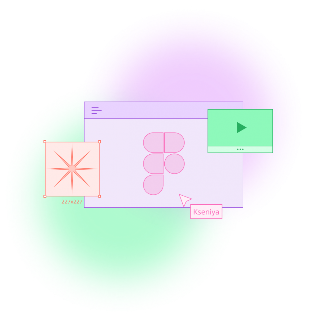
In 2016, Figma introduced an innovative browser-based interface design tool. The same year, Adobe Inc. released its own version of a UX design tool: Adobe XD.
Alongside other popular editing software options such as Sketch, both Adobe XD and Figma have evolved into competitive design platforms, and our production team decided to investigate the pros and cons of each. Here’s what we found:
Platform and performance
The most obvious difference between the two platforms is that Figma is browser-based, whereas Adobe XD is a downloadable desktop application.
Adobe XD allows users to work with local files offline. It also allows users to share and get feedback on their design, thanks to its cloud capabilities. In its recent update, Adobe took a step further and XD now integrates with apps and services across the Creative Cloud suite. This means that sharing assets between apps and users with Creative Cloud Libraries is now easier.
Some might assume that Figma’s browser-based approach to designing is limited to internet connectivity. However, Figma allows its users to work offline on a pre-opened file via a desktop app (available for both Mac and Windows).
When comparing the two, it all comes down to individual preference and work style. However, working on a browser-based platform like Figma definitely has some advantages when it comes to collaborative work and live updates.
Pricing
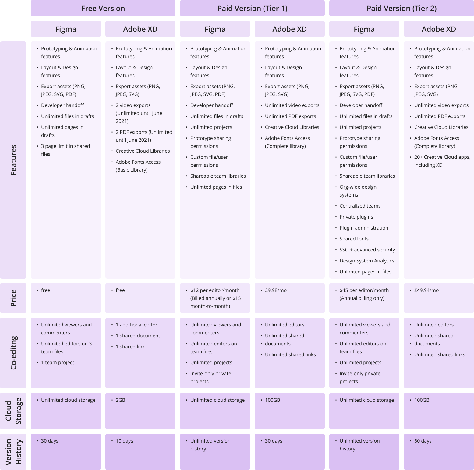
Both Figma and Adobe XD offer free and subscription-based pricing options. XD’s single-app plan for professionals and small teams costs £9.98 per month (without a trial) and is free for personal use. Figma’s pricing options break down as follows: free for personal use; $12 per editor/month on the Professional Plan; and $45 per editor/month on the Organization Plan (annual billing only).
It’s worth mentioning that Figma’s free version allows unlimited editors on 1 project and 3 team files, as well as a 30-day version history, unlimited cloud storage, and unlimited viewers. Adobe’s free starter plan only allows for collaboration on one shared document and one additional editor, limited cloud storage (2GB), and a 10-day version history.
Here a more detailed view on the price differences between the two:
Click to expand table
Features and functionality
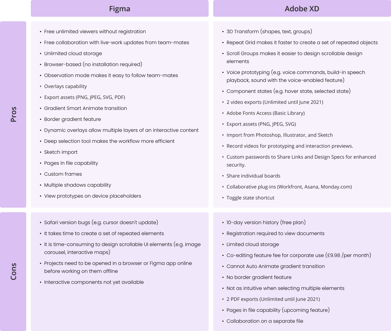
Figma and Adobe XD are becoming more similar in terms of features and functionality. Each platform seems to adopt something new with every update. For example, Adobe XD has been working hard to achieve something similar to Figma’s game-changing collaboration features. On the other hand, Figma only recently introduced its Smart Animate feature, which is very similar to the Auto Animate feature that Adobe XD introduced some time ago and changed the prototyping experience completely. However, there are still some visible differences in workflow. Let’s discover them below:
Click to expand table
What are we using at Verve Search?
At Verve Search, we’ve chosen Figma over other prototyping design options.
Here are the five reasons we decided to go with Figma:
1. Figma is free
Team accounts are paid but individual accounts are free and include all the same key features as the paid version.
2. Simpler developer handoff
Our developers can get dimensions, styles, and download icons and images from the project URL. Resources such as images and SVGs can be exported globally and locally.
3. Easy collaboration
Co-designing alongside your co-workers is no longer a fantasy. Our team can now edit files together in real-time, leave comments with mentions, and follow along via Observation Mode. This has been particularly useful for remote working.
4. All-in-one platform
It’s an all-in-one platform that does not require switching from one system to another in order to complete or share the design process. Designing, prototyping, reviewing work, and sharing feedback are all in one place.
5. Design features
Tools like ‘deep selection’ provide more control over design elements and save time during editing. Other features that our team enjoy working with are instant arcs, overlays, gradient borders, smart animate gradient transitions, and much more. Figma helps our designers to expand their creative ideas and showcase their visions throughout the design process.
Final thoughts
Figma made the right choice to focus on collaborative work and the ability to access files from the browser without installation, while I find that XD’s strength is in finding new design processes, such as Scroll Groups, 3D Transform, and Repeat-Grid features.
Only time will tell which platform will gain more recognition among designers. So far, Figma and Adobe are doing well at listening to user feedback and transforming it into real features, bringing visual design onto another level.
Features and images presented in this article are extracted from the official websites of Figma and Adobe. Figures for both are correct as of May 2021.
Interested in our content marketing and digital PR services? Get in touch.
6 UI design principles you need to know
For a designer, it’s essential to have a clear understanding of UI principles. UI principles are high-level concepts that serve as guidance when designing a user interface, which is the point at which human-computer interaction occurs. The hierarchy in the UI design is fundamental in determining what the user will take away from their experience when using the interface.
The goal of a UI designer is to anticipate what a user might need to do by producing an interface that naturally encourages exploration and avoids confusion.
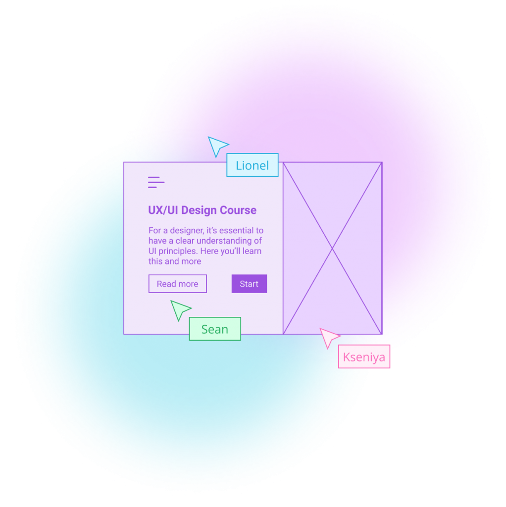
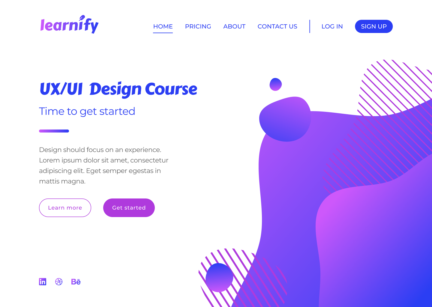
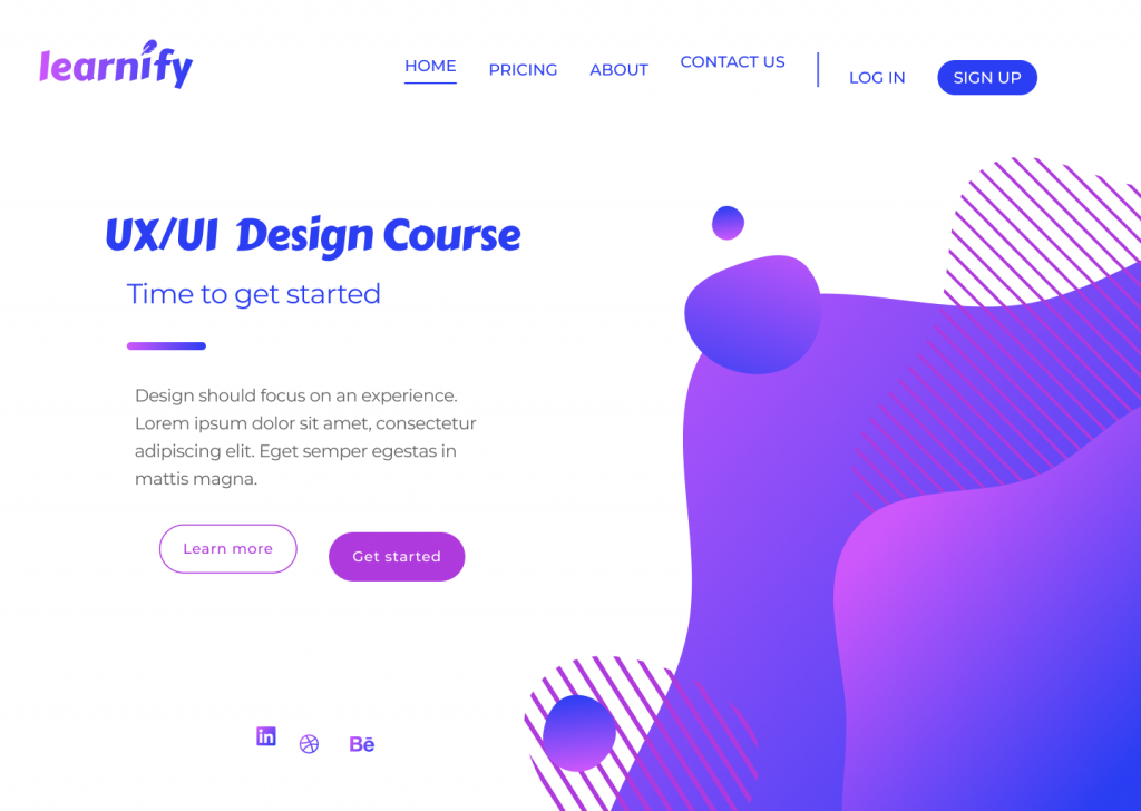
For this post, I’ve designed a simple landing page for a fictional learning platform. This landing page design – that in its current state follows all of the UI principles correctly – will be used as a point of reference to demonstrate six key design principles.
I’ve accompanied each section in this blog with a version of the above page that demonstrates how a bad design decision could affect the overall image and the usability of your design.
So, let’s get started…
Typography
Typography is one of the most important principles in user interface design. It’s the technique of arranging text to make it readable and visually appealing. The arrangement of the text includes selecting typefaces, font sizes, line lengths, line-spacing, and letter-spacing, and adjusting the space between pairs of letters.
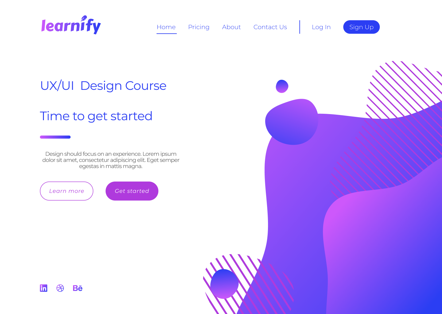
Good design doesn’t need to feature lots of different typefaces. Unless the typography is a core design element, you simply don’t need to use lots of typefaces to convey a message.
More often than not, simplicity is key, and a strong design might only feature one or two typefaces. The typography principle is there to lead the reader’s eye to the right place at the right moment. It sets the tone of your page and helps to establish a visual hierarchy in your design.
For example, a larger font size and bolder font-weight have a higher chance of being seen by the user, but if we were to compare…
this lightweight text in a bigger font
with
this bolder text in a smaller font
…the chances are the first example would stand out more.
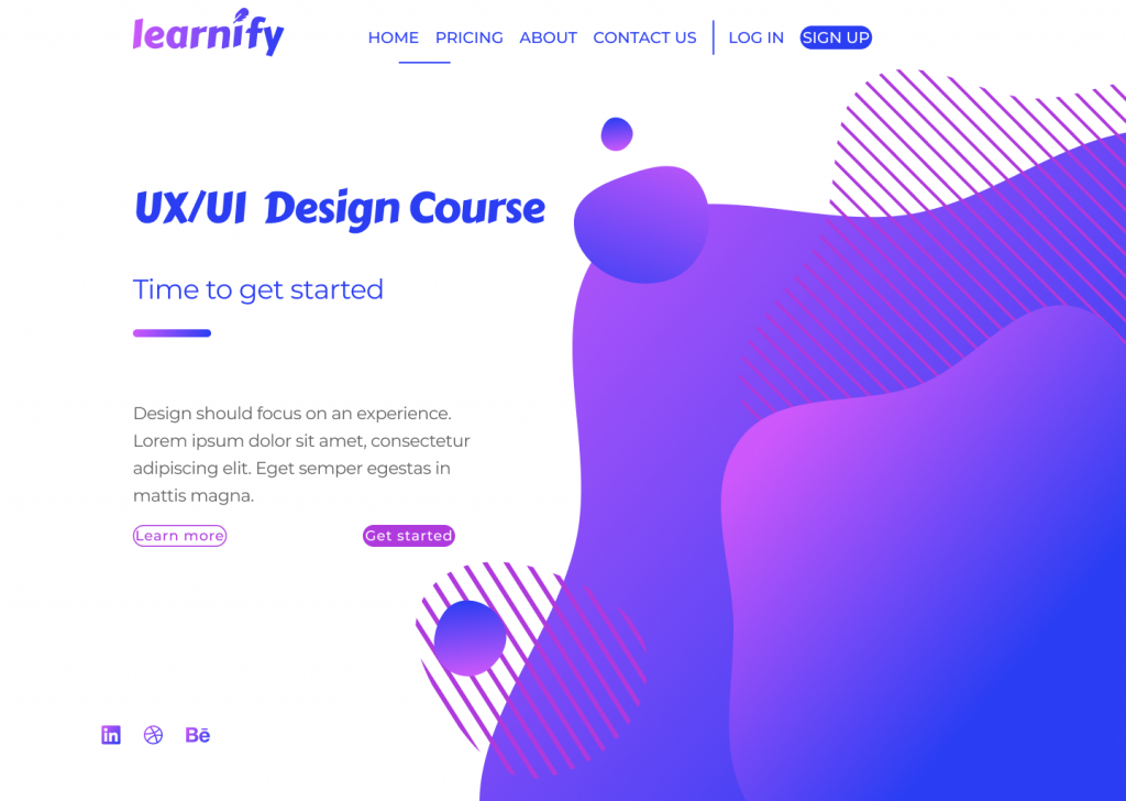
One way to improve a website’s readability is to increase leading (or line-height, in other words). This spacing between the two lines of text has a key impact on legibility; correct line-height helps the reader’s eyes travel from one line to another.
Although the standard leading is 120% the point size of the font, the leading can be set to automatic adjustment and can be modified according to the typeface needs. The body text in the example below illustrates poor use of leading.
The text is clustered which makes it difficult to read. Overall, this page does not give its viewers a sense of flow when reading the material from start to finish. The various alignments and improper use of fonts does not convey a story, nor does it urge users to take an action.
Tip
Select typeface for the headers only after you are confident with a typeface for the body text.
Scale
Scale in design refers to the sizing and the proportion of the elements on a page. Every element, whether a piece of text, a shape, or a line, has a weight.
The weight is created from the size, colour, or texture of an object. A symmetrical, well-balanced design is formed by aligning equally weighted elements on either side of the centre line. With the scale principle in mind, the designer needs to make sure that the page doesn’t look either overcrowded or empty.
One way to achieve this is with the use of padding and white space, or by simply adjusting the scale of an element. Scale can be used to direct viewers’ attention from the most to least important elements.
Objects of a bigger scale tend to attract viewers’ attention more, so the scale principle can be used as a way to rank design elements and influence the order in which users view them.
Below is an example of badly scaled design. The scale principle should help in guiding the users through their experience, but on the page below, the viewer can’t focus on any of the elements. The header is too big, the action buttons are too small, and the social media links (already highlighted enough with colour) are unnecessarily large.
Tip
It’s good practice to apply the golden ratio in your design. The golden ratio can be applied to spacing, composition, and layout; try using a golden ratio template. Plugins such as Font Scale can help establish a typography foundation.
Alignment
Alignment is the arrangement of elements in a straight line or correct relative order and is recognised as one of the core UI principles. Any two connected points are referred to as a line.
When executed correctly, alignment creates a hierarchy within a design and helps direct the user’s attention towards specific information. Arranged content is easier for the user to scan through which increases readability and the viewer’s engagement.
Alignment can be achieved with a clearly defined boundary or a division. A defined boundary can be perceived in a group of elements that share a common area. When the elements are close or proximate to each other they tend to be visually grouped.
In the example below, an excess of misaligned elements strips the viewer of a clear visual path. It’s now unclear where the viewer should start and finish navigating the page.
As the human eye naturally seeks perfection, an intentional misalignment of an object could sometimes be used as a way to attract a user’s attention. One way to do so could be by increasing the y-axis of a navigation bar link of a selected page as a way to highlight the user’s current location on a site.
Tip
Enable a predefined grid or customise one to make sure elements are aligned and visually organised.
White space
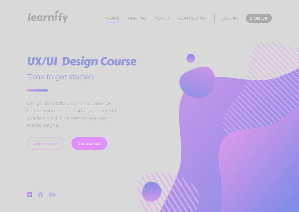
For a design to work, it needs to have an adequate amount of space between its objects. In our example below, the area around each object is white space, which also happens to be the negative space and another key UI principle.
Unlike positive space, which is the area of interest on a page, negative space is the background area around the subject of interest. The right amount of white space can simplify and break a design into chunks of information that are easier to comprehend.
A larger white space around the text helps improve readability. A design that has a very minimal use of white space could overwhelm the reader’s eye.
In the example above, it’s obvious that the design lacks white space, making it heavy on the eyes.
Here are a few reasons why this is happening. First, although the CTA buttons are emphasised with boxes, the text inside of them lacks padding and subsequently looks too big. The visuals on the right side of the page are too large and too close to the top navigation bar and the text on the left side of the page.
Elements on the left-hand side don’t have enough space to breathe and are overwhelmed by the size of the visual element. Header one and header two seem to be too far apart – despite them being part of the same group, they seem isolated from one another. The same issue can be seen with the CTA buttons, which once again are too far apart.
Tip
Button borders usually work well when the padding ratio is 1:3 for the top and bottom, and 3:3 for the right and left.
Colour
Users often perceive an aesthetically pleasing design as a more usable design, and they’re technically not wrong. More and more brutalist-inspired websites are receiving recognition among younger users. Their ruggedness and complete lack of usability is what makes them unique and memorable.
Sometimes the simplest, most intuitive, and most accessible user interface is not as popular as a modern design that has scarce consideration for usability. By and large though, if a website lacks aesthetics, it will most likely drive away visitors too.
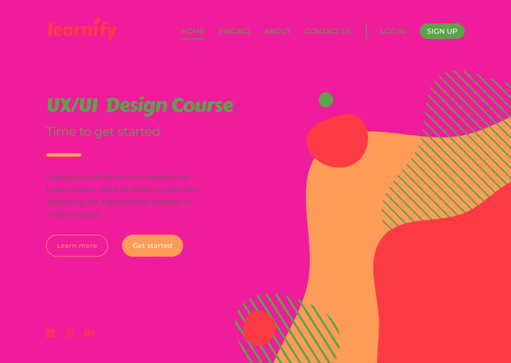
Colour is another hugely important UI principle. Colour can establish the right tone, whether it acts as the main standalone component or is used as an oomph in other design elements. Colour can set boundaries, define shapes, and give emphasis to an area of a page.
In the example above, the colour selected for the design doesn’t reflect the brand nor enhances usability. The colour combination looks tacky and lacks contrast, creating difficulty when reading the page and identifying the navigation elements.
Tip
Apply the 60-30-10 rule. That’s 60% to the dominant colour, 30% to the secondary colour, and 10% to the accent colour. Consider using colour palette plugins, as these are predefined colour sets that can speed up the process of choosing the right colours for a design project.
Contrast
Contrast is the state of something being different from something else. For elements to contrast, there should be an evident difference between the two. Colour, scale, or a combination of both can be used to contrast two or more elements and create space.
RGB, hexadecimal, and HSL all have an impact on whether a colour will have enough contrast. The Web Content Accessibility Guidelines (WCAG) 2 – the international standard for designing for accessibility – is a good way you can learn more about the specifics. WCAG 2 expresses the brightness differences between colours in a form of a ratio, which ranges from 1:1 (e.g. white on white) to 21:1 (e.g. black on white). If we were to check the contrast of RGB values on white background, the ratios would look like this:
Red = 4:1
Green = 1.4:1
Blue = 8.6:1
(*the ration value will remain the same even if the text colour is reversed with background colour)
According to WCAG 2, the minimal requirement of the AA level of contrast ratio is 4.5:1, though this ratio requirement drops to 3:1 if a large-scale text is used. This requirement can be avoided altogether when referring to the contrast in decorative text and text in logos, as these do not affect the accessibility of an interface.
It is important to note that there are many colour hues and shades out there and the ratios cannot be rounded. If the colour contrast is 4.2:1, it automatically does not meet the minimal contrast requirement.
Below is an instance of how contrast should not be used:
The above design is an example of ineffective contrast use because the elements are difficult to read and identify. Lack of contrast strains the viewer’s eyes and can result in users experiencing frustration.
Tip
Using images as backgrounds can reduce text visibility. To make sure the text is adequately readable and meets WCAG 2 contrast requirements, use a coloured overlay on the image before placing the text on top.
Final thoughts
The different elements of a design should all work together as a team to tell a story and guide viewers through their user journey.
To all budding designers, I would strongly recommend familiarising yourself with UI principles before taking on a design project. The proper use of these principles will contribute to the flow and the outcome of your design, and significantly enhance the accessibility of the page.
Take a look at some of our previous campaigns to see how the design team at Verve Search have used design principles in their award-winning work.
Interested in our content marketing and digital PR services? Get in touch.