Figma vs Adobe XD: which tool should you design with?
With remote working presenting new challenges to our creative process and our production team wanting to experiment with new design features, we’ve recently switched to a new design tool. But which option would work best for you?
In 2016, Figma introduced an innovative browser-based interface design tool. The same year, Adobe Inc. released its own version of a UX design tool: Adobe XD.
Alongside other popular editing software options such as Sketch, both Adobe XD and Figma have evolved into competitive design platforms, and our production team decided to investigate the pros and cons of each. Here’s what we found:
Platform and performance
The most obvious difference between the two platforms is that Figma is browser-based, whereas Adobe XD is a downloadable desktop application.
Adobe XD allows users to work with local files offline. It also allows users to share and get feedback on their design, thanks to its cloud capabilities. In its recent update, Adobe took a step further and XD now integrates with apps and services across the Creative Cloud suite. This means that sharing assets between apps and users with Creative Cloud Libraries is now easier.
Some might assume that Figma’s browser-based approach to designing is limited to internet connectivity. However, Figma allows its users to work offline on a pre-opened file via a desktop app (available for both Mac and Windows).
When comparing the two, it all comes down to individual preference and work style. However, working on a browser-based platform like Figma definitely has some advantages when it comes to collaborative work and live updates.
Pricing
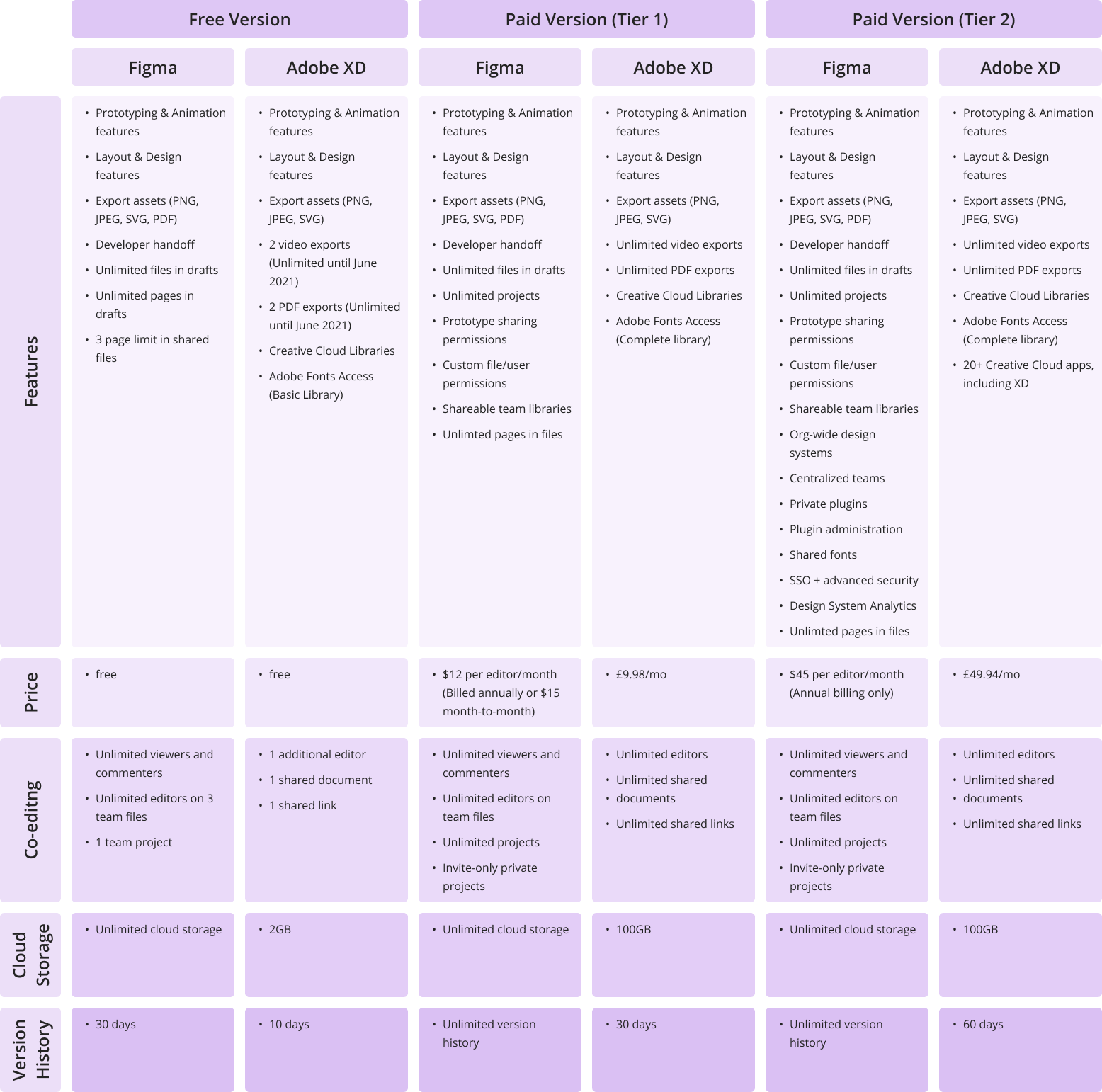
Both Figma and Adobe XD offer free and subscription-based pricing options. XD’s single-app plan for professionals and small teams costs £9.98 per month (without a trial) and is free for personal use. Figma’s pricing options break down as follows: free for personal use; $12 per editor/month on the Professional Plan; and $45 per editor/month on the Organization Plan (annual billing only).
It’s worth mentioning that Figma’s free version allows unlimited editors on 1 project and 3 team files, as well as a 30-day version history, unlimited cloud storage, and unlimited viewers. Adobe’s free starter plan only allows for collaboration on one shared document and one additional editor, limited cloud storage (2GB), and a 10-day version history.
Here a more detailed view on the price differences between the two:
Click to expand table
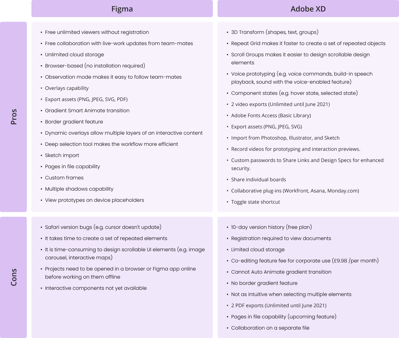
Features and functionality
Figma and Adobe XD are becoming more similar in terms of features and functionality. Each platform seems to adopt something new with every update. For example, Adobe XD has been working hard to achieve something similar to Figma’s game-changing collaboration features. On the other hand, Figma only recently introduced its Smart Animate feature, which is very similar to the Auto Animate feature that Adobe XD introduced some time ago and changed the prototyping experience completely. However, there are still some visible differences in workflow. Let’s discover them below:
Click to expand table
What are we using at Verve Search?
At Verve Search, we’ve chosen Figma over other prototyping design options.
Here are the five reasons we decided to go with Figma:
1. Figma is free
Team accounts are paid but individual accounts are free and include all the same key features as the paid version.
2. Simpler developer handoff
Our developers can get dimensions, styles, and download icons and images from the project URL. Resources such as images and SVGs can be exported globally and locally.
3. Easy collaboration
Co-designing alongside your co-workers is no longer a fantasy. Our team can now edit files together in real-time, leave comments with mentions, and follow along via Observation Mode. This has been particularly useful for remote working.
4. All-in-one platform
It’s an all-in-one platform that does not require switching from one system to another in order to complete or share the design process. Designing, prototyping, reviewing work, and sharing feedback are all in one place.
5. Design features
Tools like ‘deep selection’ provide more control over design elements and save time during editing. Other features that our team enjoy working with are instant arcs, overlays, gradient borders, smart animate gradient transitions, and much more. Figma helps our designers to expand their creative ideas and showcase their visions throughout the design process.
Final thoughts
Figma made the right choice to focus on collaborative work and the ability to access files from the browser without installation, while I find that XD’s strength is in finding new design processes, such as Scroll Groups, 3D Transform, and Repeat-Grid features.
Only time will tell which platform will gain more recognition among designers. So far, Figma and Adobe are doing well at listening to user feedback and transforming it into real features, bringing visual design onto another level.
Features and images presented in this article are extracted from the official websites of Figma and Adobe. Figures for both are correct as of May 2021.
Interested in our content marketing and digital PR services? Get in touch.
6 questions that turn numbers into newsworthy stories
Digital PR campaigns regularly build stories out of statistics, and the questions that we ask of numbers to arrive at those stories are quite consistent.
For this post, I will explore examples of news headlines, coverage for our campaigns and content from elsewhere that can be constructed from asking the following types of questions:
1. What are the highest and lowest values? 2. What’s the grand total? 3. How much or how little has something changed? 4. What’s the proportion? 5. What are the averages? 6. How many are there?
Data is as good as the questions you ask of it
Ideas for data-driven stories often start with asking: ‘what data can I find to answer my question or to create my intended headline?’.
But even once you or your team have sourced and cleaned the data you think you’ll need, you’re unlikely to find a dataset that is ready to outreach to a journalist without also examining all of the potential stories that lurk within it.
In a similar way to how a journalist asks different questions of their sources to gain different sides to a story, why wouldn’t you ‘interview’ the data that you’re working with to consider all of the ways in which you can tell your story?
Whatever your job title (asking questions of data isn’t reserved for data analysts), remembering to explore one dataset from different dimensions can be incredibly useful throughout the process of producing content and earning linked coverage — here are some of the ways in which it applies:
Ideation: the difference between producing a new idea for a campaign from one that already exists can sometimes involve calculating a similar dataset in a different way. The idea that you already have in mind may become even stronger by considering what further steps you need to take to apply a calculation that hasn’t been applied to it before.
Production: before committing to kicking off a campaign’s production, you should have some idea of the type of story that your research is going to produce. However, properly interrogating the data that you work with ensures that no important contextual layers of a story are being missed, and it may even reveal a stronger angle than what you originally set out to find.
Execution: uncovering new trends worth visualising helps to tell a more comprehensive data-driven story. Even if certain trends don’t go on to be your headline statistic, they can supplement your narrative for users of your content and for journalists who are going to write about your findings.
Outreach: applying different calculations to a dataset can diversify the number of angles you have to outreach — more angles generally means more potential for linking opportunities. At the very least, it will provide a journalist with more context around the story that you are telling them.
Not every team follows the exact same creative and outreach process, but the following examples will provide a useful framework for anyone stuck on what to do next in their quest to find stories within numbers.
1. What are the highest and lowest values?
It’s no secret that superlatives make great news stories. The maximum and minimum values in a dataset often translate as being the outliers, or the unusual, or the best and worst of something.
In 2020, two in every five headlines that had been published about Verve Search client campaigns contained one of the words: ‘most’, ‘best, ‘top’, or ‘highest’ — the majority of them referring to the highest rankings in one of our data-driven campaigns.
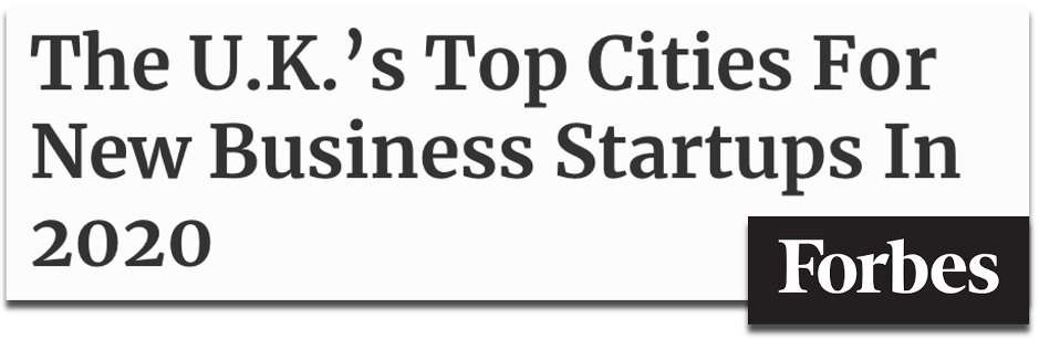
For example, when we analysed the details behind more than 6 million new business creations on Companies House, we were able to rank and reveal which UK cities and towns were enjoying the biggest boom in new start-ups in 2020.
Source: forbes.com (2020)
Ranking the highest and lowest values may often be the final step in a method of producing a story after asking other important questions of data. In the above case, we created a ranking-driven headline after our analysis also counted the number of new businesses registered on Companies House, and measured the year-on-year change in those figures.
These calculations also produced another headline figure by revealing the grand total of how many new businesses were created across every town and city in what was estimated to be a record-breaking year for UK startups forming. Summing together the key sections of data in your sample is another way to make a great headline…
Tip
Follow the links for how to find the highest and lowest values in a spreadsheet with Google Sheets, Excel or from sorting tables.
2. What’s the grand total?
How many times does a headline catch your eye with the size of the number it uses? One reason that the below headline from The Financial Times works is that behind the figure of 4,000 is a story about 4,000 humans who have lost their jobs from a single company during the COVID-19 pandemic.
Source: ft.com (2020)
The human element behind a totalvalue can help to sell it in as a headline figure, but an important consideration is whether its scale can be understood as a standalone number by the average person without needing further context. Although, sometimes, a large, eye-catching figure does do the job of providing a shocking headline before anymore context is given.
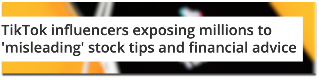
A campaign we produced called Influencer Investors analysed the scale of finance misinformation that was circulating among TikTok’s #stocktips from influencers with massive followings.
After mining through videos to calculate how frequently misleading content was appearing on the profiles of popular finance influencers, we also revealed the scale of the issue by summing together the total number of followers (28.4 million) and likes (3.6 million) that the misleading influencers and content had received.
Source: techradar.com (2021)
If you can uncover grandtotals to answer questions such as ‘how much something costs’ or ‘how many people were affected’, then you could be revealing a dataset’s most newsworthy statistic.
Even if this kind of figure doesn’t become your headline, it’s important to cite overall sample sizes as part of a transparent methodology. Add up all of the values and show off the scale of your analysis for whichever parts of your data make sense to. Journalists will usually mention this in their story along the lines of:
[Client name] analysed [sample size + metric] to discover [statistic]
Total values can become even more newsworthy when they represent a significant change…
Tip
Follow the links for how to calculate sums in spreadsheets through Google Sheets or Excel.
3. How much or how little has something changed?
Change is an essential part of storytelling. When important things change dramatically, or don’t change as expected, they often make the news. In the below investigation by the BBC, revealing howmany students sought mental health support was essential to the overall story, however, the headline focuses on that fact that more students were using mental health services than in previous years.
Source: bbc.co.uk (2019)
A campaign we produced called Priced-out Property revealed which locations in the UK and around the world have seen the greatest change in property affordability, based on the growing gap between earnings and property prices over recent years. Using change as our key measure meant we could consider every location with comparable historic data to produce a ranking of both positive and negative changes in affordability.
Source: hertfordshiremercury.co.uk (2021)
Another common way of converting change into a story is when a decreasing number is highlighted to indicate a ‘risk of extinction’ headline. This type of story often emerges from the Office For National Statistics’ Most Popular Baby Names dataset.
Source: flowercard.co.uk via mirror.co.uk (2020)
You may be working with data that isn’t longitudinal (i.e. doesn’t consider different time periods), such as cross-sectional survey results. That doesn’t necessarily mean you can’t suggest a change is taking place in the broader state of things.
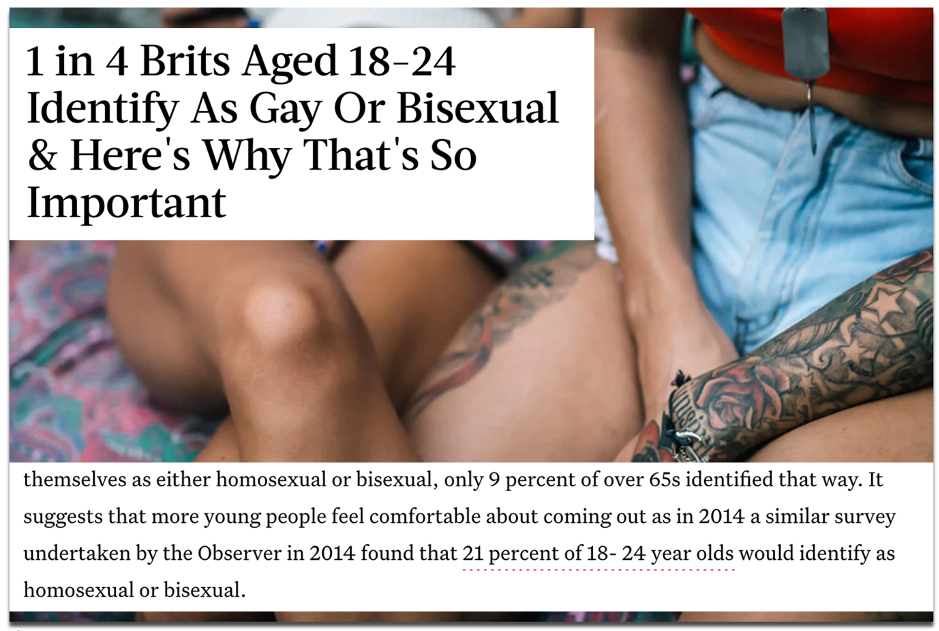
A survey-led campaign we produced called Between The Sheets asked Brits numerous questions related to their sexual activity, including what sexuality they identify as. Our insight revealed 24% of 18-24 year olds identified as either homosexual or bisexual.
Source: bustle.com (2018)
Although our data only accounted for one point in time, coverage by publications such as Bustle and The Mirror reported on this as an increase in young people identifying as gay or bisexual. They referenced a similar survey that was included in our outreach email from four years prior, which showed the figure was lower at 21%.
As well as calculating change, those headlines also incorporated proportion into their story…
Alongside other calculations, almost every campaign that I have referenced so far has included a proportional angle. Proportions tell you how large or small a number is in its relationship to a whole.
As neatly explained in an excerpt from Content hubble’s Ebook (2020), proportions provided a different perspective to the data in our Movie Mortalitycampaign, which revealed the actors who had been killed the most in their film roles:
“Without considering things proportionally, to some degree, the actor who dies the most will be a factor of who’s been in the most films. In another context, cities like London or New York will always over index for everything due to their financial power and population numbers.”
James Barnes, ‘Content hubble: 31 content campaigns that earned 11,882 links’
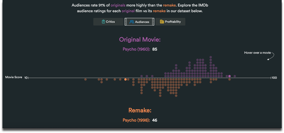
A campaign we created called Remake My Day analysed what the best and worst movie remakes were in history. This ranking of remakes according to critic and audience scores revealed little change in appetite for movie reboots, because they were consistently reviewed as worse than their original versions.
Source: Remake My Day (2019)
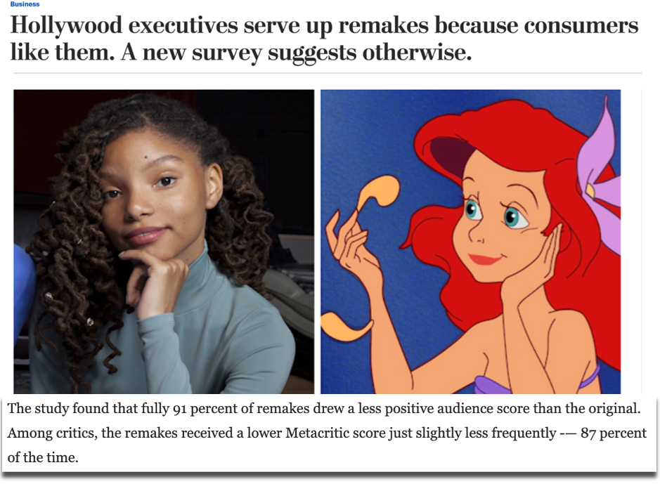
Based on the consistently negative reviews of remakes, we asked a broader question: what proportion of all remakes do audiences and critics actually prefer? Just 13% among critics and 9% among audiences was the answer. This angle – also indicated by the cluster of purple dots in our graph above – became the leading statistic that was covered in top tier publications, such as VICE and The Washington Post.
Source: washingtonpost.com (2019)
Our methodology for Remake My Day also relied on the movies in our dataset being pre-measured on a weighted average score, according to critic and audience reviews….
Tip
Follow the links for how to calculate percentages in spreadsheets through Google Sheets or Excel.
5. What are the averages?
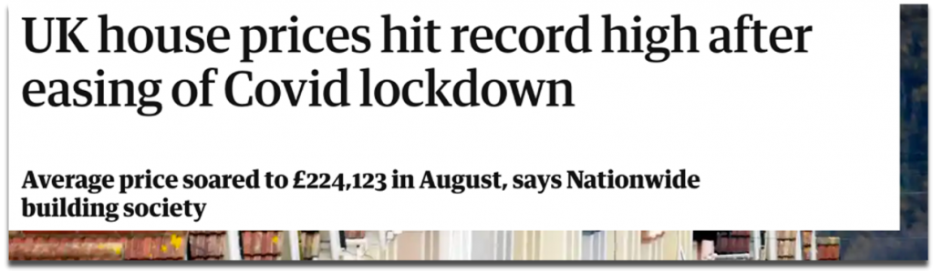
Average occurrences don’t always stop the press, but the average can be used as a benchmark to calculate who or what performs above or below it, or whether the average itself is wayward of what you would expect over a certain period of time. For example, when the average house price in the UK changes significantly, it hits the headlines.
Source: guardian.co.uk (2020)
Averages can also be useful for ranking large samples of different data points. A campaign of ours called Pioneering Women considered a sample of more than 6,900 female founders to rank universities on metrics such as how many female start-up founders had attended them and the average amount of funding raised by founders for the companies that they went on to launch.
Source: wustl.edu (2019)
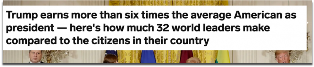
Average earnings are a particularly useful benchmark for comparing to society’s richest and (often) most talked about people. One of our most successful angles for a campaign called Pay Checkrevealed how much more world leaders earned compared to the citizens who paid their wages.
Source: businessinsider.com (2018)
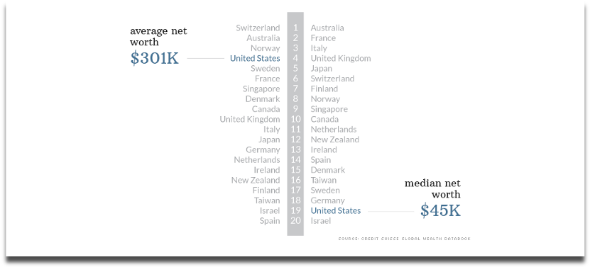
Remember to also read between averages, especially by looking at the mean and median values.
This analysis by CNN picked apart the assumption that the average American is one of the world’s wealthiest. In terms of mean net worth, which can be heavily skewed by a country’s super wealthy citizens, Americans were the fourth richest in the OECD (2014), but when you line up every individual’s net worth, the US median was actually one of the lowest.
Source: cnn.com (2014)
And such a vast gap between the mean and median values of a dataset may lead you to ask howmany super-wealthy people in the US there actually are.
Tip
Follow the links for how to calculate averages in spreadsheets through Google Sheets or Excel.
6. How many are there?
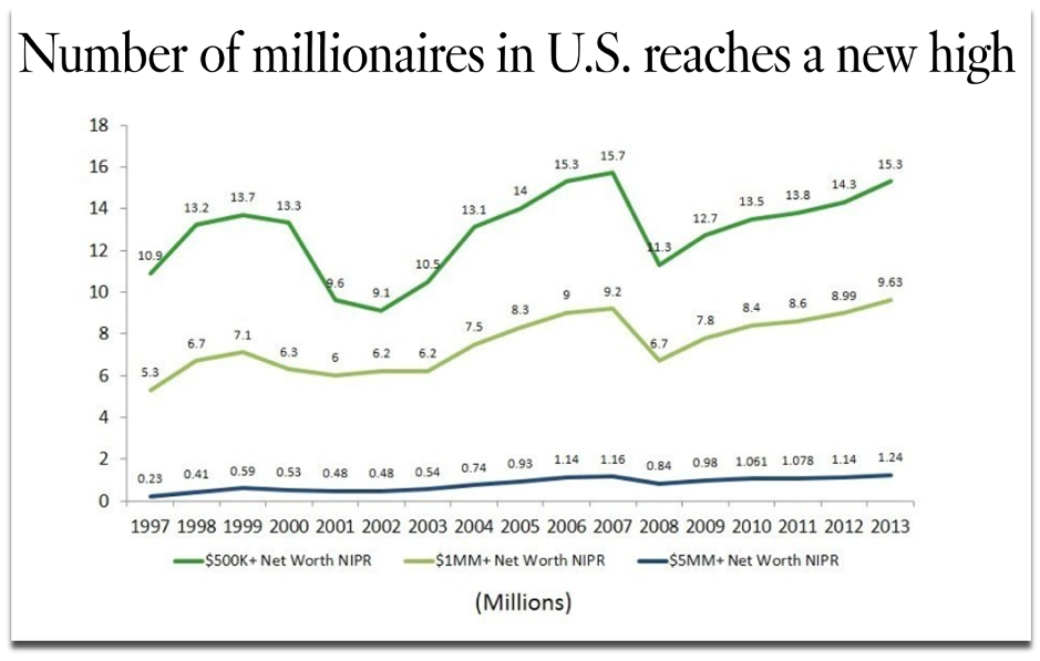
The same year that CNN published their analysis of the net worth of Americans, the LA Times took a different angle by counting how many households with a net worth of $1 million or more existed in the US, which turned out to be 9.6 million – a record number at the time. This is also a headline that highlights a significant change for the most recent time period.
Source: latimes.com (2014)
Counting how often a text or numerical value appears in a spreadsheet is often used to deliver a ‘best seller’, or, in the case of our campaign below, a ‘most borrowed’ type of angle. For a campaign called Well Read, we analysed three decades of lending data from UK libraries and counted which authors, novels and genres were borrowed the most.
Source: inews.co.uk (2018)
Unlike the data source we used above, you may be collecting information from multiple organisations, with the aim of comparing their data against each other. This means there could be missing data or inconsistent collection methods that can have implications, either as part of the story you’re trying to tell or in terms of whether the different datasets can be fairly compared at all.
By counting the data that was missing rather than what was present, VICE’s Broadly channel analysed and reported on 86 percent of universities failing to make any mention of stalking or abuse in their policy documents (2019).
One example of overcoming the nonuniform data collection methods that are typical of UK universities when responding to freedom of information requests came from an FOI-led survey by Uswitch. They counted UK University responses to uniform ‘yes’ or ‘no’ questions about their commitments to renewable energy to score them on a straightforward index.
Coming full-circle to the highest and lowest values again, many data-driven stories can be constructed by an index that considers multiple indicators to rank a group of data points.
Ranking locations within indexes is a common method for outreach campaigns, as it provides local journalists with stories that are targeted to their area, and because comparable towns, cities and countries tend to record all sorts of interesting data that can be spun into a story.
This is a creative approach to creating a headline out of many statistics where one statistic in isolation wouldn’t do the same. For example, there is no single metric that can determine what it means to be a hipster, but thisindex created by MoveHub compiled metrics such as the number of record shops, vintage boutiques, and vegan restaurants proportionally to the size of the local population to determine it was Brighton, UK.
Source: independent.co.uk (2018)
Indexes may be considered more comprehensive than trying to make the jump from one individual statistic to a headline, and indexes can sound impressive when a brand produces one about a topic within which they are considered an authority to name ‘the best’ or ‘worst’ or ‘capital’ of something.
However, indexes can also mask certain stories that exist behind individual metrics, which could have quite easily produced a headline on their own. We have previously analysed a similar metric to the one used in the above ‘Hipster Index’ to name the world’s most vegan-friendly capitals, based purely on the percentage of restaurants in a location that serve vegan food options. With a surprising result revealing Dublin, this is another example of the strength of one statistic built out of one question creating a strong headline.
Source: joe.ie (2019)
So be sure to consider how each data point or statistic that you’ve worked hard sourcing and analysing can produce its own outreach angle, even if it was originally intended to support an index’s methodology.
Recap
Keep an eye out for how often news stories are constructed by:
As part of your creative process, consider whether each of these methods can reveal more interesting angles about the next dataset you work with, or whether they can even form the crux of your next idea’s methodology.
There’s no guarantee that a dataset will contain a headline-worthy angle, and you may find that there is more data to source before you can build a story.
But when you do find yourself interrogating a particularly fruitful set of numbers from all of the dimensions we’ve discussed, then you could uncover numerous stories to tell as part of your content and outreach strategy, or at least be confident that you’ve found the most newsworthy statistic.
Further reading
A broader look at the process of turning data into a content marketing campaign: [1]
As well as your calculations, there are other ways to diversify your angles and ideas during the production and outreach stages of a campaign. This post discusses that process through considerations about topics and journalist sectors: [2]
3 useful resources for finding data and hunting for stories: [3] [4] [5]
Interested in our content marketing and digital PR services? Get in touch.
6 UI design principles you need to know
For a designer, it’s essential to have a clear understanding of UI principles. UI principles are high-level concepts that serve as guidance when designing a user interface, which is the point at which human-computer interaction occurs. The hierarchy in the UI design is fundamental in determining what the user will take away from their experience when using the interface.
The goal of a UI designer is to anticipate what a user might need to do by producing an interface that naturally encourages exploration and avoids confusion.
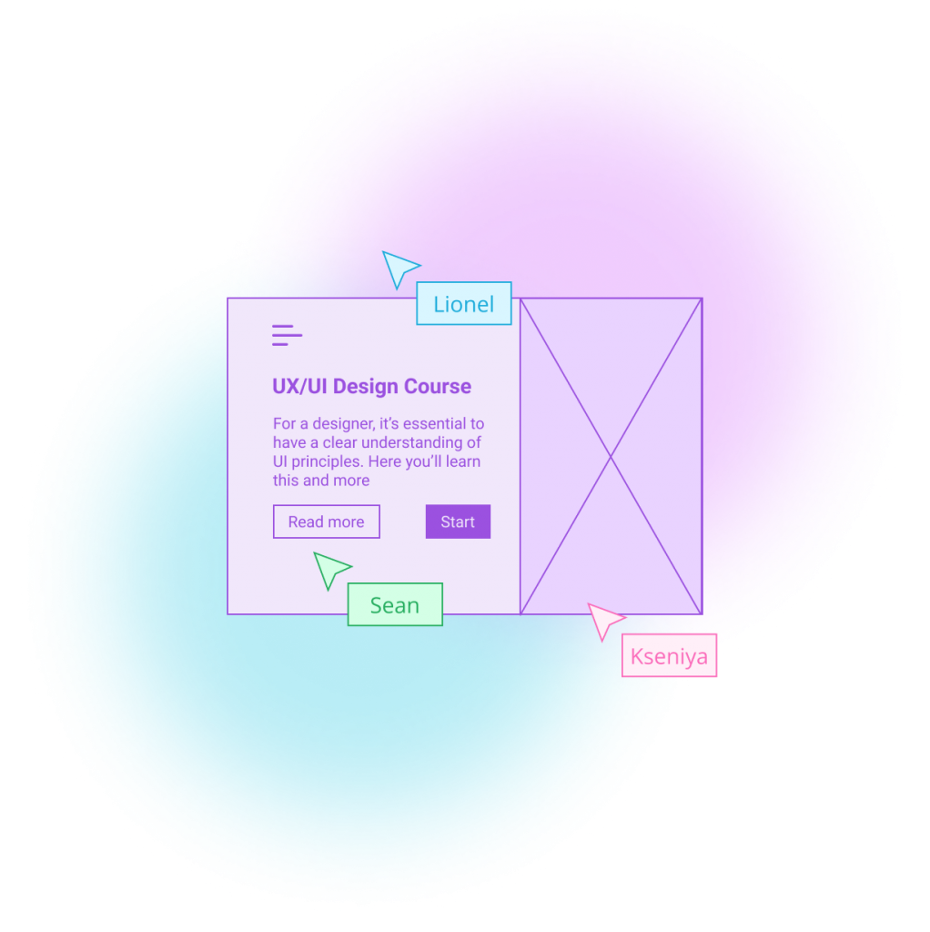
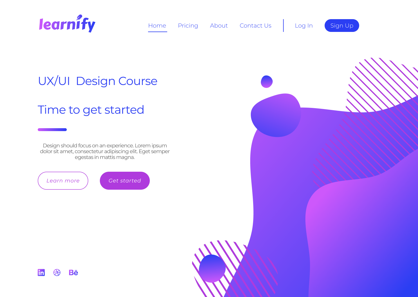
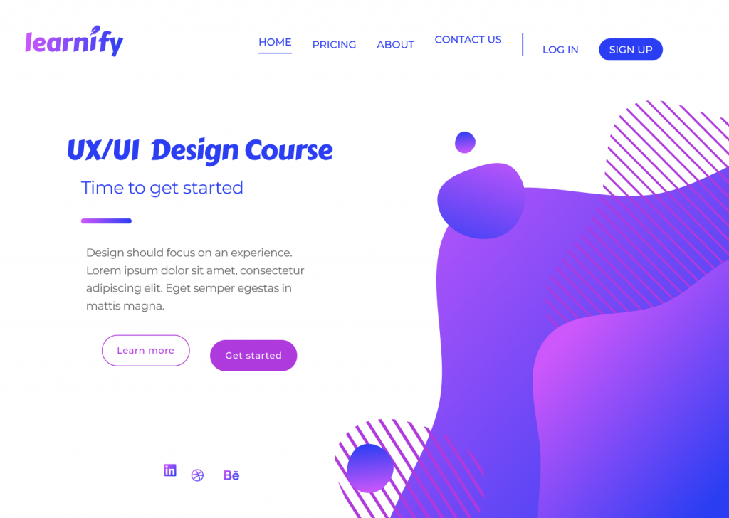
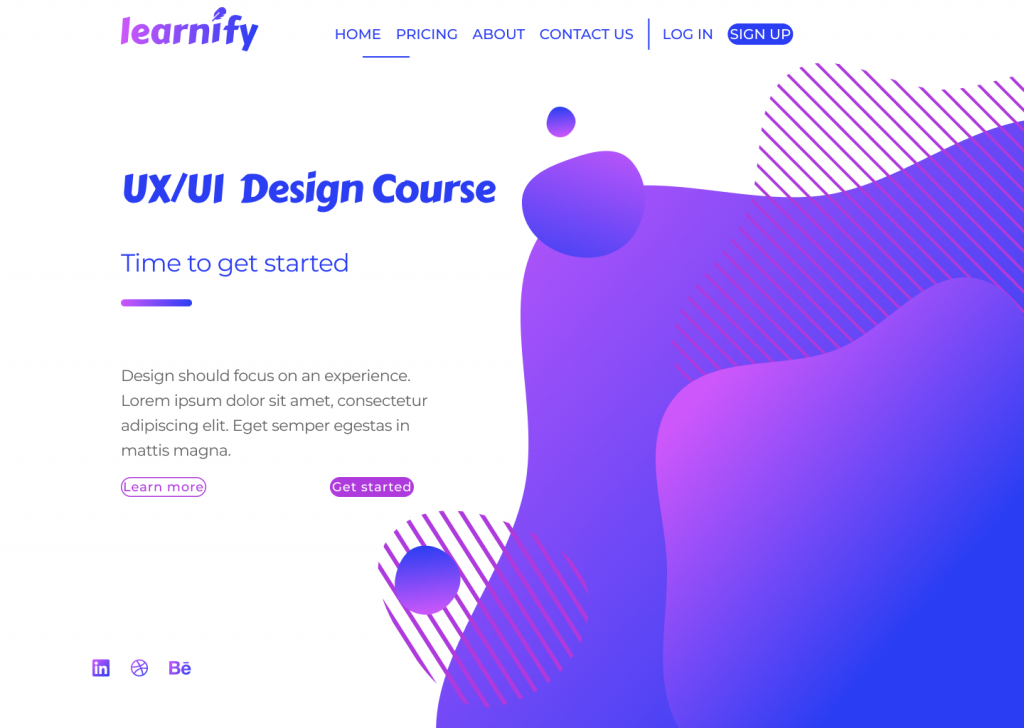
For this post, I’ve designed a simple landing page for a fictional learning platform. This landing page design – that in its current state follows all of the UI principles correctly – will be used as a point of reference to demonstrate six key design principles.
I’ve accompanied each section in this blog with a version of the above page that demonstrates how a bad design decision could affect the overall image and the usability of your design.
So, let’s get started…
Typography
Typography is one of the most important principles in user interface design. It’s the technique of arranging text to make it readable and visually appealing. The arrangement of the text includes selecting typefaces, font sizes, line lengths, line-spacing, and letter-spacing, and adjusting the space between pairs of letters.
Good design doesn’t need to feature lots of different typefaces. Unless the typography is a core design element, you simply don’t need to use lots of typefaces to convey a message.
More often than not, simplicity is key, and a strong design might only feature one or two typefaces. The typography principle is there to lead the reader’s eye to the right place at the right moment. It sets the tone of your page and helps to establish a visual hierarchy in your design.
For example, a larger font size and bolder font-weight have a higher chance of being seen by the user, but if we were to compare…
this lightweight text in a bigger font
with
this bolder text in a smaller font
…the chances are the first example would stand out more.
One way to improve a website’s readability is to increase leading (or line-height, in other words). This spacing between the two lines of text has a key impact on legibility; correct line-height helps the reader’s eyes travel from one line to another.
Although the standard leading is 120% the point size of the font, the leading can be set to automatic adjustment and can be modified according to the typeface needs. The body text in the example below illustrates poor use of leading.
The text is clustered which makes it difficult to read. Overall, this page does not give its viewers a sense of flow when reading the material from start to finish. The various alignments and improper use of fonts does not convey a story, nor does it urge users to take an action.
Tip
Select typeface for the headers only after you are confident with a typeface for the body text.
Scale
Scale in design refers to the sizing and the proportion of the elements on a page. Every element, whether a piece of text, a shape, or a line, has a weight.
The weight is created from the size, colour, or texture of an object. A symmetrical, well-balanced design is formed by aligning equally weighted elements on either side of the centre line. With the scale principle in mind, the designer needs to make sure that the page doesn’t look either overcrowded or empty.
One way to achieve this is with the use of padding and white space, or by simply adjusting the scale of an element. Scale can be used to direct viewers’ attention from the most to least important elements.
Objects of a bigger scale tend to attract viewers’ attention more, so the scale principle can be used as a way to rank design elements and influence the order in which users view them.
Below is an example of badly scaled design. The scale principle should help in guiding the users through their experience, but on the page below, the viewer can’t focus on any of the elements. The header is too big, the action buttons are too small, and the social media links (already highlighted enough with colour) are unnecessarily large.
Tip
It’s good practice to apply the golden ratio in your design. The golden ratio can be applied to spacing, composition, and layout; try using a golden ratio template. Plugins such as Font Scale can help establish a typography foundation.
Alignment
Alignment is the arrangement of elements in a straight line or correct relative order and is recognised as one of the core UI principles. Any two connected points are referred to as a line.
When executed correctly, alignment creates a hierarchy within a design and helps direct the user’s attention towards specific information. Arranged content is easier for the user to scan through which increases readability and the viewer’s engagement.
Alignment can be achieved with a clearly defined boundary or a division. A defined boundary can be perceived in a group of elements that share a common area. When the elements are close or proximate to each other they tend to be visually grouped.
In the example below, an excess of misaligned elements strips the viewer of a clear visual path. It’s now unclear where the viewer should start and finish navigating the page.
As the human eye naturally seeks perfection, an intentional misalignment of an object could sometimes be used as a way to attract a user’s attention. One way to do so could be by increasing the y-axis of a navigation bar link of a selected page as a way to highlight the user’s current location on a site.
Tip
Enable a predefined grid or customise one to make sure elements are aligned and visually organised.
White space
For a design to work, it needs to have an adequate amount of space between its objects. In our example below, the area around each object is white space, which also happens to be the negative space and another key UI principle.
Unlike positive space, which is the area of interest on a page, negative space is the background area around the subject of interest. The right amount of white space can simplify and break a design into chunks of information that are easier to comprehend.
A larger white space around the text helps improve readability. A design that has a very minimal use of white space could overwhelm the reader’s eye.
In the example above, it’s obvious that the design lacks white space, making it heavy on the eyes.
Here are a few reasons why this is happening. First, although the CTA buttons are emphasised with boxes, the text inside of them lacks padding and subsequently looks too big. The visuals on the right side of the page are too large and too close to the top navigation bar and the text on the left side of the page.
Elements on the left-hand side don’t have enough space to breathe and are overwhelmed by the size of the visual element. Header one and header two seem to be too far apart – despite them being part of the same group, they seem isolated from one another. The same issue can be seen with the CTA buttons, which once again are too far apart.
Tip
Button borders usually work well when the padding ratio is 1:3 for the top and bottom, and 3:3 for the right and left.
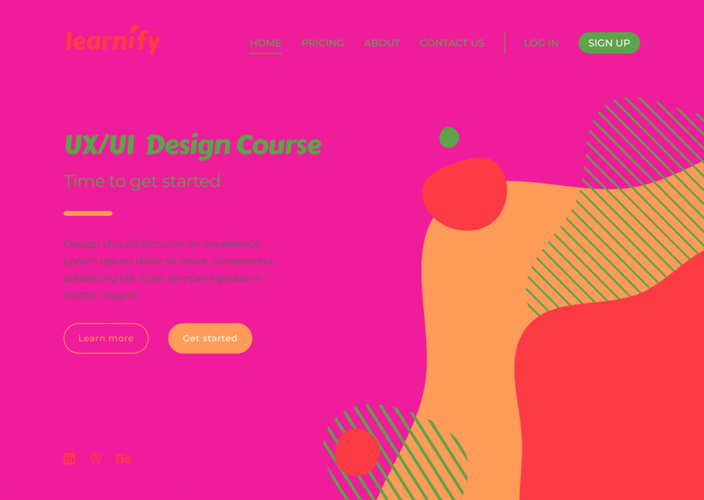
Colour
Users often perceive an aesthetically pleasing design as a more usable design, and they’re technically not wrong. More and more brutalist-inspired websites are receiving recognition among younger users. Their ruggedness and complete lack of usability is what makes them unique and memorable.
Sometimes the simplest, most intuitive, and most accessible user interface is not as popular as a modern design that has scarce consideration for usability. By and large though, if a website lacks aesthetics, it will most likely drive away visitors too.
Colour is another hugely important UI principle. Colour can establish the right tone, whether it acts as the main standalone component or is used as an oomph in other design elements. Colour can set boundaries, define shapes, and give emphasis to an area of a page.
In the example above, the colour selected for the design doesn’t reflect the brand nor enhances usability. The colour combination looks tacky and lacks contrast, creating difficulty when reading the page and identifying the navigation elements.
Tip
Apply the 60-30-10 rule. That’s 60% to the dominant colour, 30% to the secondary colour, and 10% to the accent colour. Consider using colour palette plugins, as these are predefined colour sets that can speed up the process of choosing the right colours for a design project.
Contrast
Contrast is the state of something being different from something else. For elements to contrast, there should be an evident difference between the two. Colour, scale, or a combination of both can be used to contrast two or more elements and create space.
RGB, hexadecimal, and HSL all have an impact on whether a colour will have enough contrast. The Web Content Accessibility Guidelines (WCAG) 2 – the international standard for designing for accessibility – is a good way you can learn more about the specifics. WCAG 2 expresses the brightness differences between colours in a form of a ratio, which ranges from 1:1 (e.g. white on white) to 21:1 (e.g. black on white). If we were to check the contrast of RGB values on white background, the ratios would look like this:
Red = 4:1
Green = 1.4:1
Blue = 8.6:1
(*the ration value will remain the same even if the text colour is reversed with background colour)
According to WCAG 2, the minimal requirement of the AA level of contrast ratio is 4.5:1, though this ratio requirement drops to 3:1 if a large-scale text is used. This requirement can be avoided altogether when referring to the contrast in decorative text and text in logos, as these do not affect the accessibility of an interface.
It is important to note that there are many colour hues and shades out there and the ratios cannot be rounded. If the colour contrast is 4.2:1, it automatically does not meet the minimal contrast requirement.
Below is an instance of how contrast should not be used:
The above design is an example of ineffective contrast use because the elements are difficult to read and identify. Lack of contrast strains the viewer’s eyes and can result in users experiencing frustration.
Tip
Using images as backgrounds can reduce text visibility. To make sure the text is adequately readable and meets WCAG 2 contrast requirements, use a coloured overlay on the image before placing the text on top.
Final thoughts
The different elements of a design should all work together as a team to tell a story and guide viewers through their user journey.
To all budding designers, I would strongly recommend familiarising yourself with UI principles before taking on a design project. The proper use of these principles will contribute to the flow and the outcome of your design, and significantly enhance the accessibility of the page.
Take a look at some of our previous campaigns to see how the design team at Verve Search have used design principles in their award-winning work.
Interested in our content marketing and digital PR services? Get in touch.
outREACH Online Conference: Q&A’s from Mark Johnstone
In the next part of series of speaker follow ups, we asked Mark Johnstone to answer the questions we were unable to cover at the outREACH Online Conference. If you were unable to make the conference, you’ll be pleased to know we recorded all of the sessions, including talks from Rand Fishkin, Shannon McGuirk and Lisa Myers. Take a look at them today!
Since leaving Distilled in 2016, Mark Johnstone has helped a plethora of teams and people create better content through his consultancy work. Now he has set up Content Hubble; a new site focussed entirely on generating and inspiring awesome content idea. Check out the website or twitter feed for more resources and information on training opportunities.
In the meantime, Mark has kindly taken the time to answer your questions…be ready to be inspired to create great content!
What did you learn from your biggest marketing mistake?
I have 2 answers to this. The first is that I’ve created checklists & frameworks to make sure I learn from the mistakes and remember not to make them again. I have checklists of criteria for ideas, QA checklists for production, and more.
The second one is there have been periods where I rested on my laurels. I thought I was good at what I did (which I was) and I stopped learning. In retrospect, this became a period of stagnation, and I’m disappointed that I succumbed to arrogance and wasted time when I could have been growing. One of my favourite lines from Mad Men is when Don says to Peggy “You’re good, get better.”
I hear a lot about brainstorming with, bouncing ideas off your team etc. What if you are a one man band like me?
It’s always valuable to find someone to soundboard ideas off of. Just saying them out loud to someone, you’ll notice which ones you’re not even convinced of yourself. And you’ll see how they respond. Do they look intrigued or do they look confused or indifferent. Don’t listen to what they say. Look at how they respond. I would try to find someone to chat to – your partner, a friend in the pub, a colleague in another team, an industry associate. I’m sure you can manage something. You can do it overtly or covertly, just dropping it into conversation and seeing how they respond.
I’d love to know how people stay on top of news, trends, campaigns etc. e.g. 30 min solo research, team scrums etc. Any recommendations or thoughts?
In the beginning, I set up RSS feeds and Twitter feeds and went through them every day for 30 minutes or so, first thing. It’s good for inspiration. I then save them in a swipe file, e.g. on Pinterest (I prefer a visual swipe file).
As a team, we also used to share anything anyone in the company found on a channel in Slack (not my favourite platform, but if it’s the one everyone’s using, it has the least barrier to entry). I would save anything I liked in there into my own personal swipe file.
As I’ve progressed, I don’t do it every day now, but I do sit down every month or two for half a day, or even more, and go back through the sites I like to see what I’ve missed. If you’re starting out, I’d recommend doing it regularly, i.e. daily. You can maybe switch to less regular once you’ve really absorbed a lot of reference points that spontaneously come to mind while you’re generating ideas.
I’m pretty new in the digital PR space and absolutely amazed with all the brilliant creative campaigns. How much time do you set a side from research and ideas phase to finalising a campaign like this?
There are really 2 parts to this. There’s the project duration (over how many weeks) and the hours you put into it. The campaigns, goals and budgets vary greatly, so it’s very difficult to answer specifically and succinctly.
In terms of duration, I like to set aside a minimum of 2 weeks for ideation, otherwise I find there’s a tendency to rush half-baked ideas through without allowing a cooling period to see if you still like them. For production, it really depends on the complexity of the data and the design, and whether there’s interactivity. It could be anywhere from 2 to 6 weeks, so it depends on what you’re creating. You could feasibly produce something simple in a week too.
In terms of hours, I like to encourage people to put more hours into ideation than they might be used to. I find it continually frustrating that people will happily allow days or even weeks worth of time and budget for design and development, but not for ideas. That’s simply because they can’t see the work that went into it. But if you don’t spend time getting a good idea, you could be wasting all that money on design and dev.
At the very, very least, I’d want half a day on ideation, but realistically, I like to take a couple of days just researching and generating ideas, and a couple more developing them. Spread out over a couple of weeks.
For data, it can vary from half a day to 2 weeks (or even more) depending on what you have to do to get the data (does it come in a nice table, or do you have to scrape it and tidy it up, etc).
If you’re starting out, try to allow at least a day for data and 2 days for design. I know plenty of people doing closer to half a day on data, half a day on copy and 1 day on design, but personally, I think 1 day on design is a little tight. Even 2 is short, but you can get something decent for 2 days. If you’re starting out and budgets are tight, avoid interactivity for now.
Loved all of these campaign examples: Working for an office supplies company, sometimes it is hard to come up with outside the box campaign ideas as it is related to a somewhat boring topic. What’s a good way to expand the idea brainstorming for “boring” topics like office supplies?
Here are 3 cool content campaigns off the top of my head for stationery companies – Emma the office worker, a paper dragon and the Staples speed reading test.
And it’s useful to notice that a lot of the examples that are shared widely in our industry are not for exciting sectors, e.g. there are quite a few for insurance companies and there are a few great recent examples for bingo. Bingo itself is fun, but it’s not a great topic for content creation.
The main thing to do here is shift your thinking away from the product. Now, it doesn’t have to go too far away from the product. But think more about what people do in offices. What challenges and frustrations do they have? What are they trying to achieve? You could tap into productivity, creativity, employee engagement, communication, anything that makes sense for what you do and what your customers care about in that context.
Think about what people use your product to do, what it does for them, as opposed to what it is. That’s what most advertising campaigns focus on. Dove don’t make campaigns about moisturising cream, they make campaigns about feeling beautiful in your own skin. Red Bull don’t make content about caffeine, they make campaigns about pushing life to the limits.
Stationery content doesn’t need to be about index cards. It could be about office life, productivity, business innovation, business communication, business presentations, whatever you decide. A bit of strategy work to set a clear direction could help here.
When you think of a creative campaign but then find yourself constricted by budget – would you scale down design first or do you think that’s the most important aspect?
There are two things we’re usually doing with content campaigns when you boil it right down. We’re either presenting new information or presenting information in new ways, or both, e.g. Profanity on Film presented new information. The Future Gamer presented information (that already existed) in a new way. So I’d figure out what your idea is bringing that’s new.
Then figure out what information is essential to gather and analyse, and how much time that needs.
Then think about the simplest way you can present the information. It could be as simple as a table, and there are plenty of examples of tables getting coverage. Or it could be a very simple chart. Whatever is the easiest way for people to ‘see’ the information and understand the point. Depending on the idea, you could potentially get something done for one day of research/data/analysis/copy and one day of design.
I’d do what you can to increase those budgets over time, or over-invest your own personal time if you believe in the idea and its success will open doors for you in the future. That’s kind of how I started out.
Also, when gathering a swipe file, find examples of content that could be done within your budget. And for more expensive pieces, ask yourself, how could this have been done more simply. There will often be an answer.
How do you manage the budget for such campaigns most efficiently?
Get very specific about the idea before you start. What data will it need? How will you get it? What needs to be done to it? How do you intend to design it? What interactivity will it likely contain? What’s the nearest thing that exists to this online already? Discuss it with your team and find out how long they think they’ll need (in days) for each part.
There is always a tension between project management & creative direction. Project managers want everything on time and budget, creative directors want the idea to be as good as it can be, and will discover challenges and opportunities along the way that they need/want to respond to.
Even if project management and creative direction is controlled by the same person, you’ll probably lean one way or another. I obviously lean towards creative direction. I suspect, by the question, I can guess which way you lean, although I may be wrong. There is value in both approaches, and a middle ground needs to be found.
But if you don’t have much success at creating content at the moment, be prepared to over-deliver on time on at least a few projects in order to start making them successful. That’s how I made my breakthrough, and I know others did similarly. That’s also how you get case studies that retain clients and attract more business.
There’s no point having a very efficiently delivered content project that doesn’t work.
Do you have a morning routine that helps sparking creativity?
Ha! No, I’m not much of a morning person whatsoever! Okay, a more serious answer! if I do have some creative work to do in the morning, I’ll do some research around it the night before, write down the different components of what I’m discovering on post-its, and play around with them. Look at them, brainstorm off of them, and think about the question that I want to answer the next day.
I get my desk (digital & physical) ready to start work straight away in the morning (with all the documents open that I need). I write the question down on my desk. And then, in the morning, I try to get to work as quickly as possible, without any other distraction and without opening anything else, even my phone.
I also like listening to music, and I dance about a little bit as I’m working. I like to have a pen and pad to hand, as somehow, at times, I find the physical act of writing seems to aid creativity more than typing on a computer.
The key is to stay free from distraction, focus for a good length of time, and loosen up. You’re just playing at this point in time. You are not committing to anything you write down, so get it all down, no matter how ridiculous or unlikely. You can filter through it all in a different session later. For now, lighten up….
Psst! did you know work is allowed to be fun?
Thanks again to Mark for his time during and after the conference. The next in our series of Q&A follow ups will come from the absolutely fabulous Shannon McGuirk, with more to come beyond that!
It might not feel like it, but coverage of coronavirus in the UK is reducing and has been reducing for over a month. With less than a quarter of all stories now being COVID focussed (down from a high of nearly 40%), journalists are desperate for positive, feel-good news. We took a look at what that means for outreach in exceptional times.
Our data
At the start of March, we heard from a lot of companies concerned that there was no room for brands in newspapers clamouring to cover the coronavirus. We were asked, frequently, whether it made sense to just stop outreaching entirely rather than trying to cut through the noise.
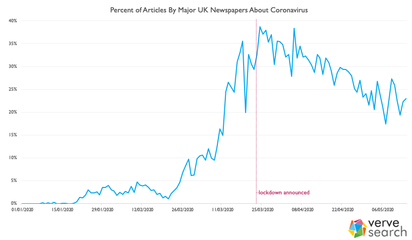
For the last 9 or so months, we’ve had a project underway where we’ve been scraping the major newspapers around the world. This data, now including over a million articles, provides us with unique insight into quite what’s being written about.
We decided to mine the data to see how many articles are being written about COVID. For this exercise, we defined an article as being about COVID if it mentioned ‘COVID’, ‘coronavirus’, ‘pandemic’, ‘furlough’, ‘quarantine’ or ‘lockdown’ in its title. This was to avoid including any articles that mentioned coronavirus but weren’t about coronavirus. We also limited this particular analysis to UK newspapers; I’m sure there’s a great piece of analysis to be done on how much coronavirus is being discussed in different countries, but that’s for another post.
What we found
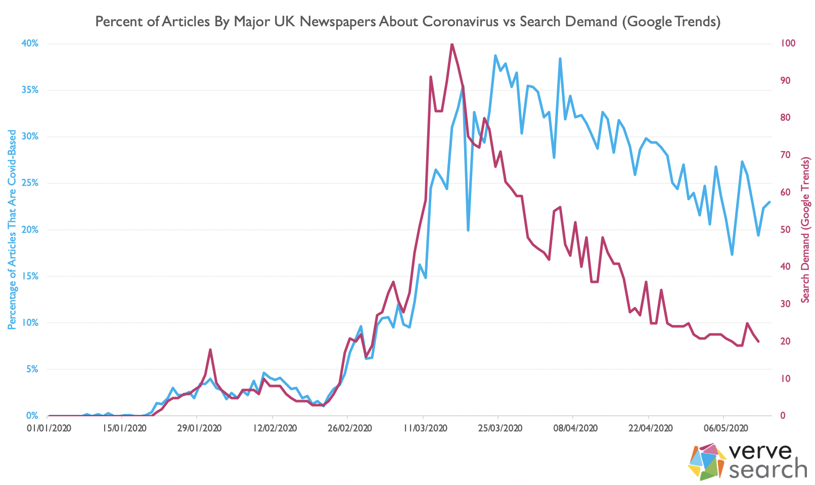
Coronavirus stories were a very small part of the media landscape early this year. It wasn’t until 25th February that COVID stories made up more than 5% of the news cycle. It would take 3 days for this figure to double and less than two weeks more for it to double again to just over 20%. Just after the lockdown was implemented, on the 24th March, coverage of coronavirus in the UK peaked, with 39% of all articles being COVID focussed. That has been dropping, relatively consistently, ever since. Last Thursday, as the nation prepared itself for a long weekend and VE day celebrations, coronavirus stories dipped to just 17%; the lowest it had been since early March.
Whilst 39% is undoubtedly a lot – thousands of articles each week on a single subject – it’s probably much less than you’d think if I’d asked you to guess. As you’ll have found out if you’re currently outreaching though, whilst coronavirus stole the frontpages and the headlines the newspaper industry has still been pushing out stories. Even at its highest, the majority of stories were not about coronavirus – and we’re now far from that peak.
Journalists’ stories follow public interest. This has never been more true than with coronavirus. If we look at UK Google trends data, we see both search volume and articles practically in lock-step with each other; articles following the previous couple of days search-demand:
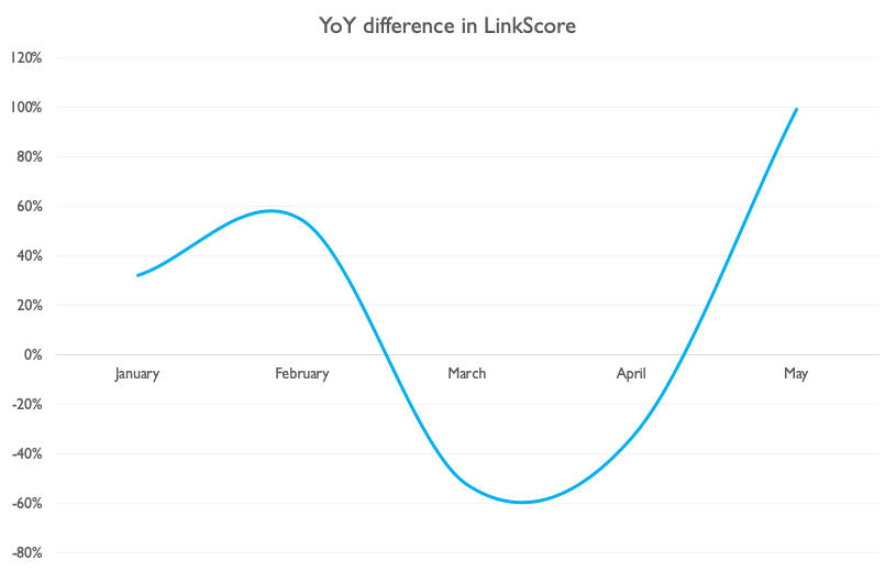
At Verve, we use LinkScore to value the links that we build in a way that’s consistent, objective and takes into account a whole plethora of key factors (relevance, site authority, no-follow status, whether it’s syndicated etc), which allows us to easily compare our outreach output year on year. When we did, we saw a picture that mirrors the above up until this last month:
Considering that, since February, we’ve had some clients on hold and some of the team is furloughed, May’s data represents more than a return to the previous form. Even with the reduction in coronavirus stories, there’s more going on. So, you might wonder, why are we seeing such results recently?
What’s Working?
1. Keeping a positive mental attitude
Lisa’s talked previously about how a lot of outreach success can be attributed to attitude and grit. Finding yourself unexpectedly working from home, with strict government measures imposed and every newspaper headline seemingly dedicated to coronavirus can knock your confidence. Here are a few ways to keep it high:
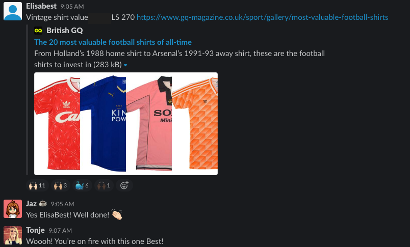
(a) Share your wins
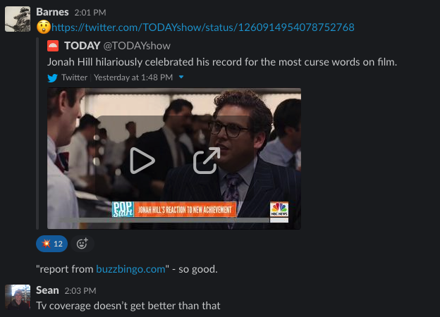
As a result, sharing wins (something we were already doing) became even more important. We have a Slack channel, we call Linkbell, dedicated to new links as they go live:
We also share, across a couple of other channels, TV, radio and print coverage:
(b) Realise there’s now less competition
According to ONS figures, 27% of the UK workforce has now been furloughed. If we assume that the figures as roughly equal for the PR and SEO sectors, this would have a substantial effect on the level of competition when emailing journalists…so we decided to look at two different metrics to estimate the effect of furloughing on these industries:
1. Back at the end of April, PR Week reported that 35% of PR firms reported having furlough around a quarter of their team, with a further 25% having furloughed some, but less than 25% of their team. If we assume an even distribution on that 25%, we can estimate that, in total, around 12% of the PR workforce in the UK is currently furloughed.
2. We investigated this by looking at the number of press releases that had been published on PRNewswire this year. Now, we know that news wires are decidedly old-hat, but that was as true in January as it is now, so any change in the last few months can be considered meaningful.
If we assume that the rate of press releases being published would have continued at the rate it was at in late February, press releases are down 21%.
Based on these two measures, journalists should currently be receiving 12%-21% fewer pitches; that’s less noise to cut through and that makes it ‘easier’ to achieve coverage.
Take the time to also Google the brand names of your competitors. It’s possible they chose to pause their link building and, if they did, know that each link you build is either extending your lead or working towards catching them up.
(c) Stay connected
One of the things a lot of us love about SEO is the community so, now, more than ever, it’s important to be a part of it. I find value in the BigSEO Slack group and can often be found lurking in the outREACH Community Slack. Meanwhile, there are virtual conferences galore; not least SMX Next and outREACH Online.
2. Positive news
Lots has been written on this, not least by Verve’s own Sean, but when the news turns bleak people seek out the uplifting and irreverent. That’s partly why we’ve seen stories about:
A pensioner pacing his garden – and raising £33 million in doing so.
Chance the Rapper handing out an award to a rapping teacher.
Those didn’t just sneak under the radar; journalists have been actively calling out for positive news:
OK Yorkshire, here’s my challenge. I want as much non-coronavirus-related news as I can find. PR teams, big opportunity here for you to showcase interesting and genuine activity with your clients. Our readers don’t just want to read Covid-19 stuff. Now is your chance to shine.
Looking for original travel feature ideas – not just UK-focused. Need inspiring, bucketlist, planning for future, retrospective and funny feature ideas. Have budget. Help! #journorequest
Hello #PR friends! We can’t write a whole paper about Coronavirus. We don’t want to. We need your non-CV themed stories more than ever. Fun stuff especially. Email in my bio! #journorequest
It’s no surprise to say that if you are in a position to talk authoritatively about coronavirus then there’s a lot of link opportunities. There are more subtle opportunities though. That’s because several industries just don’t have much going on because of social distancing. Film, sport and travel journalists, for example, have all had the big events that typically punctuate their calendars either cancelled or paired down. Whilst this also means that some campaigns, and headlines, just don’t make sense at the moment (e.g. cheap holiday deals in travel) a great headline could do better than ever.
There are also opportunities to craft content and campaigns around areas that people are searching for more of because of being stuck at home including:
Topic
YoY Change
Working from home
+614%
Online lessons
+378%
Virtual tour
+342%
Cocktail recipes
+321%
Pogo stick
+209%
Classic movies
+208%
Baking
+190%
Adoption
+138%
DIY
+87%
We’ve seen this in action with a few different movie-themed campaigns, but we’re also seeing gains on nostalgic content (as ‘classic movies’ implies). You can read about one of those campaigns here.
In Summary
Consumer behaviour is changing, and journalists are changing their coverage with it. With articles on coronavirus reducing every day and many companies yet to return their marketing teams from furlough, we’re now seeing over-sized returns from link building again. If you can put together a headline that touches people and creates discussion you’ll find high relevancy, high authority links follow.
outREACH Workshop Video 1 – Creativity & Collaboration
This is the first video in a three part series from our free outREACH workshop. This was a series of workshops teaching actionable tips and techniques that will enhance your creative content and link-building strategy.
In this first video, Lisa Myers, the CEO and Founder of Verve Search, goes through the concept and ideation process of creative campaigns.
Lisa also discusses collaboration, research and project management and how they are also crucial to a successful campaign. You’ll learn how the right people with the right attitude can change results.
The next video in this series will be released next week.
Join us for our next event. In June, we are hosting outREACH Online Conference which is a fantastic opportunity for you, or members of your team to hear from the best SEO’s, link-developers, content creators and marketers in the industry including marketing wizard Rand Fishkin, Shannon McGuirk (Aira), Carrie Rose (Rise at Seven), our very own Lisa Myers and many many more. We hope that you’ll be able to join us for this event.
If you have any questions about this content or outREACH Online please contact us at [email protected].
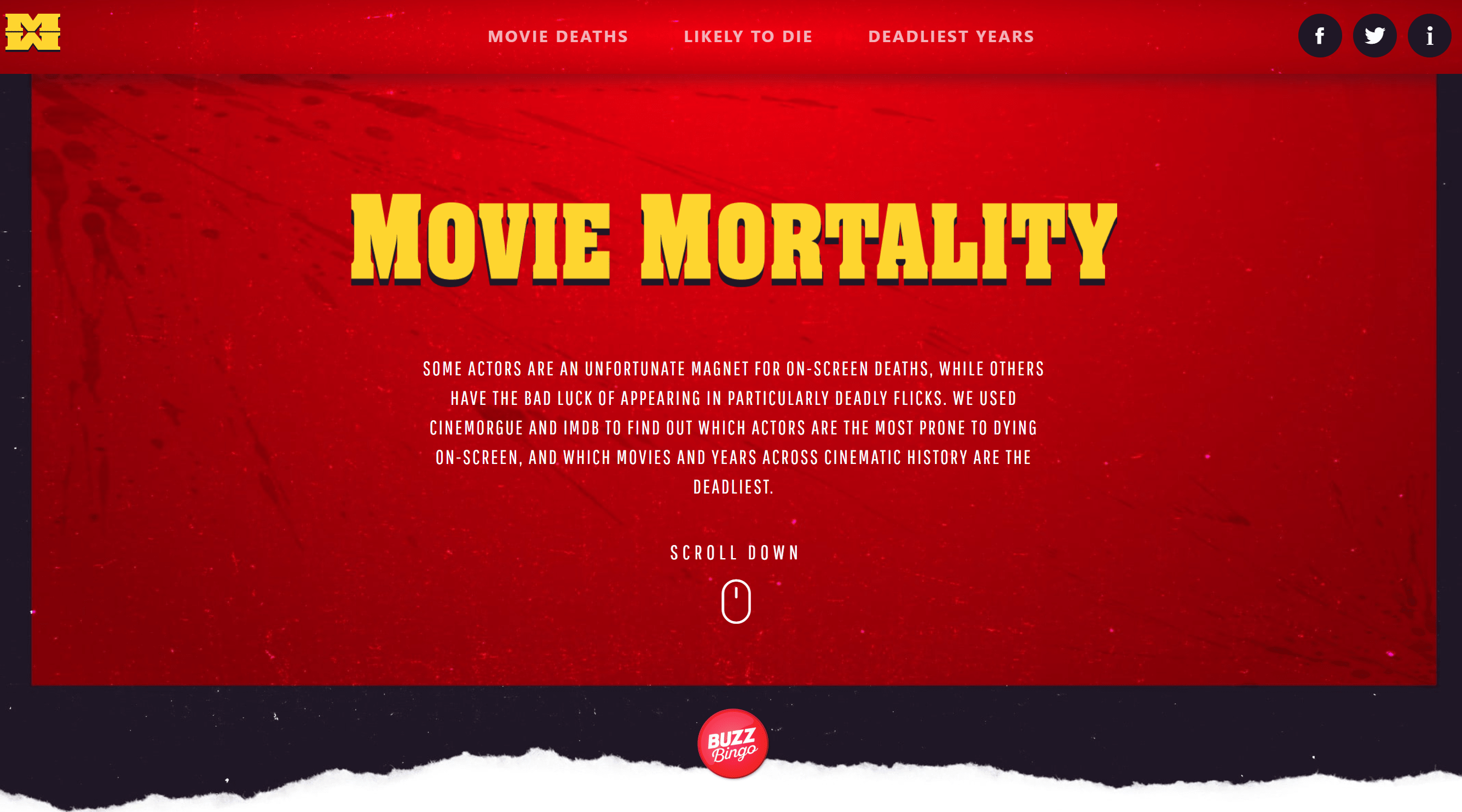
Campaign Spotlight – Movie Mortality
We may all be working from home because of the coronavirus outbreak, but our spirits at Verve Search are still high. We recently celebrated the success of our second consecutive viral campaign, weeks after the success of Insta Wealth. It was a tough act to follow, but Movie Mortality for Buzz Bingo managed over 200 links AND caught the attention of one of the campaign’s stars.
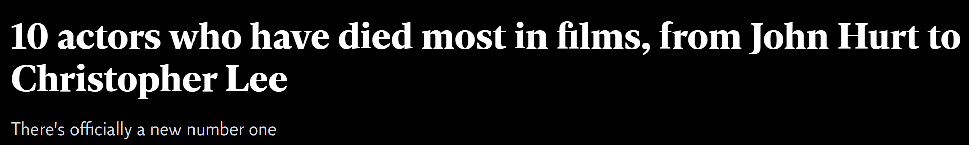
Some actors have a reputation for their frequent on-screen deaths. Sean Bean for example is renowned by his fan-base for being killed in many of his movies. However, we wanted to add to the debate by finding out which actors die the most in their movies, and which most likely to be killed in a movie role.
We have had success with movie campaigns in the past. Director’s Cut, On Location and Remake My Day all proved popular with journalists. We know that the topic has potential for lots of coverage if we have a strong methodology and eye-catching headlines.
Movie Mortality was created with a simple methodology that journalists can easily explain, and a database with all the answers. We started with a seed list of 1,500 of the world’s top actors, taken from the most popular actors on IMDb. The total count of their on-screen deaths was found using Cinemorgue, a fan-created database with over 7,000 movie fatalities.
We cross-referenced each actor’s deaths with their total filmography to determine the actors with the greatest likelihood of dying on-screen. To find out which years saw the most movie deaths, we found the top 50 highest-grossing films for every year between 1980 and 2018 using IMDb, and then each film on the list was searched on Cinemorgue to determine the death count.
The design of the splash page and the campaign’s look-and-feel were inspired by the iconic movie poster for ‘Pulp Fiction’. The style embodies the spirit of carnage that plagues the unfortunate actors featured in the campaign. We included a gender breakdown of movie deaths, a top 10 overall list, a top 10 ‘most likely to die’ list, and a chart featuring the deadliest years in film.
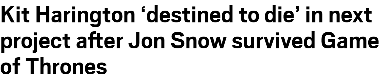
Our initial outreach focused on Kit Harrington’s 62.5% chance of death in films. The headline provided some interesting opportunities for coverage, especially as Harrington’s character Jon Snow was killed and resurrected in ‘Game of Thrones’. Metro were the first to link speculating on Harrington’s next film role in Marvel’s ‘The Eternals’.
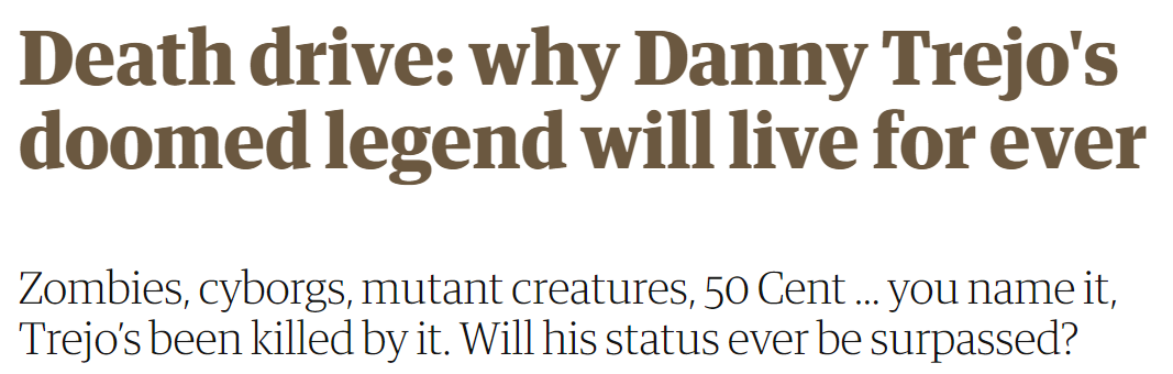
This angle alone would have made Movie Mortality a hit campaign. However, it became viral thanks to the mortality of Hollywood stalwart Danny Trejo, who was killed in 65 of his roles. Stuart Heritage of the Guardian, who initially covered the Kit Harrington angle, wrote up second article explaining why Trejo dies in so many movies, and how he beat out Christopher Lee as Hollywood’s most-killed actor.
Other sites, including the Independent, covered the story as a Top 10 list, but it still produced enticing headlines for readers.
Movie Mortality proved to be a hugely successful outreach campaign, with 211 links and a total of 10,581 Link Score (Verve’s own tool using a combination of metrics to measure the value of links). We got coverage from a range of top-tier sites including GQ, Fox News, Guardian, Lad Bible, MSN, Huffington Post, Observer, Daily Express, Metro and Yahoo.
In addition, the campaign findings were referenced in 159 pieces of additional unlinked coverage. The campaign has also been covered several times in print including features in the US edition of The Guardian (twice) as well as featuring in TV and Radio. Articles mentioning our campaign were shared 161,850 times from some relevant high-profile social media accounts, including Danny Trejo himself!
Following the success of a campaign like Insta Wealth was a challenge, but Movie Mortality proved to be a worthy successor thanks to an effective concept idea with a large database behind it, eye-catching headlines and a veteran actor who was more than happy to be named Hollywood’s most-killed actor.


 We also share, across a couple of other channels, TV, radio and print coverage: