Producing content built with AI shows that the help of artificial intelligence can open up plenty of new avenues for newsworthy storytelling.
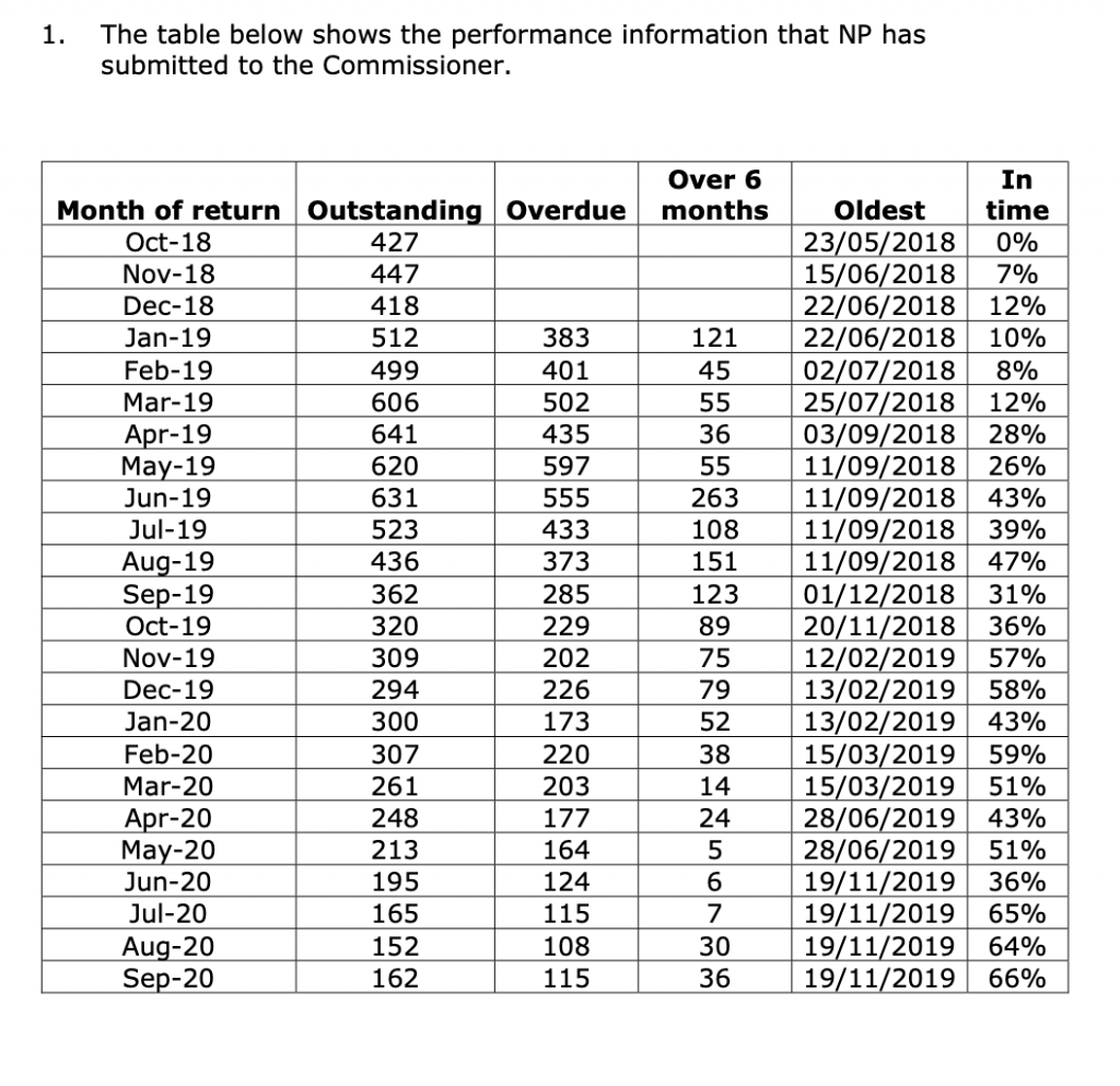
As we’ve seen over the last few years, AI can assist content creators with a number of methodologies, including facial recognition, image generation, voice recordings and even sarcastic chatbots.
With the rise of ChatGPT (if you haven’t used it yet, what have you been doing?), we could even go as far as to say that AI has scared some of us content creators into feeling like jobs are at risk.
Luckily for now, AI hasn’t completely taken over – just yet.
With a report stating that 3 in 4 marketers are using AI for content creation, AI content is certainly on the rise with blogs, publishers and brands seeking out these tools to boost their efficiency and output. Whilst the tools are handy, it can be difficult for consumers to sift out the AI from the authentic. This, however, isn’t necessarily a bad thing.
Looking at examples of content built with AI, there are a mass of marketing campaigns that have gone on to earn linked coverage from news publishers in various sectors.
This project is more about posing as artificial intelligence to roast a topic that many people care enough about to share: personal music taste.
Spotify’s marketing success from their ‘Wrapped’ feature has become an annual event on social media — earning over 1.2 million tweets in a single month, and leading to huge increases in downloads of the app (plus many many more brands trying to replicate it).
The Pudding’s subversion of what makes Spotify Wrapped so popular was a genius way to appeal to the cynical side of music fandom.
Their “faux AI” tool gives the impression that a sophisticated AI bot is judging your prized personal music taste in real time, before returning sharable results that are partially tailored to the user.
Since launching in late 2020, it has been picked up by more than 1,300 linking root domains.
More than 1 in 5 of the headlines mention AI or artificial intelligence, suggesting that the AI’s participation in the experience is a key selling point in the story, as well as helping to make the project possible in the first place.
AI image recognition technology has the potential to reveal insights on a scale that the human eye wouldn’t be able to achieve. Truth is, content built with AI doesn’t always have to be copy-based.
Using Microsoft Azure in a case study, we wanted to see whether the many selfies that exist of pet owners and their pets show a happier image than a standard image of someone without a pet.
By comparing an anonymous sample of tens of thousands of pet owner selfies to standard selfies of people, we could compare the average level of emotions displayed in either category of picture.
Combining this AI tool with geotagged image data allowed us to reveal insights related to pet owners on a more international scale.
In other cases, we were also able to use this same process to measure the happiness of the average Instagram #selfie taker and the average #newhomeowner stood outside their front door and flashing their keys.
This campaign by Neomam studios for HouseFresh also used the same tool to identify the presence and strength of smiles in order to rank the happiness of locations in the USA.
This research comes from a company that specialises in biometric authentication software with what is likely to be an attempt at downplaying some public fears over their technology.
While the statistics back up what they would hope to find — that AI isn’t fooled by spoof photos compared to the 30% of humans who do struggle to identify fakes — this story highlights an appetite that journalists have for exploring where humans and AI clash or collaborate in their capabilities around performing certain tasks.
Sentiment analysis tools can help us to draw insights around attitudes and emotions from large volumes of (usually) text-based data.
At Verve Search, one of our favourite use cases is to analyse the emotions behind different topics that are being talked about within various corners of social media.
In this example, we separated thousands of comments on US sports team’s official Facebook fan pages after wins and after losses to see which fan bases are more likely to remain supportive when the good times go bad and vice versa — also known as fair-weather fandom.
Initially, we would have loved to measure this on metrics such as fluctuating ticket sales or stadium attendances over a longer period of seasons.
But with that type of data mostly inaccessible and stadium attendance figures often debated for their accuracy, we found online fandom to be a good proxy with the help of SentiStrength, which could measure individual comments on a scale of positivity to negativity.
Other newsworthy examples of this type of analysis include when we found out which household chores cause the most stress or which elements of driving cause American motorists to complain the most.
This is a great example of content built with AI using machine learning to continue building on a subject of research from previous years.
An analysis of 3,000 English-language books by the USC Viterbi School of Engineering used NLP’s (Natural Language Processing) ability to detect the prevalence of pronouns, and thus how often men and women are represented in literature.
With this type of AI able to process vast quantities of text-based data and return such results, there is clear potential here for building on this method in other forms of media and entertainment where gender representation remains an issue.
Public speaking is usually a prerequisite of being one the most powerful people in business or politics.
So for this campaign we applied AI voice recognition software built on deep learning techniques to judge the emotional profile of famous leaders’ speaking styles.
Pulling together a large seed list of audio files from the public speeches of politicians and famous entrepreneurs, we could look at how certain emotions are more prevalent in certain individuals, political parties and genders of speaker.
Understanding what emotions are being portrayed within a person’s voice would normally have to be studied individually.
With AI-driven voice recognition, you can analyse large amounts of voiced audio files and retrieve results that are compared against the average emotional levels that the software is trained on. Or you can compare the relative emotional levels from your own dataset (in this case, the average leader) to see which voices rank highest and lowest vs those average scores.
As already noted, artificial intelligence is often talked about as something that clashes with humans — our judgement, our capabilities, or our jobs.
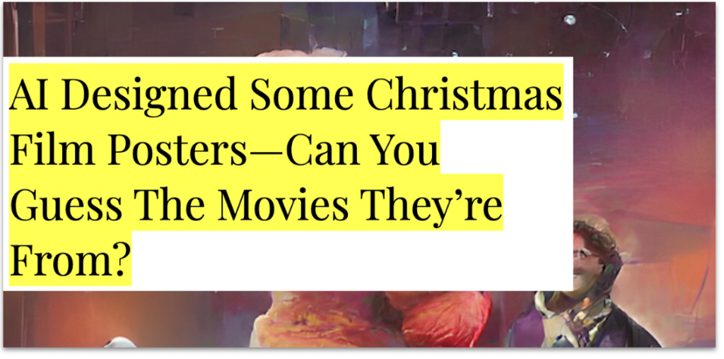
And although this content is built on AI-generated images, an essential aspect of its appeal requires the input of its audiences to guess what creation the AI tool has conjured up.
For this campaign that leant on a TikTok trend, each image is a famous scene from a Christmas movie that was mocked up in different styles by the app Wombo.
Thanks to this thread, where I found the campaign, you can also see content built with AI to help with other areas of the creative process:
Recently I've been playing around with AI image generation tools and I've realised there's SO many ways we can use them in digital PR
Below I've pulled together a list of 4 ways of how you can use AI image generation in your everyday 👇
There’s a Buzzfeed quiz for countless trends and topics. So, it’s not surprising to see that they also had a stab at the ‘audience vs AI guessing’ quiz format in July 2022, which you can try here.
AI image generation tools, such as DALL-E and Midjourney can capture our imagination in just a few words and visualise a detailed version of our thoughts much quicker than we would be capable of creating in the same format.
In this content example, the AI also had to capture the imagination of the journalist to whom the content was outreached to.
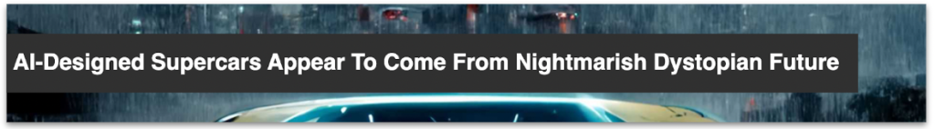
In our experience, motoring journalists who report on visual content are often an exception. They are used to dealing in data, reviews, previews, and shiny photography of even shinier vehicles.
Thanks to the creative angle used here by SEO Agency Screaming Frog, the supercars from a dystopian future is a fictional story that still managed to cut through to a sector that would normally be more concerned with stories related to cars that you can actually drive.
According to OpenAI, DALL-E is generating over 2 million images a day.
While the volume of AI-generated imagery already seems to be saturating the internet, the strategy of defining these image outputs to link them together under one newsworthy theme could still be in its infancy.
These examples of AI-generated imagery, also from the team at Screaming Frog, were fed by the names of countries and their travel slogans to see what Midjourney returned.
The posters are visually beautiful. However, when covering the story, the journalist seems particularly intrigued by what the AI — with no physical travel experience to rely on — chooses to prioritise in its interpretation of an entire country:
“Until you’ve seen a place for yourself, it’s a bit of an abstract idea, so why not ask Artificial Intelligence to generate your travel poster?… Like most travel posters, Midjourney has evoked a fairly sketchy sense of place, sometimes punctuated by notable landmarks or natural features.”
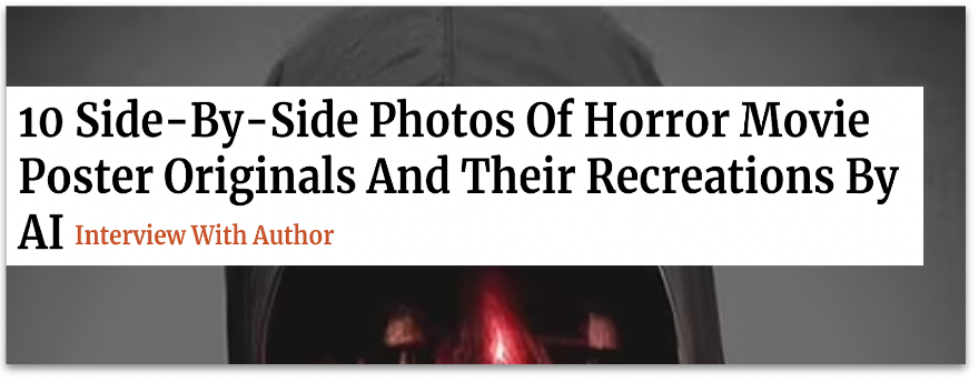
Many horror movies can be recognised by their iconic movie posters or from the faces of their terrifying villains.
The speed of AI image generation allows for trialling out different ideas for visual content. And any examples which appear to make the grade with some design touch-ups can also be targeted to a specific, short-term event in the calendar, such as Halloween.
This example by Digital PR Agency Evoluted took some of the most famous horror films of all time to see what even more terrifying versions of their posters could be reimagined by the AI app Wonder.
Check out this Twitter thread for a breakdown of the posters and more information on how they were created:
What if AI was behind our favourite Halloween classics? Using keywords from classic horror plots @vicki_collins and @laurarowleyx used AI to reimagine horror posters partnering with our design guru @willbarron to bring these to life in the style of the original posters 🧵
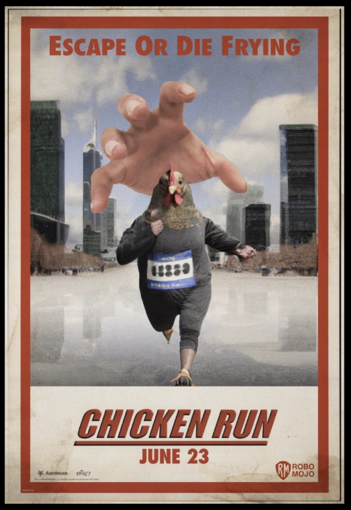
For more AI-generated movie poster goodness (and weirdness), take a look at this series of posters created by artist Vincenzi in his project ROBOMOJI.
Using a similar method as the Evoluted example, Apartment Therapy tells us that the artist inputted “a series of prompts and descriptions about a film’s visuals, titles, and premise into the AI software.”
As noted, the artist didn’t set out to earn linked coverage with his project. They are using it to ask important questions around what role AI will play in the art world going forward.
So, should we be creating content built with AI?
While artists and industries are rightly questioning what the adoption of these new technologies means for the future of creatives, some, like Manas Bhatia, are already acknowledging the part AI can play in quickly helping to visualise early concepts before an artist refines them with their expertise.
Back in 2022, we saw a campaign from Samsung earn widespread coverage after they enlisted the help of a digital designer to reinterpret famous artworks, according to the issues Gen-Z are most concerned about in 2022.
Relying on insights from a survey to inform the creative direction that an artist took provided a much more human and, therefore, newsworthy angle to this ‘reimagined’ content than what the artificial mind of a tool such as DALL-E would provide.
L.S. Lowry’s ‘Coming Home from the Mill’ (1928) reinterpreted by artist Quentin Devine (2022). Source: samsung.com/ The Art of the Problem (2022)
The extent to which you use AI and its different domains as part of your creative process will vary from one campaign to another. Some ideas will see content built with AI take the role of prototype designer, others will do much of the data processing to then allow your team to find the stories that matter within the data.
On the whole, it would be a mistake to think that the inclusion of AI alone will sell in a story to the press as newsworthy.
Without a defined creative concept to work with, these examples of AI are tools waiting to process whatever we feed them. As part of our role in creating newsworthy content out of AI, we should at the very least be setting the AI’s constraints, ensuring the inputs and outputs make sense, and closely monitoring what the overall direction is of the story that we’re trying to tell.
Further reading:
Deep Dive: AI Image Generator DALL-E Is Now Open To All — Why Should PRs and Marketers Care? by Rich Leigh [1]
The future of content creation with AI is closer than you might think by David Cohn [2]
The lawsuit that could rewrite the rules of AI copyright by James Vincent [3]
Messing around with AI and content concepts by Alex Cassidy [4]
Figma is evolving at an incredible rate. With a recent edition of FigJam and updates such as Cursor Chat and Audio, editors and viewers can collaborate even more effectively, saving time and resources.
One of the best things about Figma is the ease with which you can install all sorts of incredibly helpful plugins. If you’re new to Figma, it can be hard to know where to start – so here’s my guide to the best Figma plugins of 2021.
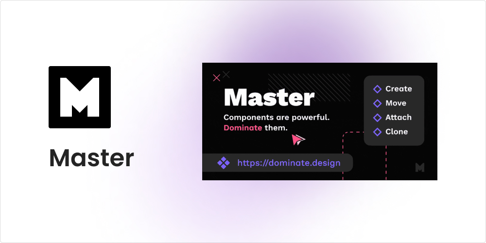
Master
Are you wanting to attach objects to an existing component or merge two main components? No problem. This plugin can help create, clone, and move components without losing overrides. While it might take some time to master this plugin, it’s absolutely worth it. Find out more about Master here.
Convertify Figma to Sketch/XD
In a previous blog, I touched on the differences between Figma and Adobe XD. For those designers that still have to toggle their design work between the two platforms, you might find the Convertify Figma to Sketch/XDplugin very useful. It easily converts and exports your design files from Figma to Sketch, Adobe XD, or After Effects with one click.
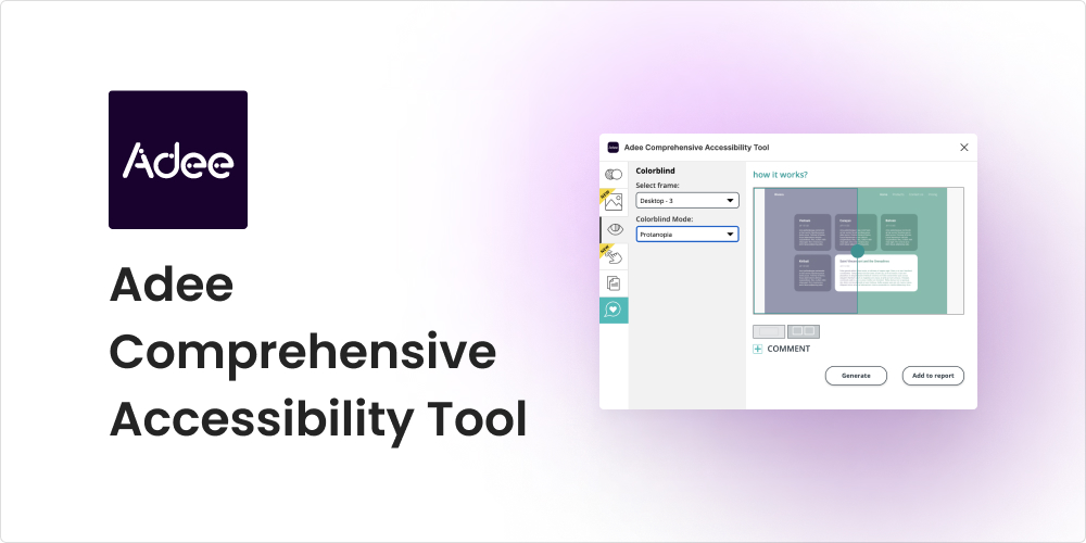
Adee Comprehensive Accessibility Tool
Adee is the plugin for you if you need to test your design out for accessibility. Adee is a powerful tool that offers a wide range of functionalities, including the game-changing colour-blind simulator. This feature lets designers select their design frames and preview them in eight colour blind modes within the Figma app.
Find / Focus
Alright, we’ve all been there – the larger the project, the harder it is to find that one layer. The Find / Focus plugin solves the difficulty of manually searching through endless layers in your document with its find, select, and zoom feature. Just type the layer name into the search window and refine your search with additional regex or case sensitive options.
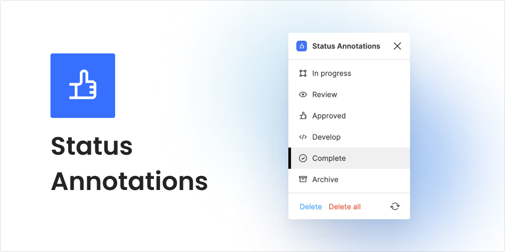
Status Annotations
For those who use Figma’sfree Starter Plan or like to keep all their design versions on one page, Status Annotationscould be a helpful plugin addition. Although the status labels are quite small, this plugin does the job. It indicates the status of the design process for any selected element – a collaboration feature we needed!
Font Scale
Fonts can be difficult at the best of times, especially for those who are just starting out in design. Font Scale helps designers achieve harmony and consistency in a typographical hierarchy. With several scale factor options to choose from, Font Scale generates font size previews.
Figma Chat
As previously mentioned, Cursor Chat does a great job as an instant messenger within Figma; it’s innovative and super helpful for collaboration work. However, if you are looking for something a bit more old school, theFigma Chatplugin is a great option.
This plugin lets you communicate with other people inside the Figma file. You can also select a frame or an element and attach it to your message so that the recipient can find that element quickly.
Final thoughts
As we’ve discussed in a previous blog post, the design team at Verve Search uses Figma because of the sense of community that the platform encourages with features that allow for enhanced collaboration between creatives. If you’re new to UX and UI design, check out our selected plugins to see how they can work for your workflow and improve the collaboration on your team.
Interested in our content marketing and digital PR services? Get in touch.
How FOI requests produce newsworthy content
A Freedom of Information request that is constructed out of uniform questions with measurable answers can build content that earns press coverage on a large scale, both geographically and across the various news topics it can cover.
The Freedom of Information Act enables any member of the public to uncover information that otherwise may not have been released to the public.
The law applies to more than 100,000 public bodies in the United Kingdom, meaning there are lots of stories out there to be told by using the law to access data.
In this post I’ll talk through various aspects of using the UK’s Freedom of Information Act as part of a content and outreach strategy that is built for earning links via press coverage, including:
What the FOI Act is
Where to find inspiration for stories
Tips on requesting the right information
Some pitfalls to avoid
1. What is the Freedom of Information Act?
Introduced in the UK in 2000, it is the right to know information about publicly owned organisations. The Act places two main responsibilities on those public authorities: a) to confirm whether they hold information, and b) to disclose that information to the person who asked for it.
Some bodies that you might expect to be covered by the Act are exempt. These include housing associations for the most part, security bodies such as MI5, and the royal family – so you won’t be able to find out how much of the taxpayer’s money the queen spends on her breakfast anytime soon.
Despite their public status, it’s also tricky to obtain anything especially useful from the BBC, as most of their interesting data seems to be protected internally “for the purposes of journalism, art or literature”.
Tip
The FOI Act also committed public authorities to regular publication schemes, meaning organisations now publish information much more proactively than they did before. This may not seem as valuable as asking for exclusive information yourself, but it’s surprising how much useful data these publications can already provide, without having to send a request. Take a look at the UK Police Force’s open data portal, for example, and you’ll already find crime data regularly published at a constabulary level.
2. Where to find inspiration for stories
If you send a quick general enquiry email to the first public organisation that you can think of, you might be disappointed to find that your request was rejected after waiting 20 working days for a response. Take a look at some of the below recommendations, which will provide inspiration for potential stories, and possibly be able to tell you if the information you seek is available at all.
WhatDoTheyKnow
Some organisations, such as the Office for National Statistics, will publish FOI requests that were made to them and responded to directly on their website. For those that don’t, WhatDoTheyKnow is the most useful way of accessing previous requests made to UK organisations.
Study examples that did and didn’t work by filtering your search by ‘successful’ or ‘unsuccessful’ requests. Doing so will potentially save you a lot of time with having to clarify your FOI request further down the line.
Another useful feature that was recently rolled out on this platform allows users to add any examples of their request being used in a news story as a citation. Look out for these citations, as they can help to inform your outreach strategy to a greater extent by seeing how certain FOI requests convert into news headlines.
WhatDoTheyKnow also allows you to make requests through their platform and includes a guide for beginners on how to request information. Requests can also be made through your own company email address or private email address.
Google News search: “Freedom of information”
When seeking inspiration for stories, sometimes a simple Google search can be just as useful as pouring through the specifics of WhatDoTheyKnow. Type in “freedom of information” and browse through the many ways in which UK and international journalists are utilising the law to produce public interest news stories.
Taking the time to read these articles from top to bottom will also show how many metrics journalists may report on for a particular type of story, as well as showing the kinds of spokespeople you can seek out within that sector to comment on your findings later on.
Doing this also presents the potential to scale up an interesting local story into something national that can be compared across different parts of the country. Did the Manchester Evening News publish their own FOI-led story about car parking fines? There’s a good chance that if it makes headlines in Manchester, a similar piece will make headlines elsewhere too.
The organisation’s website
If you have an organisation in mind, but you’re not sure whether they hold the information you want, take the time to browse through its website; specifically their services, publications and type of user data they retrieve. By the time you’ve read through these sections you will have a much better idea of what data you could ask for, and how this could convert into an idea for a story.
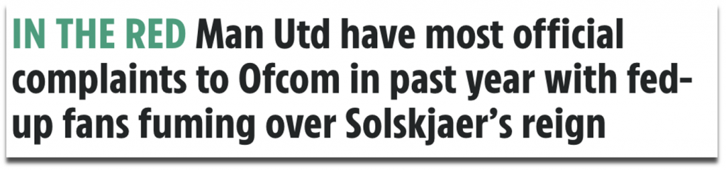
For example, OFCOM are one organisation covered by the Freedom of Information Act, and if you didn’t know what they do already, it doesn’t take long to see from their website that you can access data about public complaints related to TV, radio and other UK broadcasting services.
The BBC Shared Data Unit
The BBC Shared Data Unit is a nationwide partnership between the BBC and News Media Association that previously won ‘Editorial Innovation of the Year’ at The Drum Online Media Awards. It is dedicated to sharpening the data skills of journalists in local newsrooms around the UK and producing stories that work at scale for various regional and local titles.
Much of their data work is sourced from FOI requests, and, similar to how Digital PR campaigns aim to include angles that appeal to as many newspapers as possible, the Shared Data Unit is an excellent example of how to produce a story that resonates throughout the UK by picking out the angles from a larger dataset to make them work for local readerships. Here is one of my favourite examples of theirs:
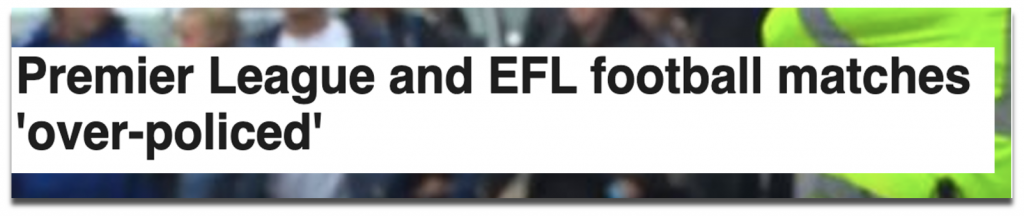
Source: bbc.co.uk (2018)
A story that found British football matches were being heavily over-policed at a significant financial cost to the taxpayer.
The journalists behind this story compared information that they requested of police constabularies around the country with match attendance data from Opta, allowing them to rank ‘number of fans per officer’. It went on to generate 18 unique pieces of coverage in different newspapers within six days — not bad, considering Digital PR isn’t their game!
Like all good data storytelling, the Shared Data Unit is transparent with its methodologies and data. I would recommend reading through these if you’re just starting out on a larger FOI project for the first time, to see how they go about their process, from research and data interpretation, right through to execution and coverage.
3. Tips on requesting information
Think like a: marketer investigative journalist curious citizen
Understanding what kind of information you can obtain doesn’t mean that you need to be an expert in coming up with ideas for data-led stories. Neither does it mean that you have to be wearing a Pulitzer Prize-winning cap in the hope of exposing the next great national scandal.
Some of the most effective FOI-led stories ask straightforward questions that the average citizen would be concerned with knowing and reading about, and which the person managing your request can easily interpret to collect data from their organisation.
Simplicity with this in mind is important. While it’s noble to try to expose a brand new category of information from a public organisation that hasn’t been released before, the time constraints of your campaign’s production may risk leading you to spend more time contesting complicated and unsuccessful requests with the Information Commissioner’s Officer (ICO) instead of gathering straightforward, consistent data.
If you’ve already committed to the sign-off and kick-off of your idea without sending any test requests, then general enquiries or ‘fishing’ for information that you’re unsure is held shouldn’t be making up the crux of your FOI request at this point.
Including a speculative question alongside a set of questions that you know will be answered would at least guarantee that the majority of your request will be fruitful.
Whereas tentatively fishing for unknown types of information and expecting completely useable answers can easily end in wasted time and resources on your side and on the organisation’s side. More on this further down in the ‘potential pitfalls’.
Scale it geographically
Typically, FOI-led stories about UK organisations are less likely to appeal to non-UK journalists or publications.
You must consider how many organisations need to be contacted in order to produce a comprehensive story, and whether the work you put in will even deliver a large enough pool of outreach prospects.
Tip
Taking your FOI requests global (i.e. contacting organisations outside of the UK) will add a new layer of complexity to your research, which I won’t cover in this post. For more information on how you can work with FOI laws in other countries, click here.
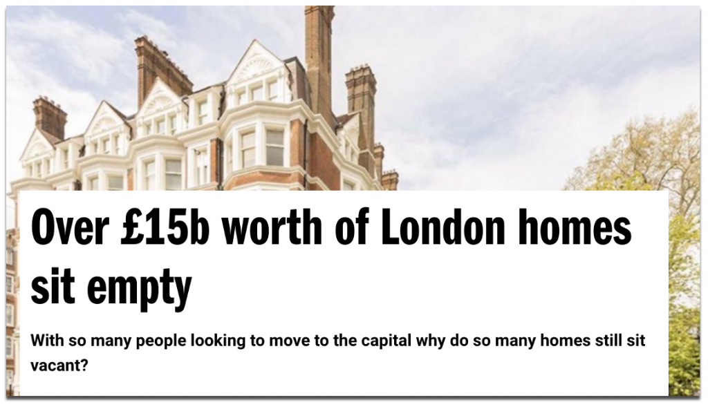
A campaign we produced for Admiral in 2019 and 2021 looked at the scale of the empty homes crisis in Britain, and provided us with perhaps the most granular list of UK-based outreach prospects that we could hope for.
Source: Timeout.com (2021)
The housing crisis, of which empty homes are a symptom, is engulfing the whole country. Therefore it was necessary to ask every British council for the same information in order to be able to compare the luxury districts of London and holiday home hotspots of Cornwall to other parts of Britain.
You don’t necessarily need to contact every council for every idea that considers information from them. This campaign produced by CompareMyMove looked at where in the UK registered the most noise complaints, and decided to focus on the most populated towns and cities. For an idea that ranked noise, focussing on places where a lot of people live made sense and didn’t necessarily require more rural (and typically quieter) districts to be considered.
You will find some organisations only have one central contact that stores all of its localised data, which means you would only need to ask for the same data once and specify that it should be broken down locally.
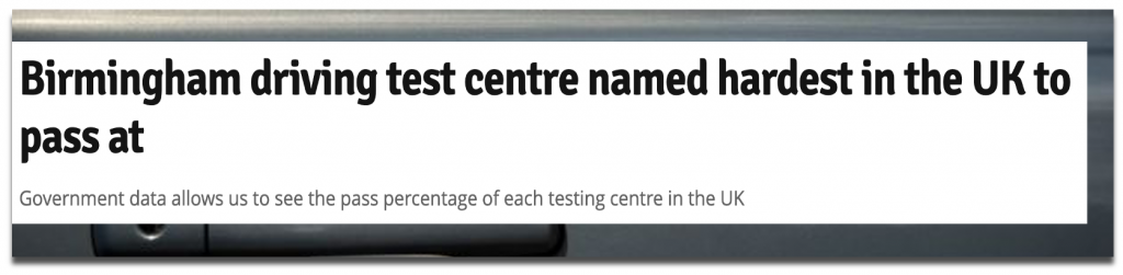
Some of the coverage from our Testing Times campaign for GoCompare leaned on an FOI response to our question on ‘multiple testers’ (i.e. those who need 5 or more attempts to pass), as well as open data from the Dept. for Transport and a survey that revealed demographic and geographic breakdowns of claims and convictions.
Source: birminghammail.co.uk (2019)
To reveal the hardest test centres for passing a driving test, the DVLA (Driver and Vehicle Licensing Agency) held this information centrally, meaning we obtained all of the local data we needed from a single FOI request.
Scale it with data points
A common method in campaigns built for link building and digital PR is to rank different metrics related to locations that are covered by news publishers. This presents the opportunity to outreach to those publishers and acknowledge that their locality ranks particularly high or low on certain measures.
While an FOI-led analysis that compares different locations on certain measures will still reveal the highest and lowest ranks in the same way, you can also build out a comprehensive story that works for all of the locations that you are including in your dataset by considering ‘the state of play’ in those areas.
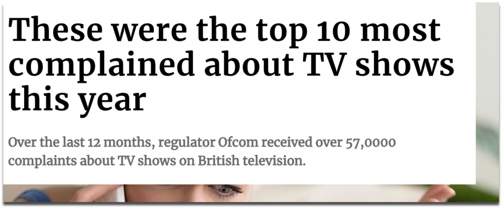
For example, the TV Tribulations campaign that we created for Buzz Bingo analysed complaints made to OFCOM and revealed which parts of the UK complain about television shows the most.
Source: scotsman.com (2019)
Even newspapers based in locations that didn’t rank highly on a national level were able to cover the campaign as we were able to provide data on their 10 most complained-about TV shows, plus how many complaints were made by that area over a given time period. It didn’t matter whether or not they were the highest ranking in the UK.
Source: manchestereveningnews.co.uk (2019)
And in terms of outreach prospects, the data points were able to be split in a way that appealed to different sectors as well as different regions. Digging into the raw data of our TV complaints allowed us to reveal ‘the most complained-about radio show’ as well as ‘the most complained-about sports teams’.
“And the most complained about radio show, according to the report, was James O'Brien on LBC, who sparked 223 complaints to Ofcom during lockdown.” Monstered by @piersmorgan. Must try harder.https://t.co/4OggtziWx5
Once you’re confident that your data is available, you can ask a number of related questions that will make for a more comprehensive dataset, and which may include outliers that wouldn’t have been discovered by only asking one broad question.
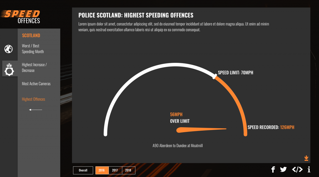
For example, depending on how sensitive the information is, you may be able to ask for more specific street-level figures rather than just a figure for an entire local authority, as we did in this GoCompare campaign called Speed Offences. This told us which roads record the most speeding offences per year (locally and nationally). Again, doing this creates an interesting story to be told for every locality, not just the outliers.
Other angles we built into this campaign included: the highest speeding offences recorded and the worst months for speeding, simply by asking for specific breakdowns.
Source: Speed Offences for Gocompare.co.uk
4. Potential pitfalls
Check for ambiguity
Accurate language is essential when crafting an FOI request.
If your request isn’t clear, it can be the difference between receiving the information you need in 40 working days rather than 20 days (after you’ve had to provide a clarification), or never.
If your request is misinterpreted and you receive the wrong kind of data, it may well be unusable and require a second request anyway.
Word the request exactly how you want the information to be delivered to you.
Describe how it should be measured, what period of time you would like it to be for, and how that time period should be split (daily, monthly, yearly?).
Oh, and specify the format. The last thing you need when compiling your responses are more than 400 councils replying with PDFs and Word Docs of data.
Consider the cost and limitations
This might seem slightly contradictory to what I mentioned about scaling up the number of angles you want to include, but you should consider the limitations of the FOI Act.
The cost limit of a request is £600 (equivalent to 24 hours of work) from a central government department, and £450 from local authorities (equivalent to 18 hours of work).
If your request is estimated by the organisation to exceed what is known as the “appropriate limit”, certain sections of the request will be refused. If your request consists of one or two questions that demand substantial work, the request may be refused outright.
If you know the data you are asking for is recorded by them, or better yet, you have done your research and seen evidence of it being published already, then the work involved in retrieving the data should fall within the cost limit.
Tip
There are more exemptions that apply to the Act, which you can read about here.
Plan ahead by sending a tester email
An FOI-led campaign can be quite a time commitment. Planning further ahead by sending an email to an organisation that asks if they have the information available is a useful step for if you want to uncover a more unique story that hasn’t been published before, but which you suspect is available from them.
Taking a longer term approach to this method of research will also give you an idea of how reliable certain organisations are in responding on time. Regardless of how much you do test in advance, a 100% response rate is unlikely to arrive within the 20-working day period that it’s supposed to.
The example below from the ICO shows that between October 2018 and September 2020, Northamptonshire Police only managed to answer a maximum of 66% of their requests on time in a single calendar month. Response success rates vary among all organisations, and you can expect them to vary from month to month within each organisation.
Source: ico.org.uk
Sending tester emails further ahead would also help for you to gauge whether the information you seek is consistently measured by similar organisations. An email to a handful of universities, for example, should tell you if they record certain data on their students in the same way, before you embark on a full investigation.
Be proactive in monitoring your responses
You’re probably blessed with more research time than the average online journalist, who is busy producing upwards of eight or more articles per day. This means that your FOI-led story could be something they wouldn’t have had the capacity to produce themselves.
Equally, you’re almost certainly not blessed with as much time and autonomy as an investigative journalist, who can press the ICO for months until they receive their satisfactory response, and it’s important to remember this during the process.
Say you’ve embarked on a round-robin FOI request, and contacted all 130 UK Universities in the UK. There’s a reasonably high chance that at least a handful of them will misinterpret your request, seek clarification, or respond beyond the 20-working day timeframe — in this case, you’d be relying on at least 130 different people to get back to you with the same information in the same format.
In the interests of deadlines, sometimes you have to cut your losses on the information that didn’t arrive. At the same time, you need to closely monitor the story that is accumulating in front of you, and decide whether there is a story there at all.
Generally speaking, a two-thirds rule of responses with consistent data would be adequate for producing an analysis of UK Universities, with clarification of how many didn’t respond, but it really does depend on what you’re comparing and what the sample size of organisations is. The data that is missing could well be more valuable in constructing a story than the data that you did receive.
Seek comments and anticipate a PR response
By its very definition, the data that you’re dealing with is authoritative and within the public interest, so don’t be surprised when organisations and public figures acknowledge it and often respond to it when it concerns them. Below is one notable example…
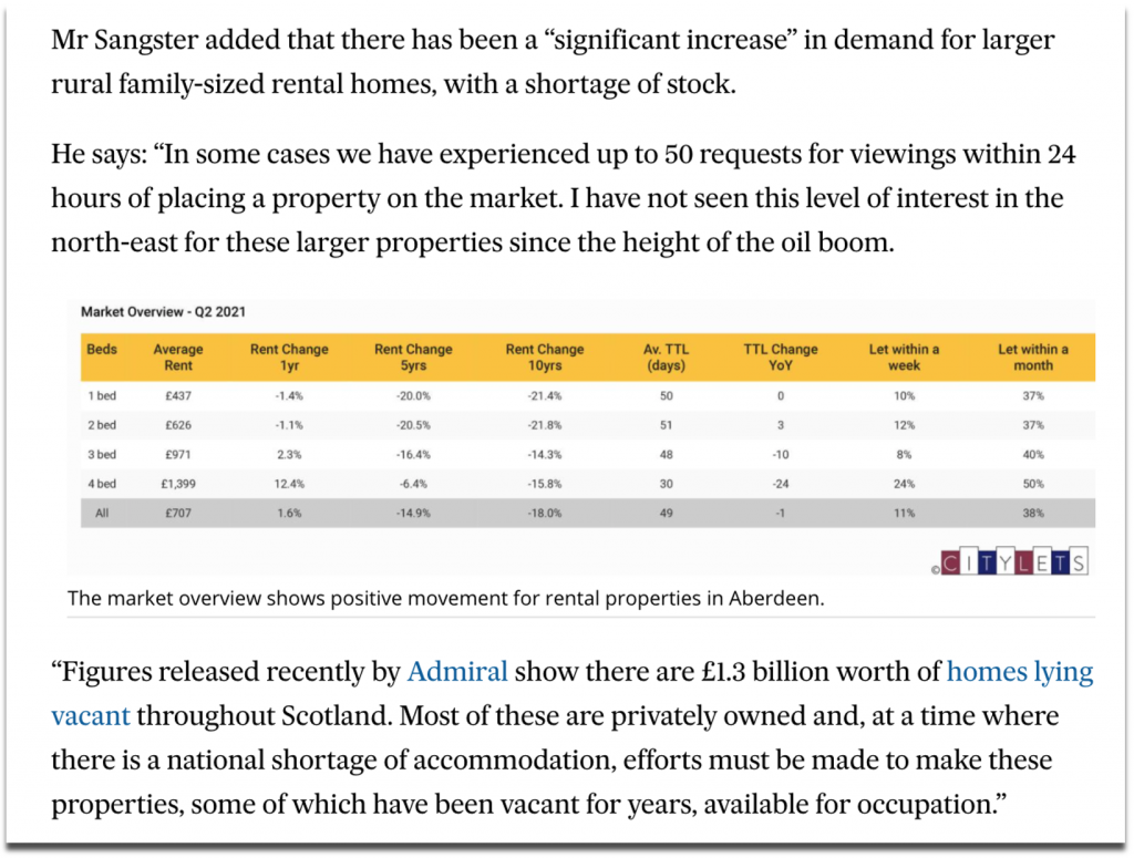
But responses are often concerned with more serious topics of public interest, such as when our empty homes valuation was quoted by a local property agent when commenting on Aberdeen’s local housing issues.
Source: pressandjournal.co.uk (2021)
Since releasing FOI-led stories and following the news coverage they receive, we’ve dealt with phone calls from a number of press offices, including NHS Trusts, councils and cultural institutions, all of whom have wanted to find out more about the data they originally sent to us.
If the main headlines that emerge from your data can be attributed to an individual or a small number of organisations, then it’s worth reaching out to them to comment. Even though a journalist will typically contact the public organisations to comment before publishing their story, doing this yourself adds valuable context and commentary to your research.
Why is your brand doing this?
This is a question that should be asked of any potential idea that is going to be published and outreached for your clients.
In the case of FOI requests, as soon as you produce content that is built on information from public bodies and take those stories to the press, the brand you’re outreaching for is influencing the reputation of other people and organisations.
Some topics may seem relevant enough to approach from a storytelling perspective in order to earn coverage for a client, but public data is sensitive and often gets politicised.
The client that you work with should be made aware of potential backlashes to an FOI-led story before an idea is deemed appropriate for them.
Interested in our content marketing and digital PR services? Get in touch.
5 of my favourite data viz talks from Outlier 2021
I was given the opportunity to attend the inaugural Outlier 2021 conference hosted by the Data Visualization Society. It featured 41 inspirational talks given by people who work across different industries, each with unique and varying levels of experience in their data visualisation specialisms.
There were so many talks to choose from, but I’ve narrowed down five that will help to reframe how you think about the process of creating impactful data visuals.
1. How do we translate cultural experiences into data stories?
The talented team at Kontinentalist create engaging data stories that unpack cultural experiences to gain a better understanding of cultural trends.
In their talk, I learnt the following tips to create a compelling data story that translates other cultures:
Find an angle that is proudly niche
If you are translating your own cultural experience, do it with pride and communicate it with an urgency that suggests if you don’t tell your story about your experiences then other people won’t be able to either.
Explore a particular angle of interest in-depth, rather than being too wide-ranging in exploring a number of angles at surface level.
This can be something as simple as introducing one lesser-known artefact or phenomenon from your culture and communicating it in a way that educates and informs a wider audience from outside of your culture.
Unpack diversity within your angles to explain how certain phenomena are experienced within that culture.
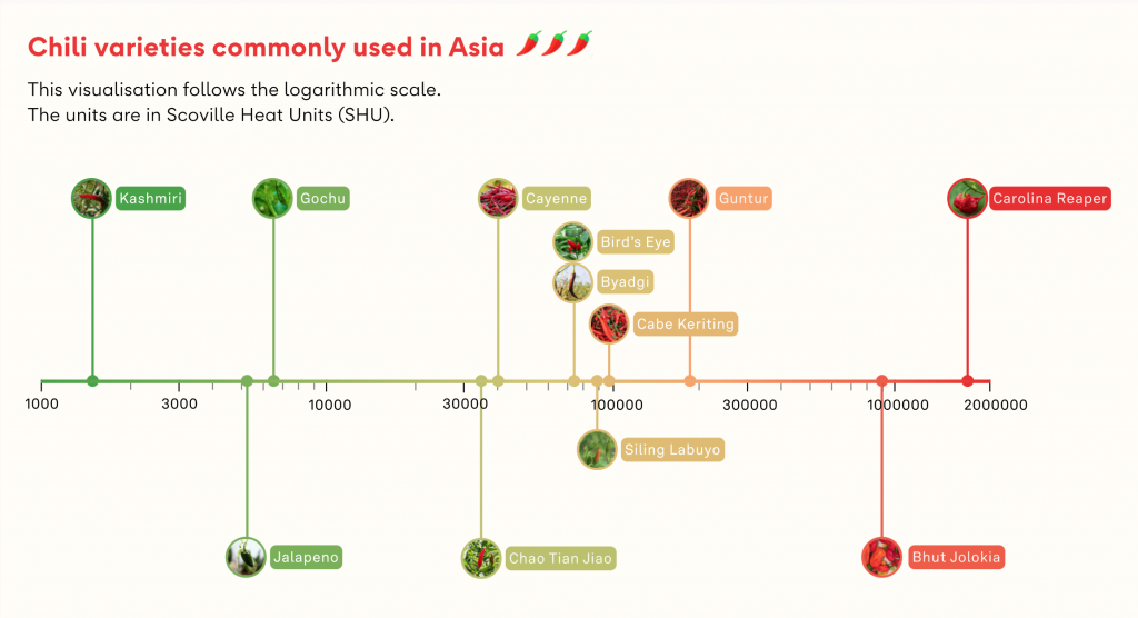
This can mean helping your audience to understand the ways in which cultural phenomena interact with the lives of different groups in that culture (e.g. What’s the big deal about chilli in Asia?).
In this example, chillis provided an excellent window for exploring Asian cuisines and the influence that chillis have upon many dishes.
The author began his analysis by asking ‘was spicy food popular in Asia?’. But the yes-no nature of the question provided added complications to finding a definitive answer to something not comprehensively documented, so he refined his analysis to explore ‘what ways spiciness – in particular, chillis – were experienced in Asia’, which was more open-ended and allowed for unpacking the answers in a less binary fashion.
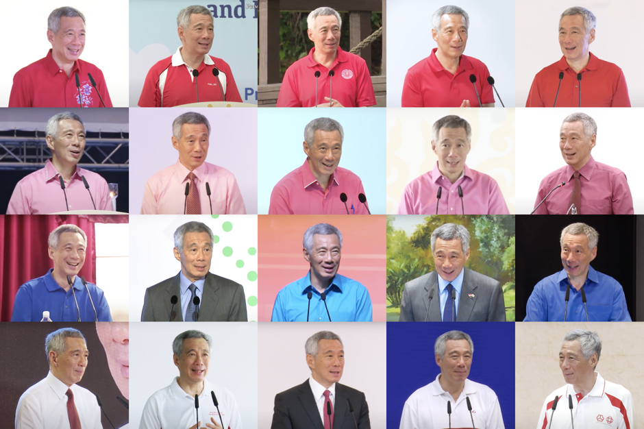
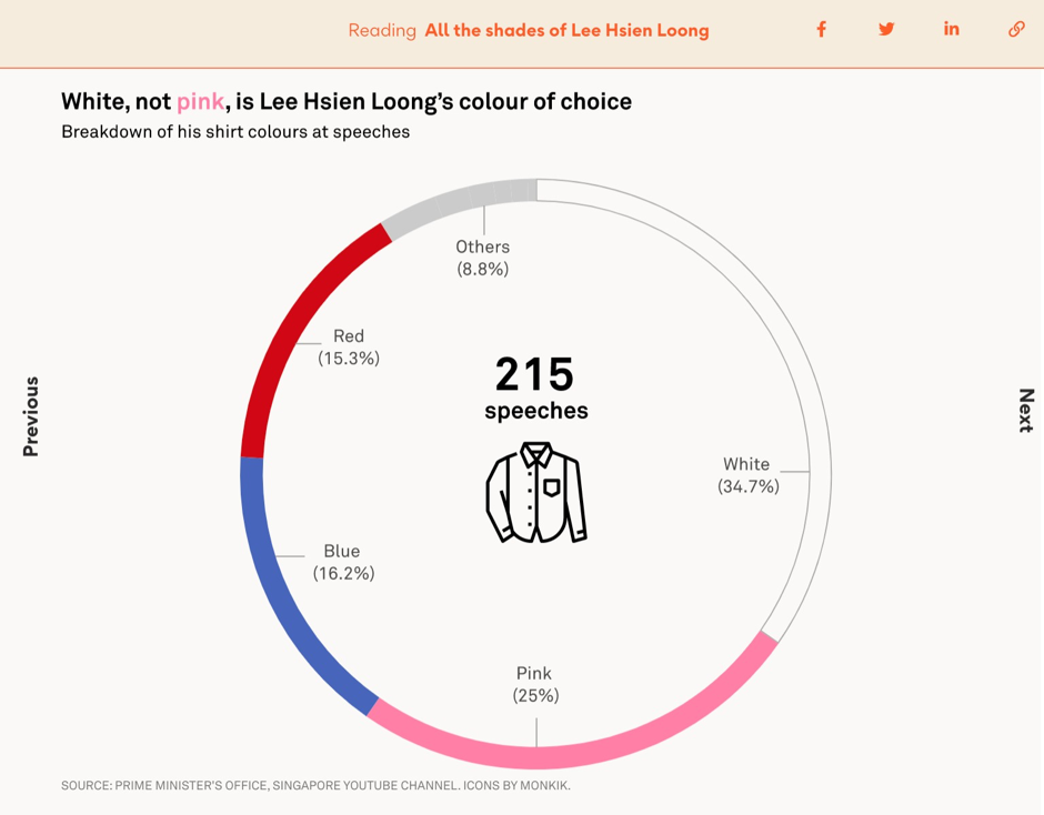
It’s a common myth that the Singaporean prime minister Lee Hsien Loong mostly wears pink shirts. After collecting data on all the shirt colours he’d worn during PM speeches it was revealed that his most commonly worn colour was actually white.
Some cultural phenomena might have a concept that is quantifiable (e.g. the popularity of different noodle brands).
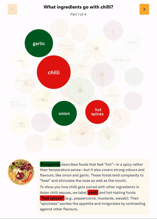
But even if there isn’t an obvious quantifiable metric, you can translate the qualitative stuff by providing a rich visual experience via maps, audio or illustrations to convey the theme, atmosphere and cultural significance of your story’s topic.
In the below example, colours were used to convey the different dimensions of flavour used in Asian cuisine. Additionally a packed circle chart was used to visualise common ingredients in chilli dishes with chords connecting circled ingredients that go well together.
Balance accuracy and understanding to ensure that the data is well presented and easy to understand.
The above visualisation of ‘ingredients that go with chilli’ is actually a condensed version of more than 100 different bubbles that had to be indexed on a scale of between 1 to 9 flavours (such as ‘sweet and sour’).
While this is a less accurate representation of the very distinct flavours that exist within these many ingredient combinations, the authors felt this struck the right balance between beauty and simplicity. They were able to provide more detail through the illustrations and text boxes that more curious readers could explore.
Tip
Providing a clear and transparent methodology and documenting every step of the process behind how you arrived at your visualisations will help balance accuracy with understanding for your audience even more.
Find a common ground
It can be easy to over-explain when trying to tell a story about one culture to an audience outside of that culture.
Here, they recommend anchoring the angle of the cultural experience that you’re trying to analyse to a more universal sentiment.
In the talk, they used an example of relating the cultural tradition of new year fortune telling to people’s universal anxiety about the future and our well wishes for loved ones, or of the popularity of instant noodles in Asia to every culture’s respective love for certain comfort foods.
2. 3D Geo DataViz: From Insight to Data-Art
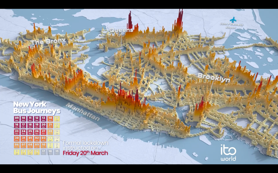
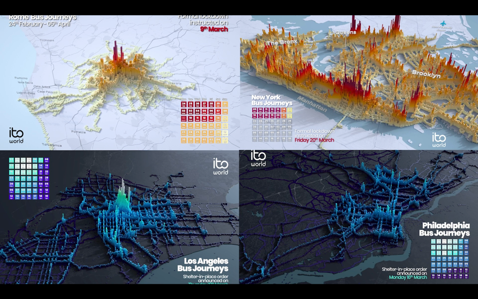
Hosted by Craig Taylor (Senior Data Visualisation Design Manager, Ito World)
Craig and his team at Ito World create narrative-driven and cinematic-looking 3D visualisations.
Craig’s talk focused on how he and his team create insight-driven visualisations that reveal how the systems we interact with impact our lives. In his talk, he explained that producing this type of visualisation requires that you:
Include granular data, since it yields more interesting results. For example, for Ito World’s project Transit In Motion, the dataset for New York City included 14.8 million locations recorded per day, 4,488 unique bus trips, and 2GB of CSV files.
Focus on the patterns that your data is creating over time. For Transit in Emotion, this involved analysing the volume of transit usage over the period of one month.
Make your visualisation’s designabstract to highlight the rhythm of your data over time. In the past, Craig has used a variety of spheres, cuboids, and meshes to portray what city-wide transit in motion looks like.
If you’re interested in making 3D data art, Houdini and Blender (which is free) are recommended.
3. DataViz, the Unempathetic Art
Hosted by Mushon Zer Aviv
Mushon is a Tel Aviv based designer, researcher, educator, and media activist. His talk highlighted how data viz can lack empathy, and takes inspiration from the following quote:
“If I look at the mass I will never act. If I look at the one, I will.”
— Mother Teresa
To ensure that your work is empathetic, Mushin says you must be aware of:
Dark data viz, which risks tone-deafness and minimising important topics.
In 2015, Mathew Lucas produced a series of infographics showing the impact of the atomic bombing in Hiroshima. Although the graphics were visually pleasing, this data viz also sparked debate, with some questioning how design should be used to aestheticise a horrific event.
Mushon cites Professor of Psychology Paul Bloom who says empathy often shines a spotlight on the individual and can be biased towards those who look like us. We find it easier to empathise with individuals, not with the masses.
He also references a study from Paul Slovic in the talk, which further illustrates this idea with what he calls ‘statistical numbing’ whereby audiences seem to empathise more with individuals than with larger groups.
In Slovic’s research he found that charity donations in response to descriptions about identifiable individuals earned more than double the donation value in response to descriptions about statistical lives (i.e. groups of individuals that weren’t personally identifiable). Sadly, the value of donations even decreased when statistics were presented alongside individual descriptions in the story.
Affectiveempathy vs cognitive empathy
According to Simon Baron-Cohen, affective empathy, which is rooted in emotion, means that you’re able to feel the same emotion or feel your own distress in response to another’s pain.
Cognitive empathy, which is more rational, means that you’re able to understand someone’s perspective or imagine what it’s like in another person’s shoes.
Muson relates these two types of empathy to Daniel Kahneman’s distinction between two ways of thinking:
Tier 1thinking: thinking automatically, quickly, with little or no effort and sense of voluntary control. Tier 2thinking: allocates attention to the effortful mental activities that demand it. These type of operations are often associated with the subjective experience of agency, choice and concentration.
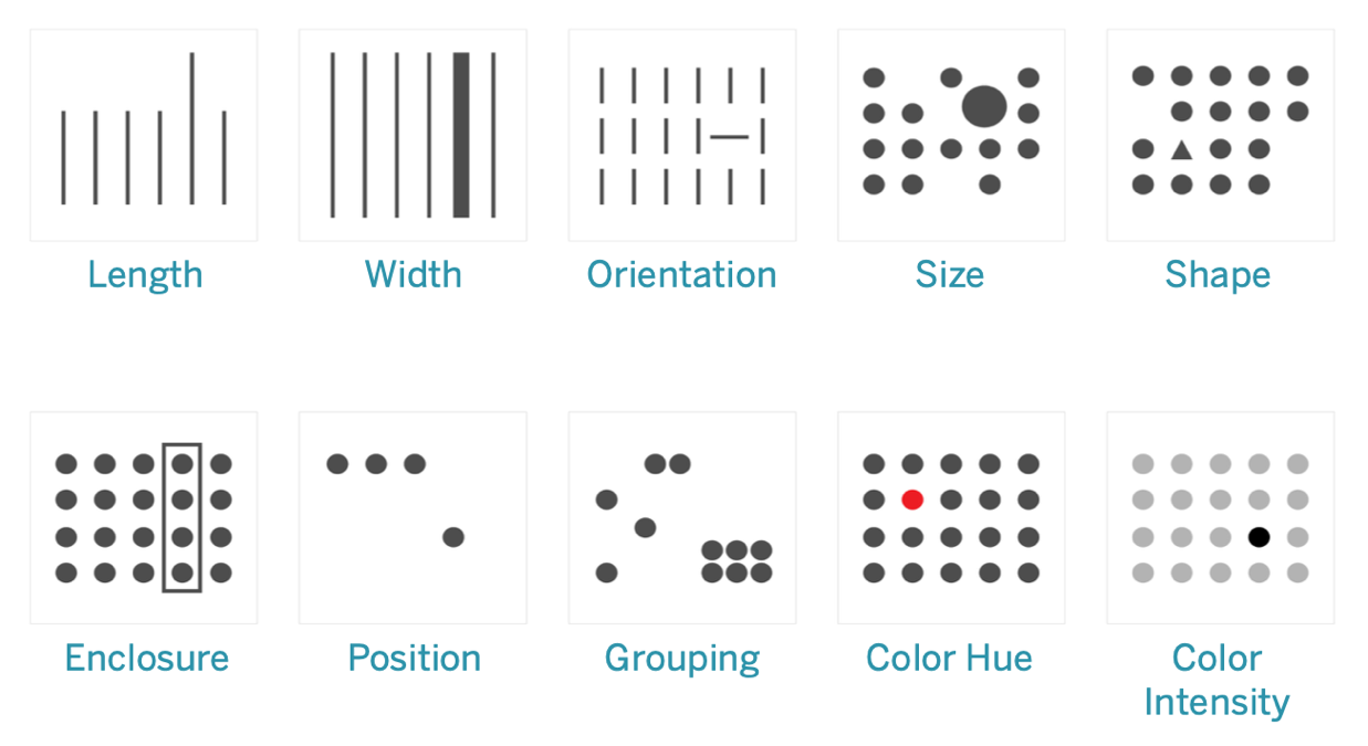
It is said that Tier 2 often contextualises the thinking of Tier 1 to inform a person’s decision-making. In visualisation, the pre-attentive attributes (below) are how we use vision to communicate between Tier 1 and Tier 2. So here Mushon asks ‘can we think of empathy as an additional pre-attentive attribute for visualisations?’ because we do not get to control or rationalise it, but it can inform our more deliberate decisions.
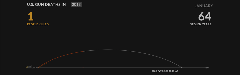
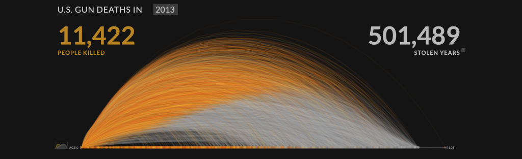
The above image is a powerful visualisation of gun deaths in America during a single year. It begins by illustrating the life arc of one person being cut in the middle vs how many more years they could have lived for.
Focussing on a single individual’s life being cut short appeals to the viewer’s affective empathy or tier 1 thinking, aka the more emotional response, before the impact of another 11,422 deaths are visualised in the same manner as below.
Data visualisations have the power to explore and explain important stories about the world.
However, it’s not enough to just say something is wrong with the world. If we have built that message well, then we should also direct that message towards the path of change and actionable insights.
4. Data points are people too
Hosted by Bronwen Robertson, Joachim Mangilima, Saja Othman, Zdeněk Hynek
Data4Change is a non-profit organisation based in London that connects social change organisations with designers, journalists, and technologists to collaboratively create data-driven solutions for some of the world’s most pressing problems. This talk focused on many of their projects which have helped to deliver change in countries around the world.
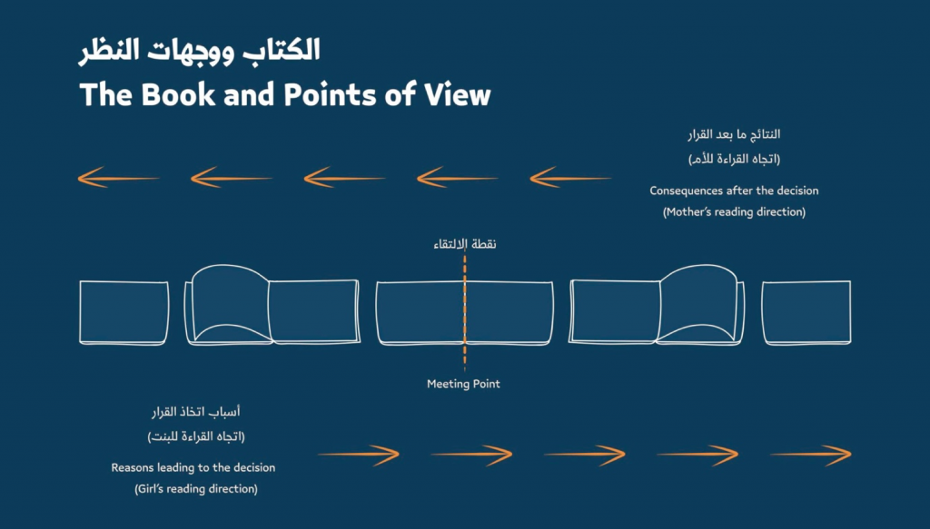
An example of this is ‘A Bride With A Doll‘, which focused on the issue of child marriage. The team designed a workshop kit and a storybook that could be read from both directions, reflecting emotional experiences, based on data insights from the community.
5. Mind Games: The psychology behind designing beautiful, effective, and impactful data viz
Hosted by Amy Alberts (Senior Director, User Research, Tableau)
This talk outlined practical guidelines which can help you predict where people look at certain parts of data viz – for example, jagged lines and bar graphs are effective at drawing the user’s attention.
Amy’s team at Tableau have previously employed eye-trackingsoftware to discover where people were focusing, gaze plots to qualitatively and quantitatively show where the eye is fixated, heatmaps to show areas of high visual tension, and gaze opacity maps to highlight areas that people give less attention.
According to their findings, the biggest attention grabbers in data visualisation are:
BANS (Big Ass Numbers) – Our eyes are drawn to large visual elements such as big text. Below is a gaze opacity map of a dashboard with big numbers.
Colour – Visual contrast relative to other areas generates attention.
Humans and maps – Our brains are hardwired to notice other humans, so when we see human-like figures in visualisations, we are automatically drawn to them. If maps and humans are relevant to your data, it is worth capitalising on this to draw attention.
Design with intent and be mindful of the context that you control. Use clear titles and high contrast elements, ethically making use of the psychological phenomenon known as the priming effect. This will help to ensure that your audience clearly understand the story that you are trying to tell with your data.
Final thoughts
The Outlier conference was incredibly informative and packed with so much knowledge about how to create culturally relevant, socially aware content that’s also visually impressive and effective in communicating concepts.
Interested in our content marketing and digital PR services? Get in touch.
Why your content needs expert collaborators (and where to find them)
Producing newsworthy content for our clients means communicating a level of authority between industries that we (quite often) have no first-hand experience of working in and journalists who have years of experience covering sectors that our clients sit within.
Often, we can rely on client spokespeople to provide comments for the press and which analyse the work we produce. But content that is built to earn links can also cover topics and conversations that stretch beyond a client’s product while still remaining relevant for them to talk about, which means we often look further afield to find people who can offer valuable perspectives on our stories, or help us construct our content from the very beginning.
In my time at Verve Search, I’ve been lucky enough to work with world-renowned scientists and academics, artists, authors, photographers, gamers, and experts on more subjects than you can shake a stick at. All of these individuals and organisations have taken our stories from being a collection of interesting statistics or attractive pieces of content to something more newsworthy, which is brought to life by the authority behind their words.
How we work with collaborators depends largely on which gaps of authority exist within the production and PR strategy of each piece of content. Here are just some examples of how we’ve worked with expert collaborators in the past:
We’ve partnered with world-renowned academics and specialists to plan and execute our campaigns, like we did here with Harvard University for Babylon Health
We’ve tapped into the unique resources of subject specialists to create in-depth campaigns with data that is normally unavailable to the public. We worked with Ian Shirley (editor of Record Collector magazine’s ‘Rare Record Price Guide‘) to put together reams of imagery and information not found elsewhere about hugely valuable vinyl records
We’ve received valuable commentary from industry experts on our survey results and independent research. For Influencer Investors, our Paxful campaign about stock market guidance on TikTok, we asked financial planner and psychologist Dr. Brad Klontz for his expert analysis of our findings and created a valuable Q&A asset
The Outreach case for finding collaborators
One key indicator to any campaign’s success is how many high-quality and authoritative links it generates, and it should almost go without saying that journalists will appreciate a story being sent their way that is supported by reliable and authoritative experts within a relevant field. I spoke to Tonje, one of Verve Search’s super-talented Outreach Specialists, to ask about why the team finds it useful to lean on the expertise of external sources…
Q&A with Tonje Odegard, Outreach Specialist
Why is outreaching more successful when there’s an externally-sourced expert attached to the story?
First of all, in addition to a credible data source, journalists always need quotes in order to complete a classic news story or feature. If we can provide these from a relevant and credible expert or collaborator, it will save the journalist having to source these from elsewhere, increasing our chances of them using our content (and ultimately linking). Alongside having graphs and illustrations from the campaign, we’re essentially providing a one-stop shop for the journalist.
Secondly, having expert commentary or quotes adds substance, credibility and gravity to the pitch, which again increases the chances of it being covered. For instance, when working with Babylon Health, we used expert commentary from the doctors there on several occasions in our campaigns and outreach. Overall, we secured links in high-punching publications such as The Telegraph, City AM, Time Out, Metro, New York Post, Houston Chronicle, Forbes, and Cosmopolitan as a result.
The top-tier coverage we received featured guidance from a client spokesperson.
What kind of things do you think journalists are interested in when it comes to experts and collaborators?
The clue is in the name; the purpose of experts and collaborators for journalists is exactly that – to provide their expertise on the subject the journalist is covering. They are an essential part of any news story or feature as it helps break up the article into a more digestible format for the reader as well as offer credibility. In essence, experts help explain the topic covered in a story.
Are expert Q&As useful to have on hand?
Q&As are a formidable way to convey information in a conversational tone that is easy for the journalist to turn into quotes – if they’re feeling really lazy, they can even copy and paste it entirely. But having the expert ready at hand to answer any additional follow-up questions is also key as many journalists want something unique or more specific to use in their article.
Do you think journalists find campaigns more reliable when they are backed up with an externalexpert’s data and imagery rather than completely in-houseassets?
Yes, I definitely believe so. Having an expert involved who is willing to endorse the campaign’s message demonstrates to the journalist that this is a legitimate and reliable source of information. If the expert comes from the client we are representing, there is a danger that the pitch can appear too commercial, but this will usually not be the case if the expert is relevant and credible – so always make sure they are. Using an external expert can often add more credibility.
How important is it to journalists that a field expert provides commentary and context on independent research findings?
As mentioned above, it helps cement the credibility of the data and message of the campaign. Any good journalist would seek to back up claims made in their article and as such, they would try to hunt down a relevant person to comment on the findings. If we can present this person at the same time as pitching them the research, both us and the journalist have killed two birds in one stone.
So, where should you begin?
Identify your needs
There are different ways you can incorporate an outside expert in your campaign. At what point they enter the production process depends on how best you think they’ll be able to contribute to the project. In my time at Verve, our collaborator partnerships have usually fallen into one of the following categories:
They comment on our in-house study. This means we’ve sourced our own data and broken it down into key findings. We may have run a study and come to some interesting conclusions, or collected a huge variety of new information via freedom of information requests. Either way, we’re looking for an authority on whatever the subject may be to give us some all-important context to what we’ve found out. We want them to answer some burning questions that have arisen because of surprising or even predictable discoveries we’ve made – answers that journalists love to feature and readers instantly trust. Ask yourself whether you need someone to answer your burning questions.
They advise us on a methodology and provide commentary where necessary. Sometimes we need collaborators to help shape the building blocks of our campaign. It means we have the story in our mind, but we need specialist guidance on how to execute something that needs an expert eye. We ran a campaign called Understanding Dementia and knew that the subject needed an official figure on dementia to ensure our campaign handled the subject with the sensitivity and authority it deserved. We worked with a leading dementia expert to give us her vision for how our planned games and puzzles could successfully emulate the confusion and frustration associated with the condition. We’ve also worked in this capacity with world-renowned academics and specialists who’ve advised on our campaigns at early junctions, like planning survey questions, helping shape extra angles to our research. Ask yourself whether you need expert guidance to build your project.
We incorporated our expert’s comments into the Understanding Dementia puzzle game to create a narrative that puts the user’s experience into context.
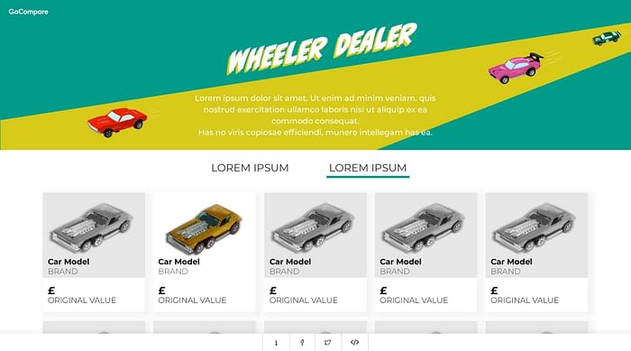
They lend us resources that are otherwise not openly accessible. Some campaigns rely on the knowledge and resources of industry professionals. We’ve worked with all sorts of individuals and companies over the years that have given us their time and expertise to help create a more valuable piece of content for the news landscape. For example, Wheeler Dealer for GoCompare saw us partner up with an expert on vintage toy cars who gave us lots of specialist data and imagery…
Wheeler Dealer used the data and imagery provided by an expert on vintage toy cars.
…and we tasked the talented 3D-modelling artists at 3DLines with creating fantastic photorealistic mock-ups of familiar TV and movie rooms remade for the modern-day. Ask yourself whether your campaign needs the unique resources of an interesting individual or company.
But where can you find the right expert?
Where to find an expert
Use free find-an-expert search engines
Some of the best universities in the world have find-an-expert indices that list the academics and experts open to helping out the media. Here are some key ones:
You can usually search by field of study to help you track down the best person for your needs. If you’re going down the academic route, you should also try googling scientific studies and research institutions relevant to your subject to discover their authors. Why not try reaching out to them? We went to Professor Daniel Russell, a leading loneliness expert who developed the globally recognised UCLA Loneliness Scale, for guidance on our loneliness project with former client Echo.
Use social media
One of the best resources for widening your network is Twitter. Search out highly followed and influential people on the subject you’re working on. We contacted Matt Huxley, an esports lecturer at Staffordshire University, through Twitter, and he agreed to help us out with our project Esports Elites for Casumo. Matt had a large social media following and was used to being featured in the media, so we knew he was a fantastic authority to comment on our findings.
Find a book
Don’t worry, you won’t need a library card for this one! We’ve found expert collaborators by searching for books around our subject of interest. If you can track down and contact the authors or researchers (perhaps through their personal websites, social media, or publishers), you might just find that they’ll be really enthusiastic about your project.
In the past, Amazon has proved to be a useful resource for finding the right books. We used this method to find an expert to help us answer some questions for our project Crep Check for Farfetch. Crep Check is a database of the most valuable trainers in the world, and we included rankings for the shoes that have appreciated the most in value from their original retail price. We knew that finding a top sneaker expert and having them answer some questions would give journalists an extra angle to feature, so we searched online for experts and found one in the form of Mathieu le Maux, author of ‘1000 Sneakers: A Guide to the World’s Greatest Kicks, from Sport to Street’.
We sent Mathieu a message over Twitter and it didn’t take long for him to get back to us. The result? GQ magazine and the Daily Mail featured some of his comments prominently:
We used this method again to search for a reputable source of data, high-quality imagery, and expert commentary for Record Value, our project with Australian life insurance company NobleOak. Our answer came in the form of Ian Shirley, editor of ‘The Rare Record Price Guide’. Ian was the perfect fit for our campaign and gave us plenty of resources to work with as well as giving us valuable information about each of the 75 records in the final campaign.
Find a charity
We’ve partnered with lots of charities over the years and the benefits of attaching the campaign to the name of a reputable and established charity are numerous.
With Understanding Dementia, our Babylon Health campaign that attempted to reflect the effects of dementia with a series of frustrating games and puzzles, we partnered with Professor June Andrews, a renowned dementia expert to help us out.
June provided guidance on what effects we could attempt to reflect with our games, plus commentary on our games to help the user understand what aspects of dementia they were experiencing.
We partnered with two mental health charities for another project with Babylon Health called Student Stress. Both charities appealed in person and on their Twitter and social media accounts for students to tell us what stress felt like in their own words. We received lots of evocative descriptions of mental health from students all around the world, and our talented designers went to work illustrating them.
Keep up with the news
We’ve secured collaborators in the past by reaching out to them as a result of seeing their work in the news. It’s a surefire way to find names that are trusted by journalists as an authority on a subject.
And finally…
When should you budget for expert collaborators?
It’s always worth keeping a budget in mind if you expect to ask a collaborator to do a large amount of work for you.
Before you reach out to someone, ask yourself:
How much of their time are we asking them to take up?
Are they just doing their day job, but for us? If so, they’ll expect to be paid.
Is this specific expert absolutely vital to the story earning coverage? If they require a fee, it’s worth thinking about putting aside some of your budget to cover it.
Sometimes, budgets will be tight. In many cases, you’ll be able to get a collaborator on board for free just by outlining the (credited) coverage they themselves will receive by taking part in your project. For a lot of people, this is sometimes compensation enough for being involved, especially if we know we’re presenting them with fascinating new insights around their specialist topic.
Keep your communication respectful of your collaborator’s energy and time and you’ll be able to build a creative partnership that will always be useful to have on hand.
Further reading:
How to enhance your Digital PR outreach with expert quotes [1]
20 examples of great quotes for your press release [2]
Interested in our content marketing and digital PR services? Get in touch.
6 UI design principles you need to know
For a designer, it’s essential to have a clear understanding of UI principles. UI principles are high-level concepts that serve as guidance when designing a user interface, which is the point at which human-computer interaction occurs. The hierarchy in the UI design is fundamental in determining what the user will take away from their experience when using the interface.
The goal of a UI designer is to anticipate what a user might need to do by producing an interface that naturally encourages exploration and avoids confusion.
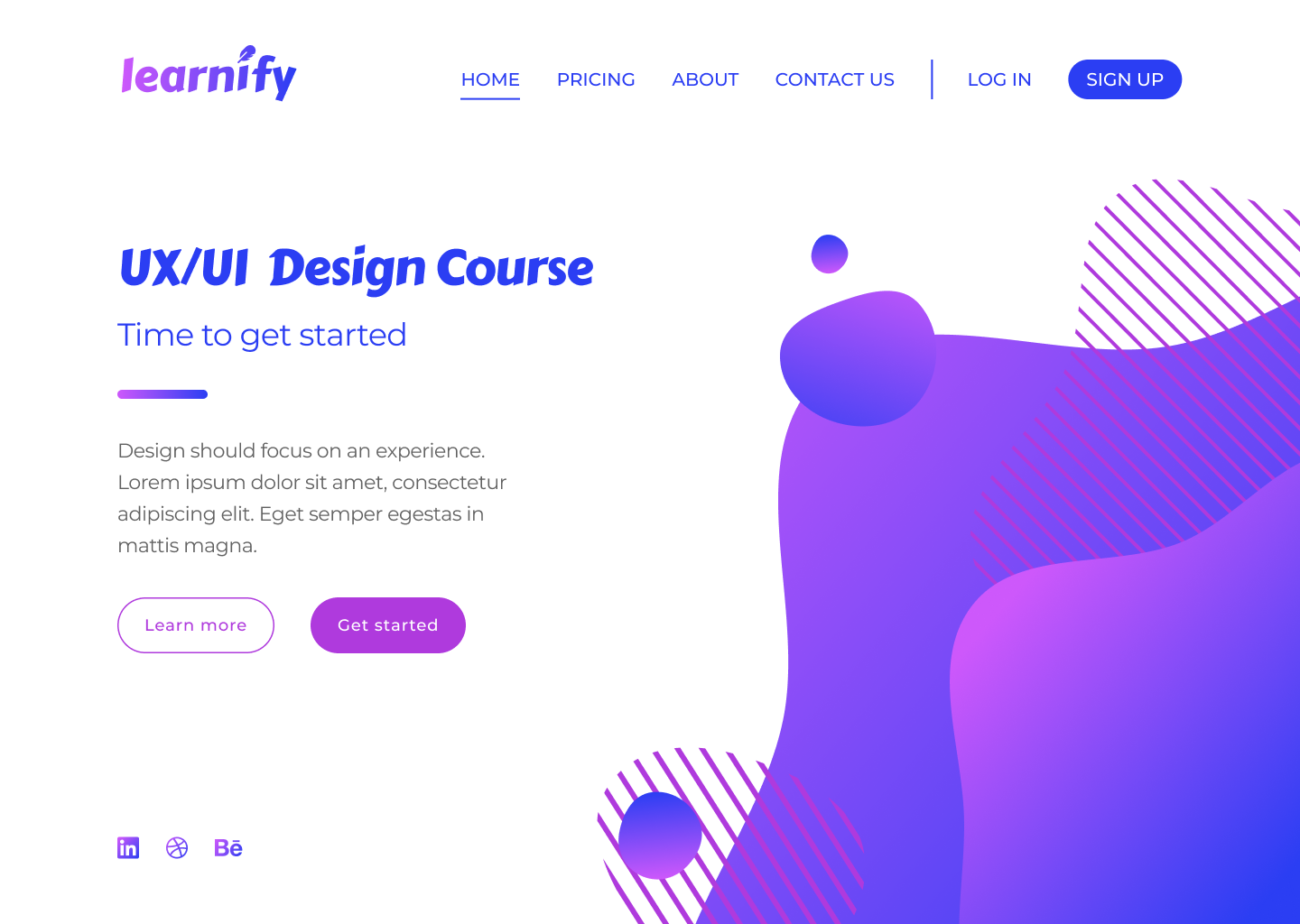
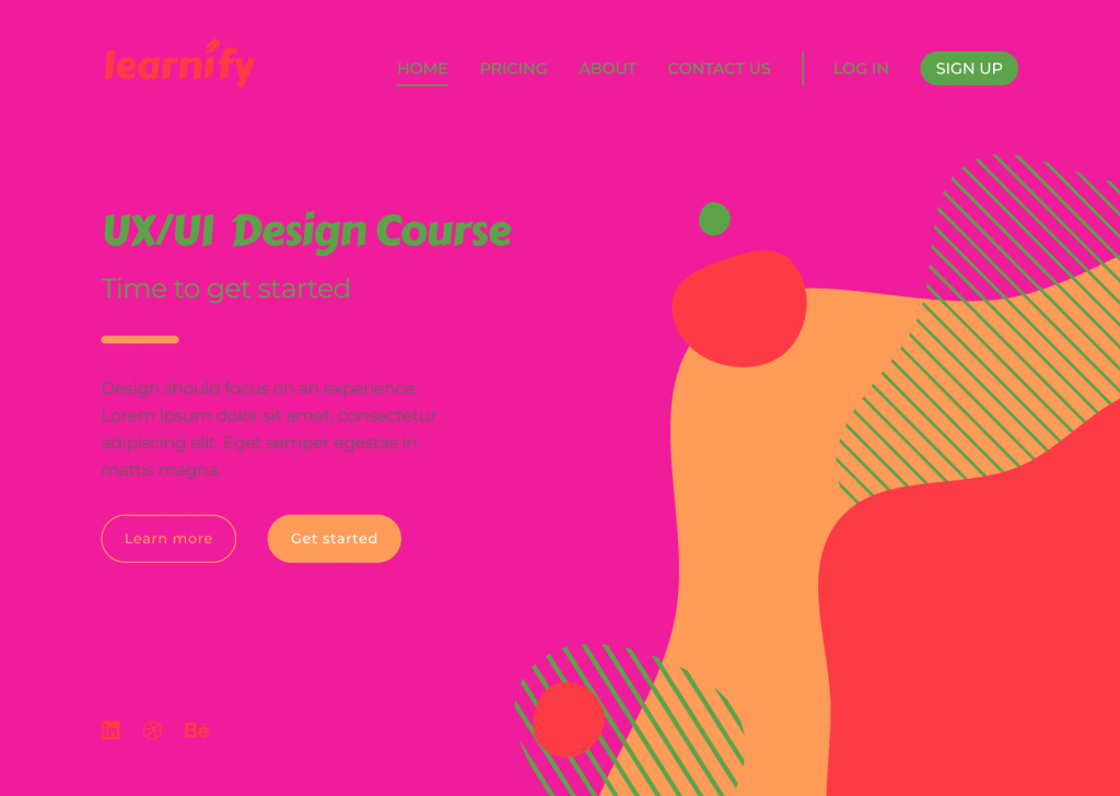
For this post, I’ve designed a simple landing page for a fictional learning platform. This landing page design – that in its current state follows all of the UI principles correctly – will be used as a point of reference to demonstrate six key design principles.
I’ve accompanied each section in this blog with a version of the above page that demonstrates how a bad design decision could affect the overall image and the usability of your design.
So, let’s get started…
Typography
Typography is one of the most important principles in user interface design. It’s the technique of arranging text to make it readable and visually appealing. The arrangement of the text includes selecting typefaces, font sizes, line lengths, line-spacing, and letter-spacing, and adjusting the space between pairs of letters.
Good design doesn’t need to feature lots of different typefaces. Unless the typography is a core design element, you simply don’t need to use lots of typefaces to convey a message.
More often than not, simplicity is key, and a strong design might only feature one or two typefaces. The typography principle is there to lead the reader’s eye to the right place at the right moment. It sets the tone of your page and helps to establish a visual hierarchy in your design.
For example, a larger font size and bolder font-weight have a higher chance of being seen by the user, but if we were to compare…
this lightweight text in a bigger font
with
this bolder text in a smaller font
…the chances are the first example would stand out more.
One way to improve a website’s readability is to increase leading (or line-height, in other words). This spacing between the two lines of text has a key impact on legibility; correct line-height helps the reader’s eyes travel from one line to another.
Although the standard leading is 120% the point size of the font, the leading can be set to automatic adjustment and can be modified according to the typeface needs. The body text in the example below illustrates poor use of leading.
The text is clustered which makes it difficult to read. Overall, this page does not give its viewers a sense of flow when reading the material from start to finish. The various alignments and improper use of fonts does not convey a story, nor does it urge users to take an action.
Tip
Select typeface for the headers only after you are confident with a typeface for the body text.
Scale
Scale in design refers to the sizing and the proportion of the elements on a page. Every element, whether a piece of text, a shape, or a line, has a weight.
The weight is created from the size, colour, or texture of an object. A symmetrical, well-balanced design is formed by aligning equally weighted elements on either side of the centre line. With the scale principle in mind, the designer needs to make sure that the page doesn’t look either overcrowded or empty.
One way to achieve this is with the use of padding and white space, or by simply adjusting the scale of an element. Scale can be used to direct viewers’ attention from the most to least important elements.
Objects of a bigger scale tend to attract viewers’ attention more, so the scale principle can be used as a way to rank design elements and influence the order in which users view them.
Below is an example of badly scaled design. The scale principle should help in guiding the users through their experience, but on the page below, the viewer can’t focus on any of the elements. The header is too big, the action buttons are too small, and the social media links (already highlighted enough with colour) are unnecessarily large.
Tip
It’s good practice to apply the golden ratio in your design. The golden ratio can be applied to spacing, composition, and layout; try using a golden ratio template. Plugins such as Font Scale can help establish a typography foundation.
Alignment
Alignment is the arrangement of elements in a straight line or correct relative order and is recognised as one of the core UI principles. Any two connected points are referred to as a line.
When executed correctly, alignment creates a hierarchy within a design and helps direct the user’s attention towards specific information. Arranged content is easier for the user to scan through which increases readability and the viewer’s engagement.
Alignment can be achieved with a clearly defined boundary or a division. A defined boundary can be perceived in a group of elements that share a common area. When the elements are close or proximate to each other they tend to be visually grouped.
In the example below, an excess of misaligned elements strips the viewer of a clear visual path. It’s now unclear where the viewer should start and finish navigating the page.
As the human eye naturally seeks perfection, an intentional misalignment of an object could sometimes be used as a way to attract a user’s attention. One way to do so could be by increasing the y-axis of a navigation bar link of a selected page as a way to highlight the user’s current location on a site.
Tip
Enable a predefined grid or customise one to make sure elements are aligned and visually organised.
White space
For a design to work, it needs to have an adequate amount of space between its objects. In our example below, the area around each object is white space, which also happens to be the negative space and another key UI principle.
Unlike positive space, which is the area of interest on a page, negative space is the background area around the subject of interest. The right amount of white space can simplify and break a design into chunks of information that are easier to comprehend.
A larger white space around the text helps improve readability. A design that has a very minimal use of white space could overwhelm the reader’s eye.
In the example above, it’s obvious that the design lacks white space, making it heavy on the eyes.
Here are a few reasons why this is happening. First, although the CTA buttons are emphasised with boxes, the text inside of them lacks padding and subsequently looks too big. The visuals on the right side of the page are too large and too close to the top navigation bar and the text on the left side of the page.
Elements on the left-hand side don’t have enough space to breathe and are overwhelmed by the size of the visual element. Header one and header two seem to be too far apart – despite them being part of the same group, they seem isolated from one another. The same issue can be seen with the CTA buttons, which once again are too far apart.
Tip
Button borders usually work well when the padding ratio is 1:3 for the top and bottom, and 3:3 for the right and left.
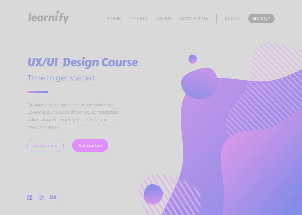
Colour
Users often perceive an aesthetically pleasing design as a more usable design, and they’re technically not wrong. More and more brutalist-inspired websites are receiving recognition among younger users. Their ruggedness and complete lack of usability is what makes them unique and memorable.
Sometimes the simplest, most intuitive, and most accessible user interface is not as popular as a modern design that has scarce consideration for usability. By and large though, if a website lacks aesthetics, it will most likely drive away visitors too.
Colour is another hugely important UI principle. Colour can establish the right tone, whether it acts as the main standalone component or is used as an oomph in other design elements. Colour can set boundaries, define shapes, and give emphasis to an area of a page.
In the example above, the colour selected for the design doesn’t reflect the brand nor enhances usability. The colour combination looks tacky and lacks contrast, creating difficulty when reading the page and identifying the navigation elements.
Tip
Apply the 60-30-10 rule. That’s 60% to the dominant colour, 30% to the secondary colour, and 10% to the accent colour. Consider using colour palette plugins, as these are predefined colour sets that can speed up the process of choosing the right colours for a design project.
Contrast
Contrast is the state of something being different from something else. For elements to contrast, there should be an evident difference between the two. Colour, scale, or a combination of both can be used to contrast two or more elements and create space.
RGB, hexadecimal, and HSL all have an impact on whether a colour will have enough contrast. The Web Content Accessibility Guidelines (WCAG) 2 – the international standard for designing for accessibility – is a good way you can learn more about the specifics. WCAG 2 expresses the brightness differences between colours in a form of a ratio, which ranges from 1:1 (e.g. white on white) to 21:1 (e.g. black on white). If we were to check the contrast of RGB values on white background, the ratios would look like this:
Red = 4:1
Green = 1.4:1
Blue = 8.6:1
(*the ration value will remain the same even if the text colour is reversed with background colour)
According to WCAG 2, the minimal requirement of the AA level of contrast ratio is 4.5:1, though this ratio requirement drops to 3:1 if a large-scale text is used. This requirement can be avoided altogether when referring to the contrast in decorative text and text in logos, as these do not affect the accessibility of an interface.
It is important to note that there are many colour hues and shades out there and the ratios cannot be rounded. If the colour contrast is 4.2:1, it automatically does not meet the minimal contrast requirement.
Below is an instance of how contrast should not be used:
The above design is an example of ineffective contrast use because the elements are difficult to read and identify. Lack of contrast strains the viewer’s eyes and can result in users experiencing frustration.
Tip
Using images as backgrounds can reduce text visibility. To make sure the text is adequately readable and meets WCAG 2 contrast requirements, use a coloured overlay on the image before placing the text on top.
Final thoughts
The different elements of a design should all work together as a team to tell a story and guide viewers through their user journey.
To all budding designers, I would strongly recommend familiarising yourself with UI principles before taking on a design project. The proper use of these principles will contribute to the flow and the outcome of your design, and significantly enhance the accessibility of the page.
Take a look at some of our previous campaigns to see how the design team at Verve Search have used design principles in their award-winning work.
Interested in our content marketing and digital PR services? Get in touch.
Campaign Spotlight – A Contact Lens Company Visual Content
My latest campaign spotlight focuses on three similar campaigns we produced for a contact lens company, all of which have been consistently covered by national and international lifestyle journalists.
These campaigns are Moving Perspectives, The Stroop Effect and Photographic Memory. I will discuss each campaign in turn, explaining the thought process behind their creation, and how their execution led to consistent coverage from top-tier publications.
The Stroop Effect was the first to launch in May this year. It is a colour perception game based on the Stroop test, a psychological phenomenon where the brain struggles to read the word of a colour when formatted with a different colour, for example Red written in green.
Based on this, we devised a test which measures how quickly you can identify five matching colours (e.g. Red, Pink, Green) against ten mismatching colours (e.g. Red, Pink, Green). We then tested the game on a survey with 2000 UK adults to give us various headlines about how well the nation performed.
To date, The Stroop Effect has been picked up 28 times with a total of 2,068 Link Score (Verve’s own tool using a combination of metrics to measure the value of links). The test also has over 100,000 views, thanks to features in the Mirror, Daily Mail, Mental Floss and Business Insider.
In July, we launched Photographic Memory, a game which tests the audience’s ability to spot details in ten images. They are given seven seconds to look at an image, then respond to a question about a detail in the photo.
We wanted to create a campaign which tests whether the user has a visual memory, as well as producing something with strong visuals that journalists could embed in an article. To add further credibility for journalists, we tested the game on 2000 UK adults to see how they performed. Just 1.2% of the respondents were able to get a perfect 10/10 score.
So far, Photographic Memory has 21 links from high authority news sites. It performed especially well with the UK tabloids, with the Sun, Daily Mail, Mirror, and Metro all covering the campaign within a few days of each other.
Our most recent campaign for a contact lens company launched on the 23rd August and has been the most successful of the three mentioned in this blog. Moving Perspectives takes optical illusions to a new level by showcasing seven mind-bending optical illusions made into moving GIF images.
We previously had success with In Perspective, a similar optical illusions piece with 11 illustrations of illusions which show the user how it tricks the brain into seeing something different. With Moving Perspectives, we explored this concept further by using dynamic illusions, which move to reveal how it works.
So far, Moving Perspectives has 41 links with a total of 2,103 Link Score. Again, this campaign proved popular with the UK tabloids including the Sun, Mirror and Daily Star all covering it. The campaign also received international coverage in Russia and Japan.
All three campaigns benefitted from quality designs which maximised the visual appeal of the campaigns and made them fun to interact with. The journalists we contacted appreciated the strong aesthetics in the three campaigns.
They also benefited from being embeddable on an article so readers can view them without having to leave the page. Moving Perspectives worked well in particular as the white background matched seamlessly with the page of an article.
As a result, the execution of these three campaigns has made it possible for us to build consistent links by appealing to lifestyle and pop-science journalists with similar content themes but a fresh idea which continues to attract coverage each time.