Producing content built with AI shows that the help of artificial intelligence can open up plenty of new avenues for newsworthy storytelling.
As we’ve seen over the last few years, AI can assist content creators with a number of methodologies, including facial recognition, image generation, voice recordings and even sarcastic chatbots.
With the rise of ChatGPT (if you haven’t used it yet, what have you been doing?), we could even go as far as to say that AI has scared some of us content creators into feeling like jobs are at risk.
Luckily for now, AI hasn’t completely taken over – just yet.
With a report stating that 3 in 4 marketers are using AI for content creation, AI content is certainly on the rise with blogs, publishers and brands seeking out these tools to boost their efficiency and output. Whilst the tools are handy, it can be difficult for consumers to sift out the AI from the authentic. This, however, isn’t necessarily a bad thing.
Looking at examples of content built with AI, there are a mass of marketing campaigns that have gone on to earn linked coverage from news publishers in various sectors.
This project is more about posing as artificial intelligence to roast a topic that many people care enough about to share: personal music taste.
Spotify’s marketing success from their ‘Wrapped’ feature has become an annual event on social media — earning over 1.2 million tweets in a single month, and leading to huge increases in downloads of the app (plus many many more brands trying to replicate it).
The Pudding’s subversion of what makes Spotify Wrapped so popular was a genius way to appeal to the cynical side of music fandom.
Their “faux AI” tool gives the impression that a sophisticated AI bot is judging your prized personal music taste in real time, before returning sharable results that are partially tailored to the user.
Since launching in late 2020, it has been picked up by more than 1,300 linking root domains.
More than 1 in 5 of the headlines mention AI or artificial intelligence, suggesting that the AI’s participation in the experience is a key selling point in the story, as well as helping to make the project possible in the first place.
AI image recognition technology has the potential to reveal insights on a scale that the human eye wouldn’t be able to achieve. Truth is, content built with AI doesn’t always have to be copy-based.
Using Microsoft Azure in a case study, we wanted to see whether the many selfies that exist of pet owners and their pets show a happier image than a standard image of someone without a pet.
By comparing an anonymous sample of tens of thousands of pet owner selfies to standard selfies of people, we could compare the average level of emotions displayed in either category of picture.
Combining this AI tool with geotagged image data allowed us to reveal insights related to pet owners on a more international scale.
In other cases, we were also able to use this same process to measure the happiness of the average Instagram #selfie taker and the average #newhomeowner stood outside their front door and flashing their keys.
This campaign by Neomam studios for HouseFresh also used the same tool to identify the presence and strength of smiles in order to rank the happiness of locations in the USA.
This research comes from a company that specialises in biometric authentication software with what is likely to be an attempt at downplaying some public fears over their technology.
While the statistics back up what they would hope to find — that AI isn’t fooled by spoof photos compared to the 30% of humans who do struggle to identify fakes — this story highlights an appetite that journalists have for exploring where humans and AI clash or collaborate in their capabilities around performing certain tasks.
Sentiment analysis tools can help us to draw insights around attitudes and emotions from large volumes of (usually) text-based data.
At Verve Search, one of our favourite use cases is to analyse the emotions behind different topics that are being talked about within various corners of social media.
In this example, we separated thousands of comments on US sports team’s official Facebook fan pages after wins and after losses to see which fan bases are more likely to remain supportive when the good times go bad and vice versa — also known as fair-weather fandom.
Initially, we would have loved to measure this on metrics such as fluctuating ticket sales or stadium attendances over a longer period of seasons.
But with that type of data mostly inaccessible and stadium attendance figures often debated for their accuracy, we found online fandom to be a good proxy with the help of SentiStrength, which could measure individual comments on a scale of positivity to negativity.
Other newsworthy examples of this type of analysis include when we found out which household chores cause the most stress or which elements of driving cause American motorists to complain the most.
This is a great example of content built with AI using machine learning to continue building on a subject of research from previous years.
An analysis of 3,000 English-language books by the USC Viterbi School of Engineering used NLP’s (Natural Language Processing) ability to detect the prevalence of pronouns, and thus how often men and women are represented in literature.
With this type of AI able to process vast quantities of text-based data and return such results, there is clear potential here for building on this method in other forms of media and entertainment where gender representation remains an issue.
Public speaking is usually a prerequisite of being one the most powerful people in business or politics.
So for this campaign we applied AI voice recognition software built on deep learning techniques to judge the emotional profile of famous leaders’ speaking styles.
Pulling together a large seed list of audio files from the public speeches of politicians and famous entrepreneurs, we could look at how certain emotions are more prevalent in certain individuals, political parties and genders of speaker.
Understanding what emotions are being portrayed within a person’s voice would normally have to be studied individually.
With AI-driven voice recognition, you can analyse large amounts of voiced audio files and retrieve results that are compared against the average emotional levels that the software is trained on. Or you can compare the relative emotional levels from your own dataset (in this case, the average leader) to see which voices rank highest and lowest vs those average scores.
As already noted, artificial intelligence is often talked about as something that clashes with humans — our judgement, our capabilities, or our jobs.
And although this content is built on AI-generated images, an essential aspect of its appeal requires the input of its audiences to guess what creation the AI tool has conjured up.
For this campaign that leant on a TikTok trend, each image is a famous scene from a Christmas movie that was mocked up in different styles by the app Wombo.
Thanks to this thread, where I found the campaign, you can also see content built with AI to help with other areas of the creative process:
Recently I've been playing around with AI image generation tools and I've realised there's SO many ways we can use them in digital PR
Below I've pulled together a list of 4 ways of how you can use AI image generation in your everyday 👇
There’s a Buzzfeed quiz for countless trends and topics. So, it’s not surprising to see that they also had a stab at the ‘audience vs AI guessing’ quiz format in July 2022, which you can try here.
AI image generation tools, such as DALL-E and Midjourney can capture our imagination in just a few words and visualise a detailed version of our thoughts much quicker than we would be capable of creating in the same format.
In this content example, the AI also had to capture the imagination of the journalist to whom the content was outreached to.
In our experience, motoring journalists who report on visual content are often an exception. They are used to dealing in data, reviews, previews, and shiny photography of even shinier vehicles.
Thanks to the creative angle used here by SEO Agency Screaming Frog, the supercars from a dystopian future is a fictional story that still managed to cut through to a sector that would normally be more concerned with stories related to cars that you can actually drive.
According to OpenAI, DALL-E is generating over 2 million images a day.
While the volume of AI-generated imagery already seems to be saturating the internet, the strategy of defining these image outputs to link them together under one newsworthy theme could still be in its infancy.
These examples of AI-generated imagery, also from the team at Screaming Frog, were fed by the names of countries and their travel slogans to see what Midjourney returned.
The posters are visually beautiful. However, when covering the story, the journalist seems particularly intrigued by what the AI — with no physical travel experience to rely on — chooses to prioritise in its interpretation of an entire country:
“Until you’ve seen a place for yourself, it’s a bit of an abstract idea, so why not ask Artificial Intelligence to generate your travel poster?… Like most travel posters, Midjourney has evoked a fairly sketchy sense of place, sometimes punctuated by notable landmarks or natural features.”
Many horror movies can be recognised by their iconic movie posters or from the faces of their terrifying villains.
The speed of AI image generation allows for trialling out different ideas for visual content. And any examples which appear to make the grade with some design touch-ups can also be targeted to a specific, short-term event in the calendar, such as Halloween.
This example by Digital PR Agency Evoluted took some of the most famous horror films of all time to see what even more terrifying versions of their posters could be reimagined by the AI app Wonder.
Check out this Twitter thread for a breakdown of the posters and more information on how they were created:
What if AI was behind our favourite Halloween classics? Using keywords from classic horror plots @vicki_collins and @laurarowleyx used AI to reimagine horror posters partnering with our design guru @willbarron to bring these to life in the style of the original posters 🧵
For more AI-generated movie poster goodness (and weirdness), take a look at this series of posters created by artist Vincenzi in his project ROBOMOJI.
Using a similar method as the Evoluted example, Apartment Therapy tells us that the artist inputted “a series of prompts and descriptions about a film’s visuals, titles, and premise into the AI software.”
As noted, the artist didn’t set out to earn linked coverage with his project. They are using it to ask important questions around what role AI will play in the art world going forward.
So, should we be creating content built with AI?
While artists and industries are rightly questioning what the adoption of these new technologies means for the future of creatives, some, like Manas Bhatia, are already acknowledging the part AI can play in quickly helping to visualise early concepts before an artist refines them with their expertise.
Back in 2022, we saw a campaign from Samsung earn widespread coverage after they enlisted the help of a digital designer to reinterpret famous artworks, according to the issues Gen-Z are most concerned about in 2022.
Relying on insights from a survey to inform the creative direction that an artist took provided a much more human and, therefore, newsworthy angle to this ‘reimagined’ content than what the artificial mind of a tool such as DALL-E would provide.
L.S. Lowry’s ‘Coming Home from the Mill’ (1928) reinterpreted by artist Quentin Devine (2022). Source: samsung.com/ The Art of the Problem (2022)
The extent to which you use AI and its different domains as part of your creative process will vary from one campaign to another. Some ideas will see content built with AI take the role of prototype designer, others will do much of the data processing to then allow your team to find the stories that matter within the data.
On the whole, it would be a mistake to think that the inclusion of AI alone will sell in a story to the press as newsworthy.
Without a defined creative concept to work with, these examples of AI are tools waiting to process whatever we feed them. As part of our role in creating newsworthy content out of AI, we should at the very least be setting the AI’s constraints, ensuring the inputs and outputs make sense, and closely monitoring what the overall direction is of the story that we’re trying to tell.
Further reading:
Deep Dive: AI Image Generator DALL-E Is Now Open To All — Why Should PRs and Marketers Care? by Rich Leigh [1]
The future of content creation with AI is closer than you might think by David Cohn [2]
The lawsuit that could rewrite the rules of AI copyright by James Vincent [3]
Messing around with AI and content concepts by Alex Cassidy [4]
A Freedom of Information request that is constructed out of uniform questions with measurable answers can build content that earns press coverage on a large scale, both geographically and across the various news topics it can cover.
The Freedom of Information Act enables any member of the public to uncover information that otherwise may not have been released to the public.
The law applies to more than 100,000 public bodies in the United Kingdom, meaning there are lots of stories out there to be told by using the law to access data.
In this post I’ll talk through various aspects of using the UK’s Freedom of Information Act as part of a content and outreach strategy that is built for earning links via press coverage, including:
What the FOI Act is
Where to find inspiration for stories
Tips on requesting the right information
Some pitfalls to avoid
1. What is the Freedom of Information Act?
Introduced in the UK in 2000, it is the right to know information about publicly owned organisations. The Act places two main responsibilities on those public authorities: a) to confirm whether they hold information, and b) to disclose that information to the person who asked for it.
Some bodies that you might expect to be covered by the Act are exempt. These include housing associations for the most part, security bodies such as MI5, and the royal family – so you won’t be able to find out how much of the taxpayer’s money the queen spends on her breakfast anytime soon.
Despite their public status, it’s also tricky to obtain anything especially useful from the BBC, as most of their interesting data seems to be protected internally “for the purposes of journalism, art or literature”.
Tip
The FOI Act also committed public authorities to regular publication schemes, meaning organisations now publish information much more proactively than they did before. This may not seem as valuable as asking for exclusive information yourself, but it’s surprising how much useful data these publications can already provide, without having to send a request. Take a look at the UK Police Force’s open data portal, for example, and you’ll already find crime data regularly published at a constabulary level.
2. Where to find inspiration for stories
If you send a quick general enquiry email to the first public organisation that you can think of, you might be disappointed to find that your request was rejected after waiting 20 working days for a response. Take a look at some of the below recommendations, which will provide inspiration for potential stories, and possibly be able to tell you if the information you seek is available at all.
WhatDoTheyKnow
Some organisations, such as the Office for National Statistics, will publish FOI requests that were made to them and responded to directly on their website. For those that don’t, WhatDoTheyKnow is the most useful way of accessing previous requests made to UK organisations.
Study examples that did and didn’t work by filtering your search by ‘successful’ or ‘unsuccessful’ requests. Doing so will potentially save you a lot of time with having to clarify your FOI request further down the line.
Another useful feature that was recently rolled out on this platform allows users to add any examples of their request being used in a news story as a citation. Look out for these citations, as they can help to inform your outreach strategy to a greater extent by seeing how certain FOI requests convert into news headlines.
WhatDoTheyKnow also allows you to make requests through their platform and includes a guide for beginners on how to request information. Requests can also be made through your own company email address or private email address.
Google News search: “Freedom of information”
When seeking inspiration for stories, sometimes a simple Google search can be just as useful as pouring through the specifics of WhatDoTheyKnow. Type in “freedom of information” and browse through the many ways in which UK and international journalists are utilising the law to produce public interest news stories.
Taking the time to read these articles from top to bottom will also show how many metrics journalists may report on for a particular type of story, as well as showing the kinds of spokespeople you can seek out within that sector to comment on your findings later on.
Doing this also presents the potential to scale up an interesting local story into something national that can be compared across different parts of the country. Did the Manchester Evening News publish their own FOI-led story about car parking fines? There’s a good chance that if it makes headlines in Manchester, a similar piece will make headlines elsewhere too.
The organisation’s website
If you have an organisation in mind, but you’re not sure whether they hold the information you want, take the time to browse through its website; specifically their services, publications and type of user data they retrieve. By the time you’ve read through these sections you will have a much better idea of what data you could ask for, and how this could convert into an idea for a story.
For example, OFCOM are one organisation covered by the Freedom of Information Act, and if you didn’t know what they do already, it doesn’t take long to see from their website that you can access data about public complaints related to TV, radio and other UK broadcasting services.
The BBC Shared Data Unit
The BBC Shared Data Unit is a nationwide partnership between the BBC and News Media Association that previously won ‘Editorial Innovation of the Year’ at The Drum Online Media Awards. It is dedicated to sharpening the data skills of journalists in local newsrooms around the UK and producing stories that work at scale for various regional and local titles.
Much of their data work is sourced from FOI requests, and, similar to how Digital PR campaigns aim to include angles that appeal to as many newspapers as possible, the Shared Data Unit is an excellent example of how to produce a story that resonates throughout the UK by picking out the angles from a larger dataset to make them work for local readerships. Here is one of my favourite examples of theirs:
Source: bbc.co.uk (2018)
A story that found British football matches were being heavily over-policed at a significant financial cost to the taxpayer.
The journalists behind this story compared information that they requested of police constabularies around the country with match attendance data from Opta, allowing them to rank ‘number of fans per officer’. It went on to generate 18 unique pieces of coverage in different newspapers within six days — not bad, considering Digital PR isn’t their game!
Like all good data storytelling, the Shared Data Unit is transparent with its methodologies and data. I would recommend reading through these if you’re just starting out on a larger FOI project for the first time, to see how they go about their process, from research and data interpretation, right through to execution and coverage.
3. Tips on requesting information
Think like a: marketer investigative journalist curious citizen
Understanding what kind of information you can obtain doesn’t mean that you need to be an expert in coming up with ideas for data-led stories. Neither does it mean that you have to be wearing a Pulitzer Prize-winning cap in the hope of exposing the next great national scandal.
Some of the most effective FOI-led stories ask straightforward questions that the average citizen would be concerned with knowing and reading about, and which the person managing your request can easily interpret to collect data from their organisation.
Simplicity with this in mind is important. While it’s noble to try to expose a brand new category of information from a public organisation that hasn’t been released before, the time constraints of your campaign’s production may risk leading you to spend more time contesting complicated and unsuccessful requests with the Information Commissioner’s Officer (ICO) instead of gathering straightforward, consistent data.
If you’ve already committed to the sign-off and kick-off of your idea without sending any test requests, then general enquiries or ‘fishing’ for information that you’re unsure is held shouldn’t be making up the crux of your FOI request at this point.
Including a speculative question alongside a set of questions that you know will be answered would at least guarantee that the majority of your request will be fruitful.
Whereas tentatively fishing for unknown types of information and expecting completely useable answers can easily end in wasted time and resources on your side and on the organisation’s side. More on this further down in the ‘potential pitfalls’.
Scale it geographically
Typically, FOI-led stories about UK organisations are less likely to appeal to non-UK journalists or publications.
You must consider how many organisations need to be contacted in order to produce a comprehensive story, and whether the work you put in will even deliver a large enough pool of outreach prospects.
Tip
Taking your FOI requests global (i.e. contacting organisations outside of the UK) will add a new layer of complexity to your research, which I won’t cover in this post. For more information on how you can work with FOI laws in other countries, click here.
A campaign we produced for Admiral in 2019 and 2021 looked at the scale of the empty homes crisis in Britain, and provided us with perhaps the most granular list of UK-based outreach prospects that we could hope for.
Source: Timeout.com (2021)
The housing crisis, of which empty homes are a symptom, is engulfing the whole country. Therefore it was necessary to ask every British council for the same information in order to be able to compare the luxury districts of London and holiday home hotspots of Cornwall to other parts of Britain.
You don’t necessarily need to contact every council for every idea that considers information from them. This campaign produced by CompareMyMove looked at where in the UK registered the most noise complaints, and decided to focus on the most populated towns and cities. For an idea that ranked noise, focussing on places where a lot of people live made sense and didn’t necessarily require more rural (and typically quieter) districts to be considered.
You will find some organisations only have one central contact that stores all of its localised data, which means you would only need to ask for the same data once and specify that it should be broken down locally.
Some of the coverage from our Testing Times campaign for GoCompare leaned on an FOI response to our question on ‘multiple testers’ (i.e. those who need 5 or more attempts to pass), as well as open data from the Dept. for Transport and a survey that revealed demographic and geographic breakdowns of claims and convictions.
Source: birminghammail.co.uk (2019)
To reveal the hardest test centres for passing a driving test, the DVLA (Driver and Vehicle Licensing Agency) held this information centrally, meaning we obtained all of the local data we needed from a single FOI request.
Scale it with data points
A common method in campaigns built for link building and digital PR is to rank different metrics related to locations that are covered by news publishers. This presents the opportunity to outreach to those publishers and acknowledge that their locality ranks particularly high or low on certain measures.
While an FOI-led analysis that compares different locations on certain measures will still reveal the highest and lowest ranks in the same way, you can also build out a comprehensive story that works for all of the locations that you are including in your dataset by considering ‘the state of play’ in those areas.
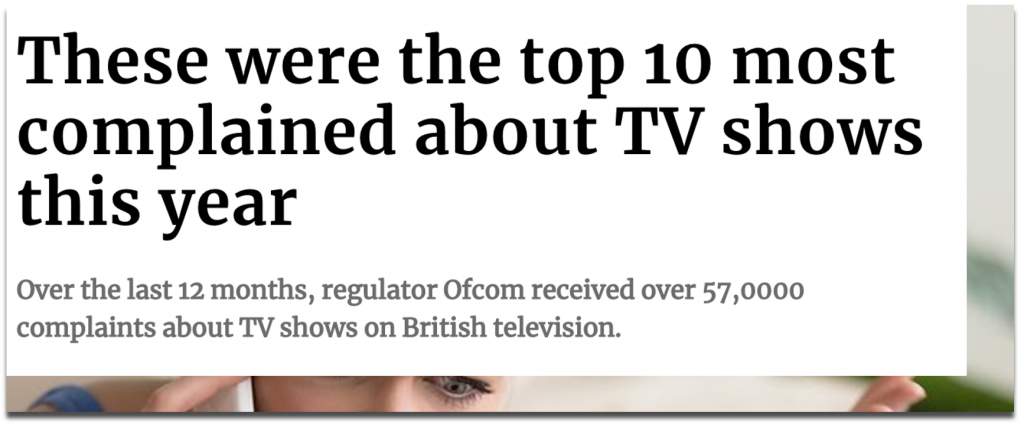
For example, the TV Tribulations campaign that we created for Buzz Bingo analysed complaints made to OFCOM and revealed which parts of the UK complain about television shows the most.
Source: scotsman.com (2019)
Even newspapers based in locations that didn’t rank highly on a national level were able to cover the campaign as we were able to provide data on their 10 most complained-about TV shows, plus how many complaints were made by that area over a given time period. It didn’t matter whether or not they were the highest ranking in the UK.
Source: manchestereveningnews.co.uk (2019)
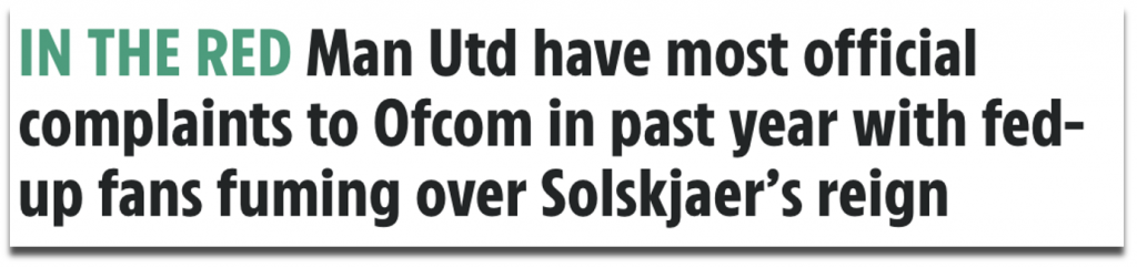
And in terms of outreach prospects, the data points were able to be split in a way that appealed to different sectors as well as different regions. Digging into the raw data of our TV complaints allowed us to reveal ‘the most complained-about radio show’ as well as ‘the most complained-about sports teams’.
“And the most complained about radio show, according to the report, was James O'Brien on LBC, who sparked 223 complaints to Ofcom during lockdown.” Monstered by @piersmorgan. Must try harder.https://t.co/4OggtziWx5
Once you’re confident that your data is available, you can ask a number of related questions that will make for a more comprehensive dataset, and which may include outliers that wouldn’t have been discovered by only asking one broad question.
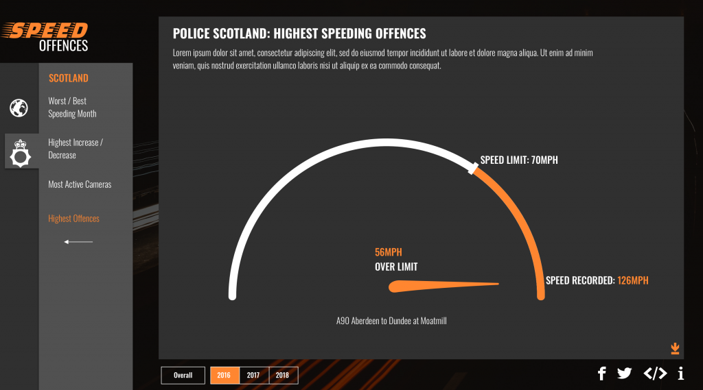
For example, depending on how sensitive the information is, you may be able to ask for more specific street-level figures rather than just a figure for an entire local authority, as we did in this GoCompare campaign called Speed Offences. This told us which roads record the most speeding offences per year (locally and nationally). Again, doing this creates an interesting story to be told for every locality, not just the outliers.
Other angles we built into this campaign included: the highest speeding offences recorded and the worst months for speeding, simply by asking for specific breakdowns.
Source: Speed Offences for Gocompare.co.uk
4. Potential pitfalls
Check for ambiguity
Accurate language is essential when crafting an FOI request.
If your request isn’t clear, it can be the difference between receiving the information you need in 40 working days rather than 20 days (after you’ve had to provide a clarification), or never.
If your request is misinterpreted and you receive the wrong kind of data, it may well be unusable and require a second request anyway.
Word the request exactly how you want the information to be delivered to you.
Describe how it should be measured, what period of time you would like it to be for, and how that time period should be split (daily, monthly, yearly?).
Oh, and specify the format. The last thing you need when compiling your responses are more than 400 councils replying with PDFs and Word Docs of data.
Consider the cost and limitations
This might seem slightly contradictory to what I mentioned about scaling up the number of angles you want to include, but you should consider the limitations of the FOI Act.
The cost limit of a request is £600 (equivalent to 24 hours of work) from a central government department, and £450 from local authorities (equivalent to 18 hours of work).
If your request is estimated by the organisation to exceed what is known as the “appropriate limit”, certain sections of the request will be refused. If your request consists of one or two questions that demand substantial work, the request may be refused outright.
If you know the data you are asking for is recorded by them, or better yet, you have done your research and seen evidence of it being published already, then the work involved in retrieving the data should fall within the cost limit.
Tip
There are more exemptions that apply to the Act, which you can read about here.
Plan ahead by sending a tester email
An FOI-led campaign can be quite a time commitment. Planning further ahead by sending an email to an organisation that asks if they have the information available is a useful step for if you want to uncover a more unique story that hasn’t been published before, but which you suspect is available from them.
Taking a longer term approach to this method of research will also give you an idea of how reliable certain organisations are in responding on time. Regardless of how much you do test in advance, a 100% response rate is unlikely to arrive within the 20-working day period that it’s supposed to.
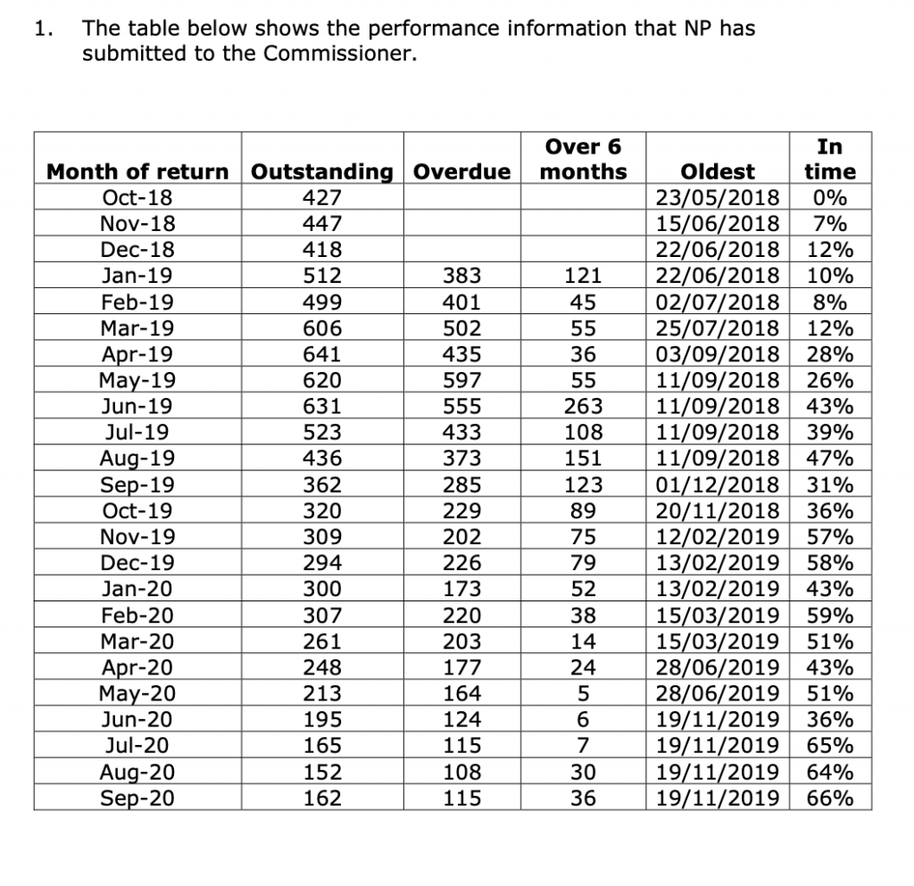
The example below from the ICO shows that between October 2018 and September 2020, Northamptonshire Police only managed to answer a maximum of 66% of their requests on time in a single calendar month. Response success rates vary among all organisations, and you can expect them to vary from month to month within each organisation.
Source: ico.org.uk
Sending tester emails further ahead would also help for you to gauge whether the information you seek is consistently measured by similar organisations. An email to a handful of universities, for example, should tell you if they record certain data on their students in the same way, before you embark on a full investigation.
Be proactive in monitoring your responses
You’re probably blessed with more research time than the average online journalist, who is busy producing upwards of eight or more articles per day. This means that your FOI-led story could be something they wouldn’t have had the capacity to produce themselves.
Equally, you’re almost certainly not blessed with as much time and autonomy as an investigative journalist, who can press the ICO for months until they receive their satisfactory response, and it’s important to remember this during the process.
Say you’ve embarked on a round-robin FOI request, and contacted all 130 UK Universities in the UK. There’s a reasonably high chance that at least a handful of them will misinterpret your request, seek clarification, or respond beyond the 20-working day timeframe — in this case, you’d be relying on at least 130 different people to get back to you with the same information in the same format.
In the interests of deadlines, sometimes you have to cut your losses on the information that didn’t arrive. At the same time, you need to closely monitor the story that is accumulating in front of you, and decide whether there is a story there at all.
Generally speaking, a two-thirds rule of responses with consistent data would be adequate for producing an analysis of UK Universities, with clarification of how many didn’t respond, but it really does depend on what you’re comparing and what the sample size of organisations is. The data that is missing could well be more valuable in constructing a story than the data that you did receive.
Seek comments and anticipate a PR response
By its very definition, the data that you’re dealing with is authoritative and within the public interest, so don’t be surprised when organisations and public figures acknowledge it and often respond to it when it concerns them. Below is one notable example…
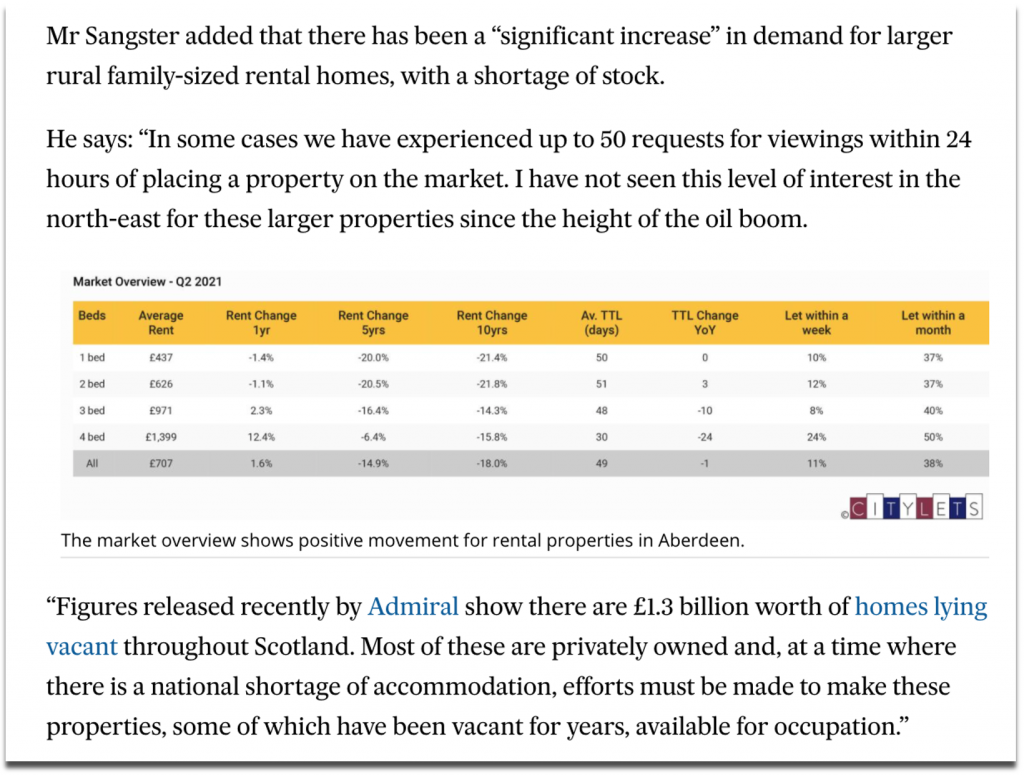
But responses are often concerned with more serious topics of public interest, such as when our empty homes valuation was quoted by a local property agent when commenting on Aberdeen’s local housing issues.
Source: pressandjournal.co.uk (2021)
Since releasing FOI-led stories and following the news coverage they receive, we’ve dealt with phone calls from a number of press offices, including NHS Trusts, councils and cultural institutions, all of whom have wanted to find out more about the data they originally sent to us.
If the main headlines that emerge from your data can be attributed to an individual or a small number of organisations, then it’s worth reaching out to them to comment. Even though a journalist will typically contact the public organisations to comment before publishing their story, doing this yourself adds valuable context and commentary to your research.
Why is your brand doing this?
This is a question that should be asked of any potential idea that is going to be published and outreached for your clients.
In the case of FOI requests, as soon as you produce content that is built on information from public bodies and take those stories to the press, the brand you’re outreaching for is influencing the reputation of other people and organisations.
Some topics may seem relevant enough to approach from a storytelling perspective in order to earn coverage for a client, but public data is sensitive and often gets politicised.
The client that you work with should be made aware of potential backlashes to an FOI-led story before an idea is deemed appropriate for them.
Interested in our content marketing and digital PR services? Get in touch.
6 questions that turn numbers into newsworthy stories
Digital PR campaigns regularly build stories out of statistics, and the questions that we ask of numbers to arrive at those stories are quite consistent.
For this post, I will explore examples of news headlines, coverage for our campaigns and content from elsewhere that can be constructed from asking the following types of questions:
1. What are the highest and lowest values? 2. What’s the grand total? 3. How much or how little has something changed? 4. What’s the proportion? 5. What are the averages? 6. How many are there?
Data is as good as the questions you ask of it
Ideas for data-driven stories often start with asking: ‘what data can I find to answer my question or to create my intended headline?’.
But even once you or your team have sourced and cleaned the data you think you’ll need, you’re unlikely to find a dataset that is ready to outreach to a journalist without also examining all of the potential stories that lurk within it.
In a similar way to how a journalist asks different questions of their sources to gain different sides to a story, why wouldn’t you ‘interview’ the data that you’re working with to consider all of the ways in which you can tell your story?
Whatever your job title (asking questions of data isn’t reserved for data analysts), remembering to explore one dataset from different dimensions can be incredibly useful throughout the process of producing content and earning linked coverage — here are some of the ways in which it applies:
Ideation: the difference between producing a new idea for a campaign from one that already exists can sometimes involve calculating a similar dataset in a different way. The idea that you already have in mind may become even stronger by considering what further steps you need to take to apply a calculation that hasn’t been applied to it before.
Production: before committing to kicking off a campaign’s production, you should have some idea of the type of story that your research is going to produce. However, properly interrogating the data that you work with ensures that no important contextual layers of a story are being missed, and it may even reveal a stronger angle than what you originally set out to find.
Execution: uncovering new trends worth visualising helps to tell a more comprehensive data-driven story. Even if certain trends don’t go on to be your headline statistic, they can supplement your narrative for users of your content and for journalists who are going to write about your findings.
Outreach: applying different calculations to a dataset can diversify the number of angles you have to outreach — more angles generally means more potential for linking opportunities. At the very least, it will provide a journalist with more context around the story that you are telling them.
Not every team follows the exact same creative and outreach process, but the following examples will provide a useful framework for anyone stuck on what to do next in their quest to find stories within numbers.
1. What are the highest and lowest values?
It’s no secret that superlatives make great news stories. The maximum and minimum values in a dataset often translate as being the outliers, or the unusual, or the best and worst of something.
In 2020, two in every five headlines that had been published about Verve Search client campaigns contained one of the words: ‘most’, ‘best, ‘top’, or ‘highest’ — the majority of them referring to the highest rankings in one of our data-driven campaigns.
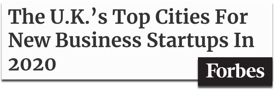
For example, when we analysed the details behind more than 6 million new business creations on Companies House, we were able to rank and reveal which UK cities and towns were enjoying the biggest boom in new start-ups in 2020.
Source: forbes.com (2020)
Ranking the highest and lowest values may often be the final step in a method of producing a story after asking other important questions of data. In the above case, we created a ranking-driven headline after our analysis also counted the number of new businesses registered on Companies House, and measured the year-on-year change in those figures.
These calculations also produced another headline figure by revealing the grand total of how many new businesses were created across every town and city in what was estimated to be a record-breaking year for UK startups forming. Summing together the key sections of data in your sample is another way to make a great headline…
Tip
Follow the links for how to find the highest and lowest values in a spreadsheet with Google Sheets, Excel or from sorting tables.
2. What’s the grand total?
How many times does a headline catch your eye with the size of the number it uses? One reason that the below headline from The Financial Times works is that behind the figure of 4,000 is a story about 4,000 humans who have lost their jobs from a single company during the COVID-19 pandemic.
Source: ft.com (2020)
The human element behind a totalvalue can help to sell it in as a headline figure, but an important consideration is whether its scale can be understood as a standalone number by the average person without needing further context. Although, sometimes, a large, eye-catching figure does do the job of providing a shocking headline before anymore context is given.
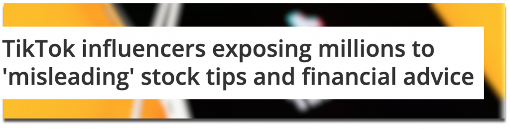
A campaign we produced called Influencer Investors analysed the scale of finance misinformation that was circulating among TikTok’s #stocktips from influencers with massive followings.
After mining through videos to calculate how frequently misleading content was appearing on the profiles of popular finance influencers, we also revealed the scale of the issue by summing together the total number of followers (28.4 million) and likes (3.6 million) that the misleading influencers and content had received.
Source: techradar.com (2021)
If you can uncover grandtotals to answer questions such as ‘how much something costs’ or ‘how many people were affected’, then you could be revealing a dataset’s most newsworthy statistic.
Even if this kind of figure doesn’t become your headline, it’s important to cite overall sample sizes as part of a transparent methodology. Add up all of the values and show off the scale of your analysis for whichever parts of your data make sense to. Journalists will usually mention this in their story along the lines of:
[Client name] analysed [sample size + metric] to discover [statistic]
Total values can become even more newsworthy when they represent a significant change…
Tip
Follow the links for how to calculate sums in spreadsheets through Google Sheets or Excel.
3. How much or how little has something changed?
Change is an essential part of storytelling. When important things change dramatically, or don’t change as expected, they often make the news. In the below investigation by the BBC, revealing howmany students sought mental health support was essential to the overall story, however, the headline focuses on that fact that more students were using mental health services than in previous years.
Source: bbc.co.uk (2019)
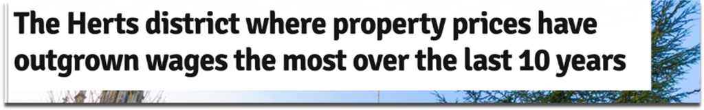
A campaign we produced called Priced-out Property revealed which locations in the UK and around the world have seen the greatest change in property affordability, based on the growing gap between earnings and property prices over recent years. Using change as our key measure meant we could consider every location with comparable historic data to produce a ranking of both positive and negative changes in affordability.
Source: hertfordshiremercury.co.uk (2021)
Another common way of converting change into a story is when a decreasing number is highlighted to indicate a ‘risk of extinction’ headline. This type of story often emerges from the Office For National Statistics’ Most Popular Baby Names dataset.
Source: flowercard.co.uk via mirror.co.uk (2020)
You may be working with data that isn’t longitudinal (i.e. doesn’t consider different time periods), such as cross-sectional survey results. That doesn’t necessarily mean you can’t suggest a change is taking place in the broader state of things.
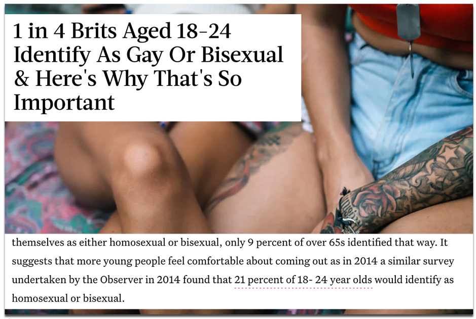
A survey-led campaign we produced called Between The Sheets asked Brits numerous questions related to their sexual activity, including what sexuality they identify as. Our insight revealed 24% of 18-24 year olds identified as either homosexual or bisexual.
Source: bustle.com (2018)
Although our data only accounted for one point in time, coverage by publications such as Bustle and The Mirror reported on this as an increase in young people identifying as gay or bisexual. They referenced a similar survey that was included in our outreach email from four years prior, which showed the figure was lower at 21%.
As well as calculating change, those headlines also incorporated proportion into their story…
Alongside other calculations, almost every campaign that I have referenced so far has included a proportional angle. Proportions tell you how large or small a number is in its relationship to a whole.
As neatly explained in an excerpt from Content hubble’s Ebook (2020), proportions provided a different perspective to the data in our Movie Mortalitycampaign, which revealed the actors who had been killed the most in their film roles:
“Without considering things proportionally, to some degree, the actor who dies the most will be a factor of who’s been in the most films. In another context, cities like London or New York will always over index for everything due to their financial power and population numbers.”
James Barnes, ‘Content hubble: 31 content campaigns that earned 11,882 links’
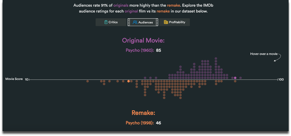
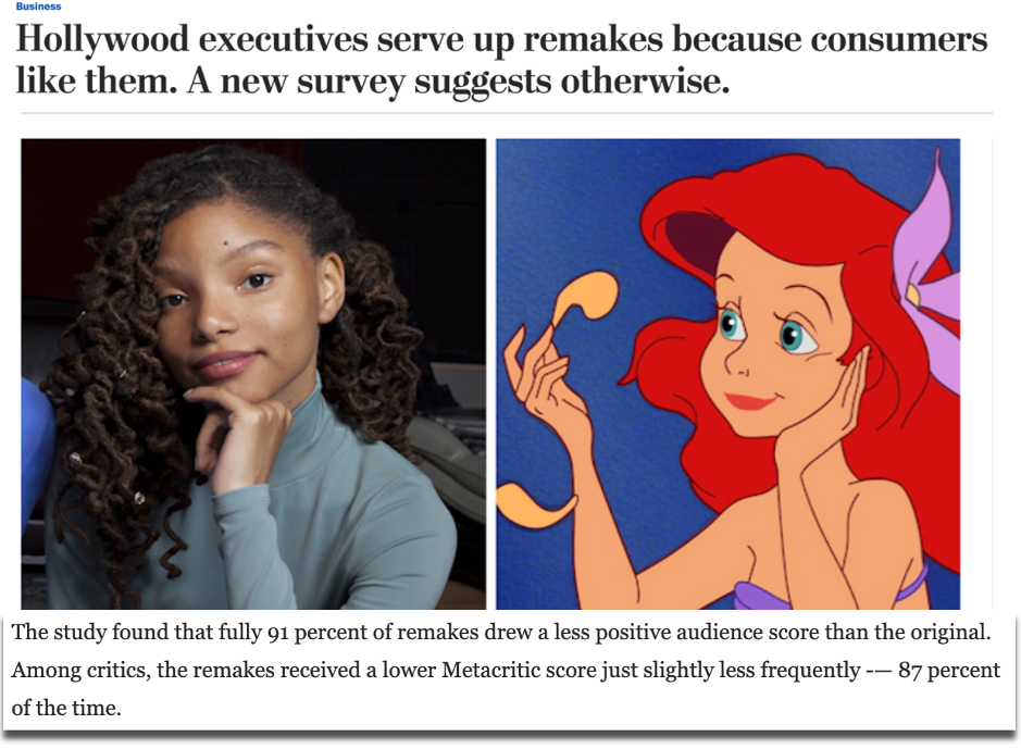
A campaign we created called Remake My Day analysed what the best and worst movie remakes were in history. This ranking of remakes according to critic and audience scores revealed little change in appetite for movie reboots, because they were consistently reviewed as worse than their original versions.
Source: Remake My Day (2019)
Based on the consistently negative reviews of remakes, we asked a broader question: what proportion of all remakes do audiences and critics actually prefer? Just 13% among critics and 9% among audiences was the answer. This angle – also indicated by the cluster of purple dots in our graph above – became the leading statistic that was covered in top tier publications, such as VICE and The Washington Post.
Source: washingtonpost.com (2019)
Our methodology for Remake My Day also relied on the movies in our dataset being pre-measured on a weighted average score, according to critic and audience reviews….
Tip
Follow the links for how to calculate percentages in spreadsheets through Google Sheets or Excel.
5. What are the averages?
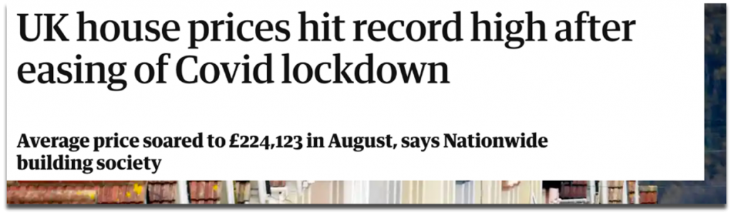
Average occurrences don’t always stop the press, but the average can be used as a benchmark to calculate who or what performs above or below it, or whether the average itself is wayward of what you would expect over a certain period of time. For example, when the average house price in the UK changes significantly, it hits the headlines.
Source: guardian.co.uk (2020)
Averages can also be useful for ranking large samples of different data points. A campaign of ours called Pioneering Women considered a sample of more than 6,900 female founders to rank universities on metrics such as how many female start-up founders had attended them and the average amount of funding raised by founders for the companies that they went on to launch.
Source: wustl.edu (2019)
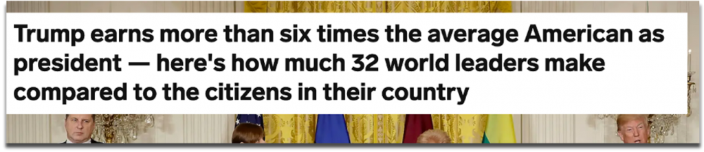
Average earnings are a particularly useful benchmark for comparing to society’s richest and (often) most talked about people. One of our most successful angles for a campaign called Pay Checkrevealed how much more world leaders earned compared to the citizens who paid their wages.
Source: businessinsider.com (2018)
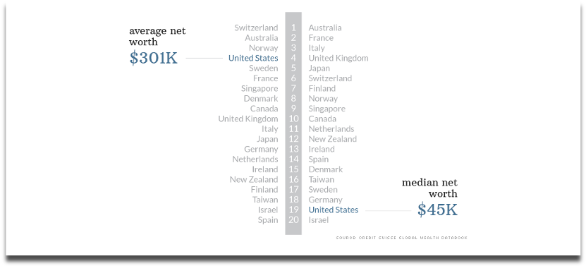
Remember to also read between averages, especially by looking at the mean and median values.
This analysis by CNN picked apart the assumption that the average American is one of the world’s wealthiest. In terms of mean net worth, which can be heavily skewed by a country’s super wealthy citizens, Americans were the fourth richest in the OECD (2014), but when you line up every individual’s net worth, the US median was actually one of the lowest.
Source: cnn.com (2014)
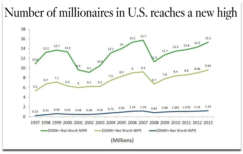
And such a vast gap between the mean and median values of a dataset may lead you to ask howmany super-wealthy people in the US there actually are.
Tip
Follow the links for how to calculate averages in spreadsheets through Google Sheets or Excel.
6. How many are there?
The same year that CNN published their analysis of the net worth of Americans, the LA Times took a different angle by counting how many households with a net worth of $1 million or more existed in the US, which turned out to be 9.6 million – a record number at the time. This is also a headline that highlights a significant change for the most recent time period.
Source: latimes.com (2014)
Counting how often a text or numerical value appears in a spreadsheet is often used to deliver a ‘best seller’, or, in the case of our campaign below, a ‘most borrowed’ type of angle. For a campaign called Well Read, we analysed three decades of lending data from UK libraries and counted which authors, novels and genres were borrowed the most.
Source: inews.co.uk (2018)
Unlike the data source we used above, you may be collecting information from multiple organisations, with the aim of comparing their data against each other. This means there could be missing data or inconsistent collection methods that can have implications, either as part of the story you’re trying to tell or in terms of whether the different datasets can be fairly compared at all.
By counting the data that was missing rather than what was present, VICE’s Broadly channel analysed and reported on 86 percent of universities failing to make any mention of stalking or abuse in their policy documents (2019).
One example of overcoming the nonuniform data collection methods that are typical of UK universities when responding to freedom of information requests came from an FOI-led survey by Uswitch. They counted UK University responses to uniform ‘yes’ or ‘no’ questions about their commitments to renewable energy to score them on a straightforward index.
Coming full-circle to the highest and lowest values again, many data-driven stories can be constructed by an index that considers multiple indicators to rank a group of data points.
Ranking locations within indexes is a common method for outreach campaigns, as it provides local journalists with stories that are targeted to their area, and because comparable towns, cities and countries tend to record all sorts of interesting data that can be spun into a story.
This is a creative approach to creating a headline out of many statistics where one statistic in isolation wouldn’t do the same. For example, there is no single metric that can determine what it means to be a hipster, but thisindex created by MoveHub compiled metrics such as the number of record shops, vintage boutiques, and vegan restaurants proportionally to the size of the local population to determine it was Brighton, UK.
Source: independent.co.uk (2018)
Indexes may be considered more comprehensive than trying to make the jump from one individual statistic to a headline, and indexes can sound impressive when a brand produces one about a topic within which they are considered an authority to name ‘the best’ or ‘worst’ or ‘capital’ of something.
However, indexes can also mask certain stories that exist behind individual metrics, which could have quite easily produced a headline on their own. We have previously analysed a similar metric to the one used in the above ‘Hipster Index’ to name the world’s most vegan-friendly capitals, based purely on the percentage of restaurants in a location that serve vegan food options. With a surprising result revealing Dublin, this is another example of the strength of one statistic built out of one question creating a strong headline.
Source: joe.ie (2019)
So be sure to consider how each data point or statistic that you’ve worked hard sourcing and analysing can produce its own outreach angle, even if it was originally intended to support an index’s methodology.
Recap
Keep an eye out for how often news stories are constructed by:
As part of your creative process, consider whether each of these methods can reveal more interesting angles about the next dataset you work with, or whether they can even form the crux of your next idea’s methodology.
There’s no guarantee that a dataset will contain a headline-worthy angle, and you may find that there is more data to source before you can build a story.
But when you do find yourself interrogating a particularly fruitful set of numbers from all of the dimensions we’ve discussed, then you could uncover numerous stories to tell as part of your content and outreach strategy, or at least be confident that you’ve found the most newsworthy statistic.
Further reading
A broader look at the process of turning data into a content marketing campaign: [1]
As well as your calculations, there are other ways to diversify your angles and ideas during the production and outreach stages of a campaign. This post discusses that process through considerations about topics and journalist sectors: [2]
3 useful resources for finding data and hunting for stories: [3] [4] [5]
Interested in our content marketing and digital PR services? Get in touch.
How brands are helping people in need during the pandemic
You don’t need to look far to find another alarming statistic or piece of bad news about the current pandemic.
But not all news needs to be negative, particularly at a time like this.
In recent weeks, social media has platformed its fair share of positivity, including Italians hosting gigs on balconies, and help and assistance being offered around the UK and Ireland to those in self-isolation via the hashtag #SelfIsolationHelp.
Good news is on the agenda
Digital PRs will be spending the next few weeks figuring out how best to approach journalists with stories during this sensitive time.
Like any topic, readers will only consume so much bad news about the coronavirus, before looking elsewhere. There have already been calls from editors and reporters at The Yorkshire Post and BBC News to remind us that “uplifting distractions and inspiration” are definitely in demand.
Which is why it isn’t surprising to see that many positive initiatives announced in the past few days have gone on to attract national press coverage.
It’s worth thinking about what positive stories your brand can tell over the next few months, which could go on to support and inspire people who need it, or at least provide them with a welcome distraction.
Positive initiatives from big brands
We have already started to see brands recognise and react to the problems that the coronavirus outbreak is causing to certain groups of people. Below we have highlighted some of these examples, which illustrate how companies can utilise their products and services as forces for good.
Acknowledging the tireless work that NHS staff are facing during the pandemic, Pret has announced that it will give all frontline staff free hot drinks and a 50% discount on food products, such as cakes and sandwiches.
The coffee and food chain has also closed off most of the seating areas in its UK restaurants, which will reduce crowding and cater more towards those who are self-isolating, thanks to a greater focus on takeaways.
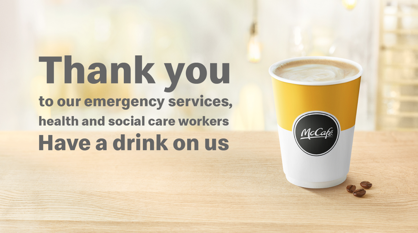
A similar initiative is being followed by McDonald’s. The fast food restaurant is offering free drinks to NHS staff, social workers and emergency services.
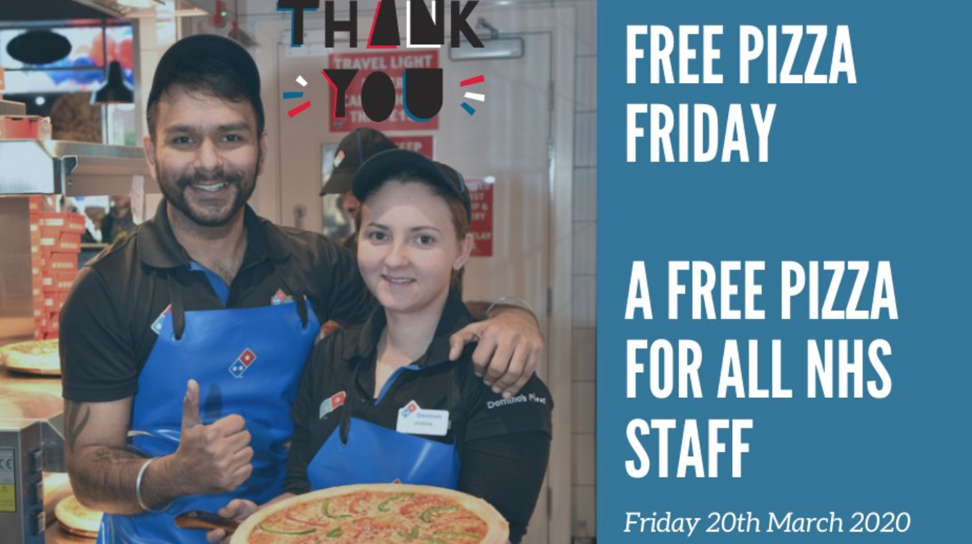
Domino’s Pizza is offering free pizza in selected stores to NHS workers on Friday 20th March.
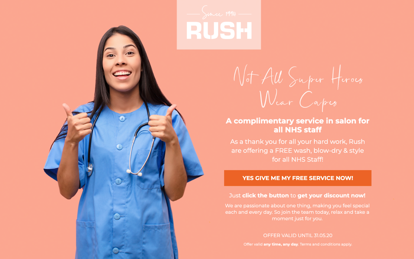
Something as simple as a trip to the hairdressers can really rejuvenate a person after a stressful day. In this second example of support being offered to NHS staff, RUSH is offering them a complimentary wash, blow-dry & style throughout what is expected to be the virus’s peak months of March, April and May.
Gigs, exhibitions and public gatherings of all kinds are being cancelled in many countries for the foreseeable future, meaning those who work within the arts and entertainment industries, especially those who rely on it as their main source of income, will be severely affected.
To support musicians during Covid-19, we’re waiving our revenue share on all sales this Friday, April 2nd, from midnight to midnight Pacific Time.
In response to this, Bandcamp announced that 100% of the profits made from purchases on their site on Friday 20th March will go directly to artists and labels. Considering that Spotify pays out less than $0.009 per stream, the amount that an artist can instead earn from unwavered fees on Bandcamp for just one day could make a considerable difference to their personal finances.
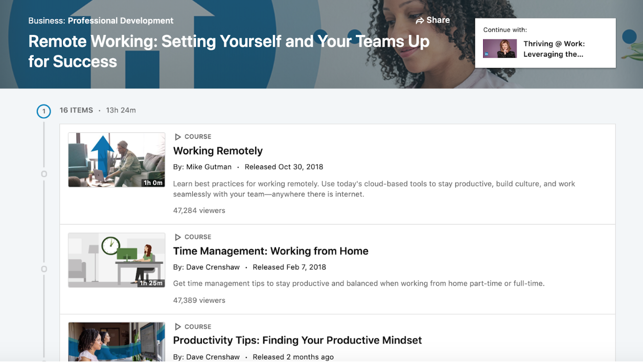
Working from home for more than a day or two is something most of us aren’t used to. Recognising that people will need plenty of tips on everything this entails, from staying productive, to managing the wellbeing of themselves and other team members, LinkedIn announced that 16 of its educational videos (equivalent to more than 13 hours of content) are now freely available to watch and learn from.
These are challenging times, and we’d like to do what we can to help. This month, we’re offering a completely free one-year subscription to Balance to anyone who wants it.
Coping with self-isolation will be challenging, and there is no telling the extent to which the pandemic may negatively impact on people’s mental health. As a helping hand, Meditation app Balance is giving people the chance to sign up to their app for a year’s free subscription, the offer is open for the duration of March.
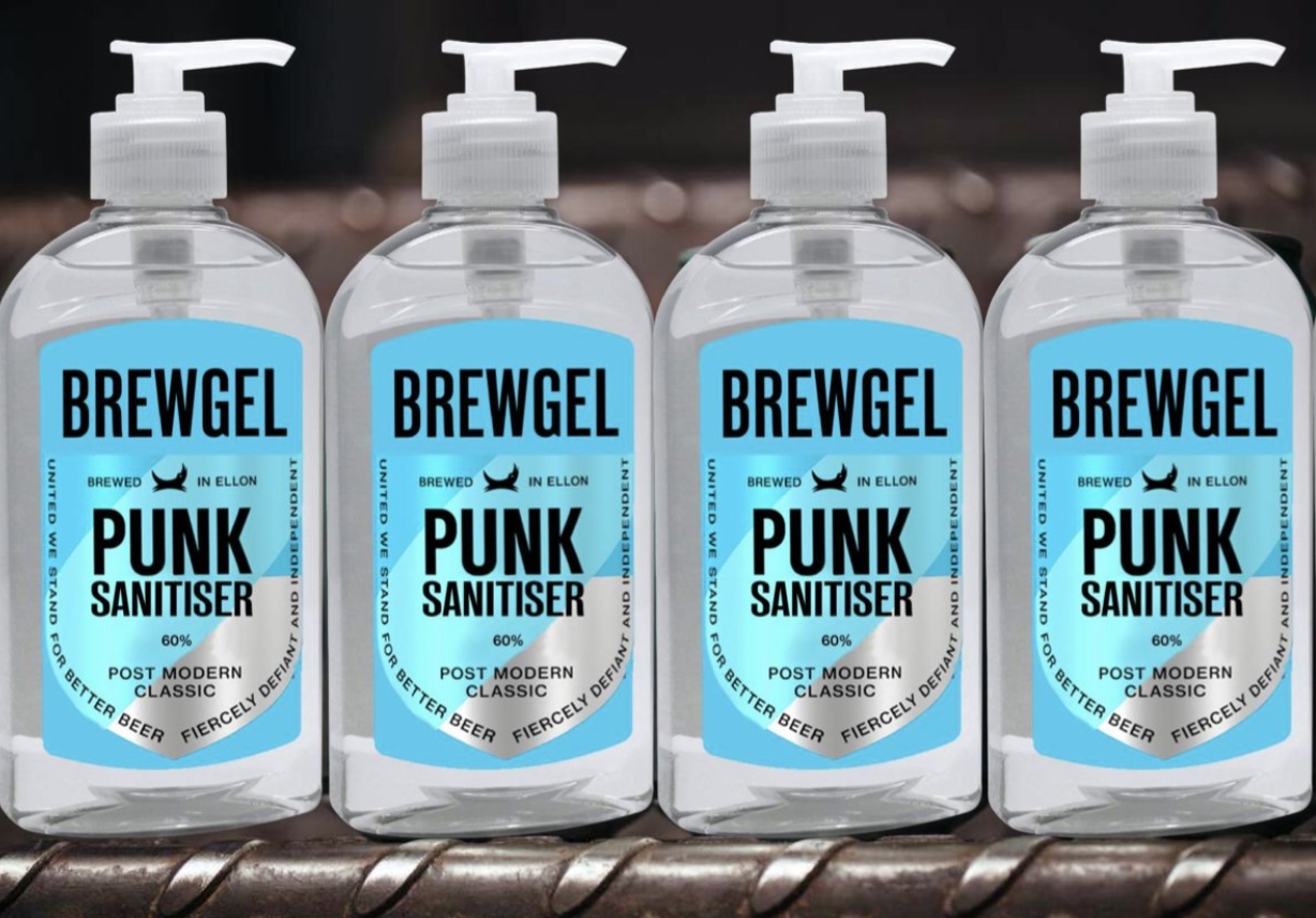
Anyone who has ventured into a supermarket this month will know that hand sanitiser is at a premium. In recognition of the issue, Brewdog has announced that it will turn its attention to producing hand sanitiser in its Scotland distillery, saying it will be freely available to those in need of it.
Natural spaces will be an essential outlet for people who are self-isolating. The National Trust has promised to open many of its parks and gardens around the country for people to get out of their homes and “use open spaces to relax and refresh”.
We're aiming to open many of our gardens and parks for free during this difficult time, so the nation can use open spaces to relax and refresh, while following the government’s social distancing guidance. We will be closing our houses, cafés and shops this week. pic.twitter.com/ETY1oEo8VZ
Stockpiling from some shoppers has meant many people in the UK have recently been missing out on everyday essentials. In response to this, Tesco announced a number of changes to how their stores will operate, so that they can “provide more of what people need in a clean and safe environment”.
The changes include: designated hours of the week for the elderly and vulnerable to complete their shopping, a limit of 3 items per shopper on every product line, and new closing hours of 10pm to ensure that stocks can be replenished and its employees can properly rest.
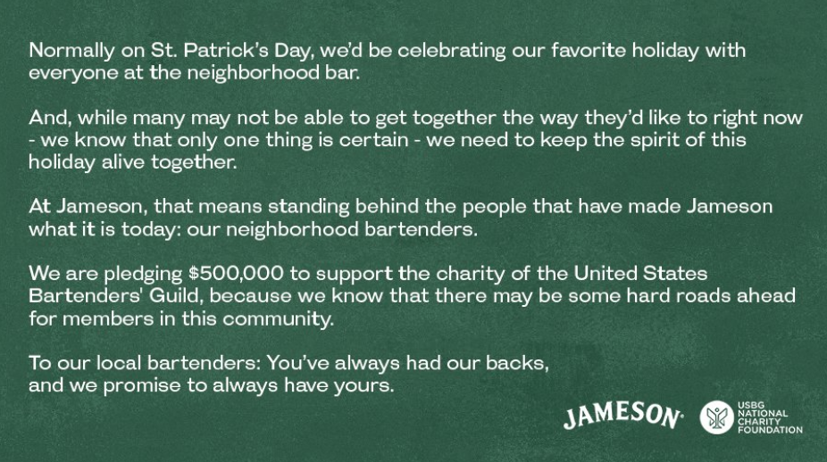
With pubs and clubs continuing to empty or close down entirely due to safety concerns about the coronavirus, bartending is another profession at-risk of unemployment and losing out on a regular pay packet. In the US, Jameson Whiskey has pledged a $500,000 donation to the United States Bartender’s Guild, an organisation that helps empower and foster collaboration between bartenders throughout their careers.
The whisky brand will also match every dollar donated by the public (up to $100,000) to the Bartender Emergency Assistance Programme, which has been established to aid service industry personnel who are experiencing financial difficulties as a result of the outbreak.
Further reading:
Outside of current events, there are plenty of companies that maintain strong ethical standards by giving something back to their communities and workers all year round. If you’d like to read more about them, check out the B Corps directory.
Adage is constantly updating this article with information on how big brands are responding to the Coronavirus outbreak.
This column from the NYTimes dissects how the coronavirus has quickly infected the content that we consume online.