6 questions that turn numbers into newsworthy stories

Digital PR campaigns regularly build stories out of statistics, and the questions that we ask of numbers to arrive at those stories are quite consistent.
For this post, I will explore examples of news headlines, coverage for our campaigns and content from elsewhere that can be constructed from asking the following types of questions:
1. What are the highest and lowest values?
2. What’s the grand total?
3. How much or how little has something changed?
4. What’s the proportion?
5. What are the averages?
6. How many are there?
Data is as good as the questions you ask of it
Ideas for data-driven stories often start with asking: ‘what data can I find to answer my question or to create my intended headline?’.
But even once you or your team have sourced and cleaned the data you think you’ll need, you’re unlikely to find a dataset that is ready to outreach to a journalist without also examining all of the potential stories that lurk within it.
In a similar way to how a journalist asks different questions of their sources to gain different sides to a story, why wouldn’t you ‘interview’ the data that you’re working with to consider all of the ways in which you can tell your story?
Whatever your job title (asking questions of data isn’t reserved for data analysts), remembering to explore one dataset from different dimensions can be incredibly useful throughout the process of producing content and earning linked coverage — here are some of the ways in which it applies:
- Ideation: the difference between producing a new idea for a campaign from one that already exists can sometimes involve calculating a similar dataset in a different way. The idea that you already have in mind may become even stronger by considering what further steps you need to take to apply a calculation that hasn’t been applied to it before.
- Production: before committing to kicking off a campaign’s production, you should have some idea of the type of story that your research is going to produce. However, properly interrogating the data that you work with ensures that no important contextual layers of a story are being missed, and it may even reveal a stronger angle than what you originally set out to find.
- Execution: uncovering new trends worth visualising helps to tell a more comprehensive data-driven story. Even if certain trends don’t go on to be your headline statistic, they can supplement your narrative for users of your content and for journalists who are going to write about your findings.
- Outreach: applying different calculations to a dataset can diversify the number of angles you have to outreach — more angles generally means more potential for linking opportunities. At the very least, it will provide a journalist with more context around the story that you are telling them.
Not every team follows the exact same creative and outreach process, but the following examples will provide a useful framework for anyone stuck on what to do next in their quest to find stories within numbers.
1. What are the highest and lowest values?
It’s no secret that superlatives make great news stories. The maximum and minimum values in a dataset often translate as being the outliers, or the unusual, or the best and worst of something.
In 2020, two in every five headlines that had been published about Verve Search client campaigns contained one of the words: ‘most’, ‘best, ‘top’, or ‘highest’ — the majority of them referring to the highest rankings in one of our data-driven campaigns.
For example, when we analysed the details behind more than 6 million new business creations on Companies House, we were able to rank and reveal which UK cities and towns were enjoying the biggest boom in new start-ups in 2020.

Ranking the highest and lowest values may often be the final step in a method of producing a story after asking other important questions of data. In the above case, we created a ranking-driven headline after our analysis also counted the number of new businesses registered on Companies House, and measured the year-on-year change in those figures.
These calculations also produced another headline figure by revealing the grand total of how many new businesses were created across every town and city in what was estimated to be a record-breaking year for UK startups forming. Summing together the key sections of data in your sample is another way to make a great headline…
 Tip
Tip
Follow the links for how to find the highest and lowest values in a spreadsheet with Google Sheets, Excel or from sorting tables.
2. What’s the grand total?
How many times does a headline catch your eye with the size of the number it uses? One reason that the below headline from The Financial Times works is that behind the figure of 4,000 is a story about 4,000 humans who have lost their jobs from a single company during the COVID-19 pandemic.

The human element behind a total value can help to sell it in as a headline figure, but an important consideration is whether its scale can be understood as a standalone number by the average person without needing further context. Although, sometimes, a large, eye-catching figure does do the job of providing a shocking headline before anymore context is given.
A campaign we produced called Influencer Investors analysed the scale of finance misinformation that was circulating among TikTok’s #stocktips from influencers with massive followings.
After mining through videos to calculate how frequently misleading content was appearing on the profiles of popular finance influencers, we also revealed the scale of the issue by summing together the total number of followers (28.4 million) and likes (3.6 million) that the misleading influencers and content had received.

If you can uncover grand totals to answer questions such as ‘how much something costs’ or ‘how many people were affected’, then you could be revealing a dataset’s most newsworthy statistic.
Even if this kind of figure doesn’t become your headline, it’s important to cite overall sample sizes as part of a transparent methodology. Add up all of the values and show off the scale of your analysis for whichever parts of your data make sense to. Journalists will usually mention this in their story along the lines of:
[Client name] analysed [sample size + metric] to discover [statistic]
Total values can become even more newsworthy when they represent a significant change…
Tip
Follow the links for how to calculate sums in spreadsheets through Google Sheets or Excel.
3. How much or how little has something changed?
Change is an essential part of storytelling. When important things change dramatically, or don’t change as expected, they often make the news. In the below investigation by the BBC, revealing how many students sought mental health support was essential to the overall story, however, the headline focuses on that fact that more students were using mental health services than in previous years.

A campaign we produced called Priced-out Property revealed which locations in the UK and around the world have seen the greatest change in property affordability, based on the growing gap between earnings and property prices over recent years. Using change as our key measure meant we could consider every location with comparable historic data to produce a ranking of both positive and negative changes in affordability.

Another common way of converting change into a story is when a decreasing number is highlighted to indicate a ‘risk of extinction’ headline. This type of story often emerges from the Office For National Statistics’ Most Popular Baby Names dataset.

You may be working with data that isn’t longitudinal (i.e. doesn’t consider different time periods), such as cross-sectional survey results. That doesn’t necessarily mean you can’t suggest a change is taking place in the broader state of things.
A survey-led campaign we produced called Between The Sheets asked Brits numerous questions related to their sexual activity, including what sexuality they identify as. Our insight revealed 24% of 18-24 year olds identified as either homosexual or bisexual.
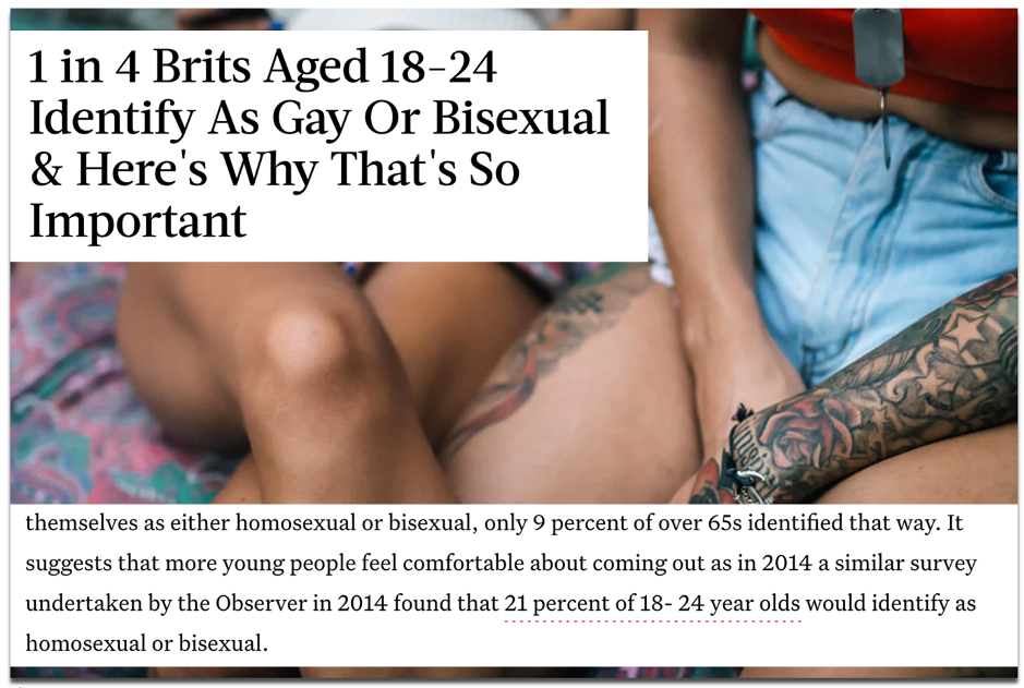
Although our data only accounted for one point in time, coverage by publications such as Bustle and The Mirror reported on this as an increase in young people identifying as gay or bisexual. They referenced a similar survey that was included in our outreach email from four years prior, which showed the figure was lower at 21%.
As well as calculating change, those headlines also incorporated proportion into their story…
Tip
Follow the links for how to calculate relative change and absolute change in spreadsheets.
4. What’s the proportion?
Alongside other calculations, almost every campaign that I have referenced so far has included a proportional angle. Proportions tell you how large or small a number is in its relationship to a whole.
As neatly explained in an excerpt from Content hubble’s Ebook (2020), proportions provided a different perspective to the data in our Movie Mortality campaign, which revealed the actors who had been killed the most in their film roles:
“Without considering things proportionally, to some degree, the actor who dies the most will be a factor of who’s been in the most films. In another context, cities like London or New York will always over index for everything due to their financial power and population numbers.”
James Barnes, ‘Content hubble: 31 content campaigns that earned 11,882 links’
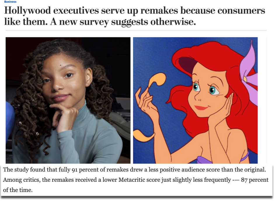
A campaign we created called Remake My Day analysed what the best and worst movie remakes were in history. This ranking of remakes according to critic and audience scores revealed little change in appetite for movie reboots, because they were consistently reviewed as worse than their original versions.
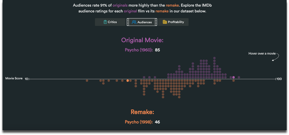
Based on the consistently negative reviews of remakes, we asked a broader question: what proportion of all remakes do audiences and critics actually prefer? Just 13% among critics and 9% among audiences was the answer. This angle – also indicated by the cluster of purple dots in our graph above – became the leading statistic that was covered in top tier publications, such as VICE and The Washington Post.
Our methodology for Remake My Day also relied on the movies in our dataset being pre-measured on a weighted average score, according to critic and audience reviews….
Tip
Follow the links for how to calculate percentages in spreadsheets through Google Sheets or Excel.
5. What are the averages?
Average occurrences don’t always stop the press, but the average can be used as a benchmark to calculate who or what performs above or below it, or whether the average itself is wayward of what you would expect over a certain period of time. For example, when the average house price in the UK changes significantly, it hits the headlines.

Averages can also be useful for ranking large samples of different data points. A campaign of ours called Pioneering Women considered a sample of more than 6,900 female founders to rank universities on metrics such as how many female start-up founders had attended them and the average amount of funding raised by founders for the companies that they went on to launch.

Average earnings are a particularly useful benchmark for comparing to society’s richest and (often) most talked about people. One of our most successful angles for a campaign called Pay Check revealed how much more world leaders earned compared to the citizens who paid their wages.

Remember to also read between averages, especially by looking at the mean and median values.
This analysis by CNN picked apart the assumption that the average American is one of the world’s wealthiest. In terms of mean net worth, which can be heavily skewed by a country’s super wealthy citizens, Americans were the fourth richest in the OECD (2014), but when you line up every individual’s net worth, the US median was actually one of the lowest.
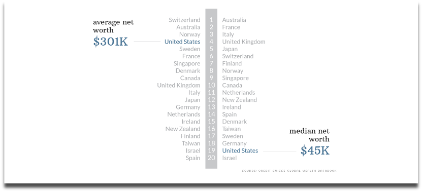
And such a vast gap between the mean and median values of a dataset may lead you to ask how many super-wealthy people in the US there actually are.
Tip
Follow the links for how to calculate averages in spreadsheets through Google Sheets or Excel.
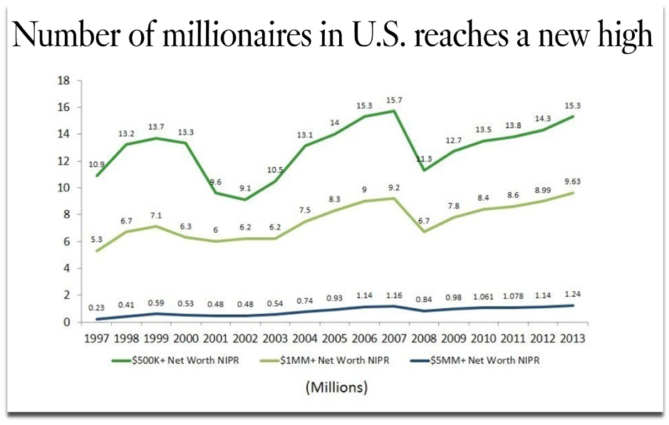
6. How many are there?
The same year that CNN published their analysis of the net worth of Americans, the LA Times took a different angle by counting how many households with a net worth of $1 million or more existed in the US, which turned out to be 9.6 million – a record number at the time. This is also a headline that highlights a significant change for the most recent time period.
Counting how often a text or numerical value appears in a spreadsheet is often used to deliver a ‘best seller’, or, in the case of our campaign below, a ‘most borrowed’ type of angle. For a campaign called Well Read, we analysed three decades of lending data from UK libraries and counted which authors, novels and genres were borrowed the most.

Unlike the data source we used above, you may be collecting information from multiple organisations, with the aim of comparing their data against each other. This means there could be missing data or inconsistent collection methods that can have implications, either as part of the story you’re trying to tell or in terms of whether the different datasets can be fairly compared at all.
By counting the data that was missing rather than what was present, VICE’s Broadly channel analysed and reported on 86 percent of universities failing to make any mention of stalking or abuse in their policy documents (2019).
One example of overcoming the nonuniform data collection methods that are typical of UK universities when responding to freedom of information requests came from an FOI-led survey by Uswitch. They counted UK University responses to uniform ‘yes’ or ‘no’ questions about their commitments to renewable energy to score them on a straightforward index.
Tip
Follow the links for how to count data in spreadsheets through Google Sheets or Excel, or by counting cells for specific criteria.
Compiling your metrics into an index
Coming full-circle to the highest and lowest values again, many data-driven stories can be constructed by an index that considers multiple indicators to rank a group of data points.
Ranking locations within indexes is a common method for outreach campaigns, as it provides local journalists with stories that are targeted to their area, and because comparable towns, cities and countries tend to record all sorts of interesting data that can be spun into a story.
This is a creative approach to creating a headline out of many statistics where one statistic in isolation wouldn’t do the same. For example, there is no single metric that can determine what it means to be a hipster, but this index created by MoveHub compiled metrics such as the number of record shops, vintage boutiques, and vegan restaurants proportionally to the size of the local population to determine it was Brighton, UK.

Indexes may be considered more comprehensive than trying to make the jump from one individual statistic to a headline, and indexes can sound impressive when a brand produces one about a topic within which they are considered an authority to name ‘the best’ or ‘worst’ or ‘capital’ of something.
However, indexes can also mask certain stories that exist behind individual metrics, which could have quite easily produced a headline on their own. We have previously analysed a similar metric to the one used in the above ‘Hipster Index’ to name the world’s most vegan-friendly capitals, based purely on the percentage of restaurants in a location that serve vegan food options. With a surprising result revealing Dublin, this is another example of the strength of one statistic built out of one question creating a strong headline.

So be sure to consider how each data point or statistic that you’ve worked hard sourcing and analysing can produce its own outreach angle, even if it was originally intended to support an index’s methodology.
Recap
Keep an eye out for how often news stories are constructed by:
1) rankings
2) grand totals
3) change
4) proportion
5) averages
6) counting
As part of your creative process, consider whether each of these methods can reveal more interesting angles about the next dataset you work with, or whether they can even form the crux of your next idea’s methodology.
There’s no guarantee that a dataset will contain a headline-worthy angle, and you may find that there is more data to source before you can build a story.
But when you do find yourself interrogating a particularly fruitful set of numbers from all of the dimensions we’ve discussed, then you could uncover numerous stories to tell as part of your content and outreach strategy, or at least be confident that you’ve found the most newsworthy statistic.
Further reading
- A broader look at the process of turning data into a content marketing campaign: [1]
- As well as your calculations, there are other ways to diversify your angles and ideas during the production and outreach stages of a campaign. This post discusses that process through considerations about topics and journalist sectors: [2]
- 3 useful resources for finding data and hunting for stories: [3] [4] [5]
Interested in our content marketing and digital PR services? Get in touch.