5 of my favourite data viz talks from Outlier 2021

I was given the opportunity to attend the inaugural Outlier 2021 conference hosted by the Data Visualization Society. It featured 41 inspirational talks given by people who work across different industries, each with unique and varying levels of experience in their data visualisation specialisms.
There were so many talks to choose from, but I’ve narrowed down five that will help to reframe how you think about the process of creating impactful data visuals.
1. How do we translate cultural experiences into data stories?
Hosted by Isabella Chua & Mick Yang (Kontinentalist)
The talented team at Kontinentalist create engaging data stories that unpack cultural experiences to gain a better understanding of cultural trends.
In their talk, I learnt the following tips to create a compelling data story that translates other cultures:
- Find an angle that is proudly niche
If you are translating your own cultural experience, do it with pride and communicate it with an urgency that suggests if you don’t tell your story about your experiences then other people won’t be able to either.
Explore a particular angle of interest in-depth, rather than being too wide-ranging in exploring a number of angles at surface level.
This can be something as simple as introducing one lesser-known artefact or phenomenon from your culture and communicating it in a way that educates and informs a wider audience from outside of your culture.
- Unpack diversity within your angles to explain how certain phenomena are experienced within that culture.
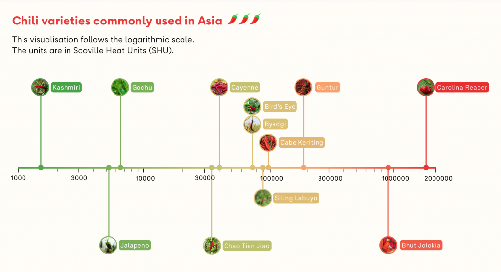
This can mean helping your audience to understand the ways in which cultural phenomena interact with the lives of different groups in that culture (e.g. What’s the big deal about chilli in Asia?).
In this example, chillis provided an excellent window for exploring Asian cuisines and the influence that chillis have upon many dishes.
The author began his analysis by asking ‘was spicy food popular in Asia?’. But the yes-no nature of the question provided added complications to finding a definitive answer to something not comprehensively documented, so he refined his analysis to explore ‘what ways spiciness – in particular, chillis – were experienced in Asia’, which was more open-ended and allowed for unpacking the answers in a less binary fashion.
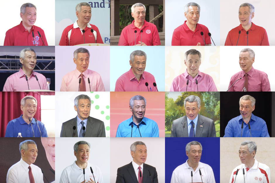
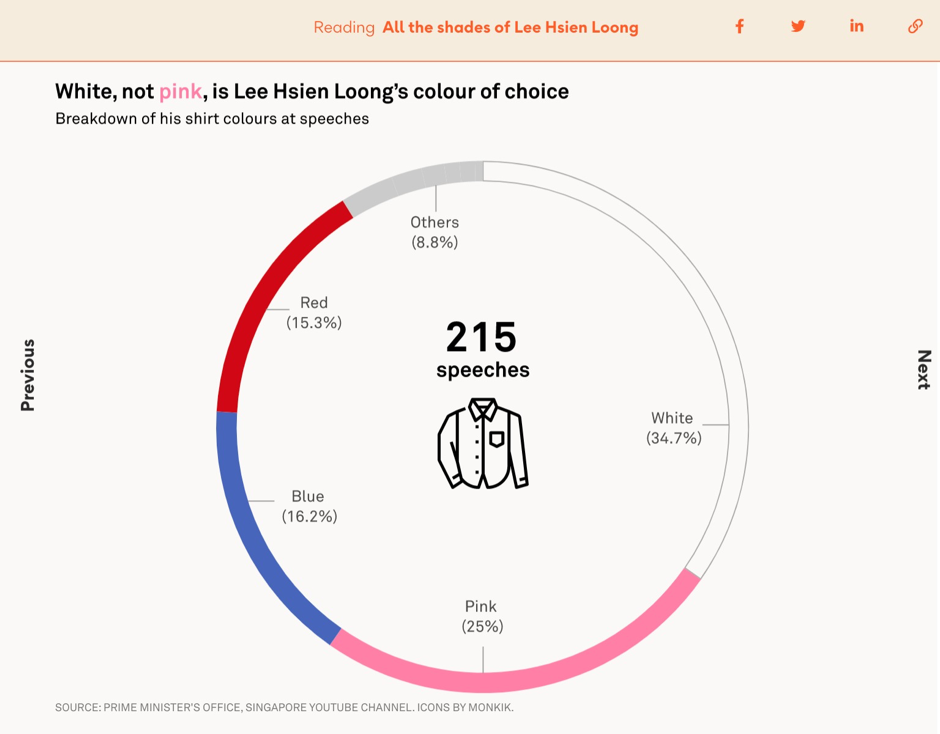
- Test conventional wisdom to dispel common myths (e.g. All the shades of Lee Hsien Loong).
It’s a common myth that the Singaporean prime minister Lee Hsien Loong mostly wears pink shirts. After collecting data on all the shirt colours he’d worn during PM speeches it was revealed that his most commonly worn colour was actually white.
- Quantify the intangible
Some cultural phenomena might have a concept that is quantifiable (e.g. the popularity of different noodle brands).
But even if there isn’t an obvious quantifiable metric, you can translate the qualitative stuff by providing a rich visual experience via maps, audio or illustrations to convey the theme, atmosphere and cultural significance of your story’s topic.
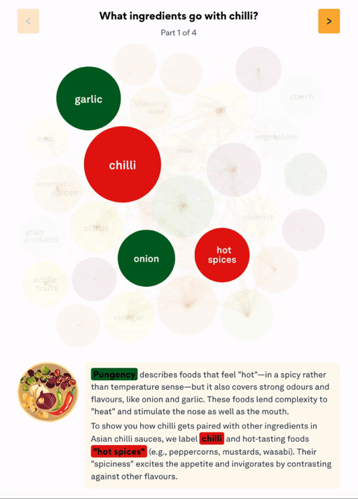
In the below example, colours were used to convey the different dimensions of flavour used in Asian cuisine. Additionally a packed circle chart was used to visualise common ingredients in chilli dishes with chords connecting circled ingredients that go well together.
- Balance accuracy and understanding to ensure that the data is well presented and easy to understand.
The above visualisation of ‘ingredients that go with chilli’ is actually a condensed version of more than 100 different bubbles that had to be indexed on a scale of between 1 to 9 flavours (such as ‘sweet and sour’).
While this is a less accurate representation of the very distinct flavours that exist within these many ingredient combinations, the authors felt this struck the right balance between beauty and simplicity. They were able to provide more detail through the illustrations and text boxes that more curious readers could explore.
 Tip
Tip
Providing a clear and transparent methodology and documenting every step of the process behind how you arrived at your visualisations will help balance accuracy with understanding for your audience even more.
- Find a common ground
It can be easy to over-explain when trying to tell a story about one culture to an audience outside of that culture.
Here, they recommend anchoring the angle of the cultural experience that you’re trying to analyse to a more universal sentiment.
In the talk, they used an example of relating the cultural tradition of new year fortune telling to people’s universal anxiety about the future and our well wishes for loved ones, or of the popularity of instant noodles in Asia to every culture’s respective love for certain comfort foods.
2. 3D Geo DataViz: From Insight to Data-Art
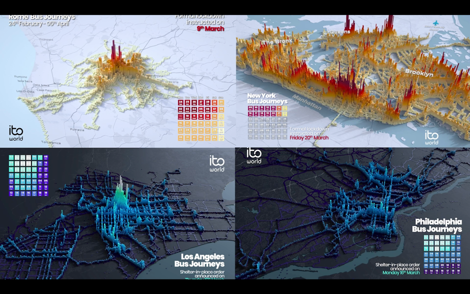
Hosted by Craig Taylor (Senior Data Visualisation Design Manager, Ito World)
Craig and his team at Ito World create narrative-driven and cinematic-looking 3D visualisations.
Craig’s talk focused on how he and his team create insight-driven visualisations that reveal how the systems we interact with impact our lives. In his talk, he explained that producing this type of visualisation requires that you:
- Include granular data, since it yields more interesting results. For example, for Ito World’s project Transit In Motion, the dataset for New York City included 14.8 million locations recorded per day, 4,488 unique bus trips, and 2GB of CSV files.
- Focus on the patterns that your data is creating over time. For Transit in Emotion, this involved analysing the volume of transit usage over the period of one month.
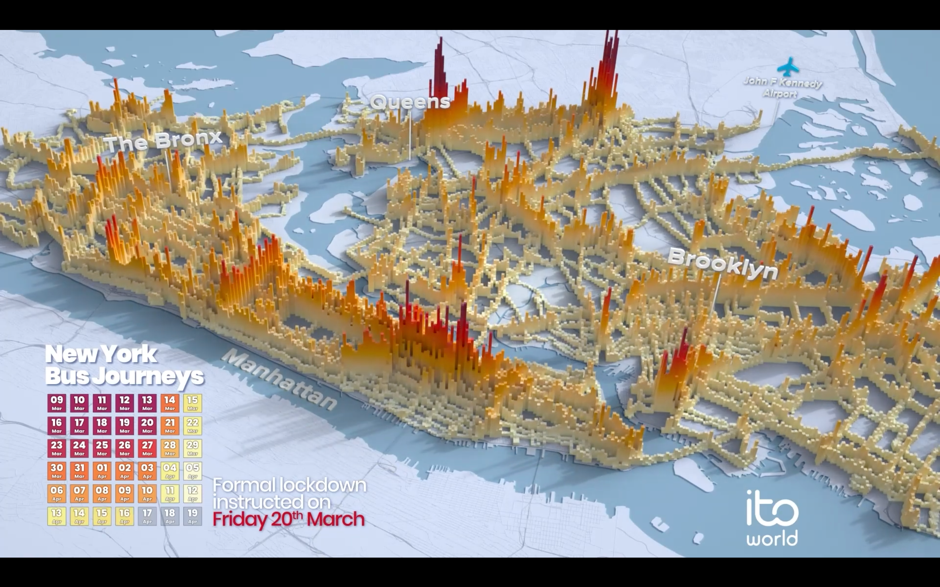
- Make your visualisation’s design abstract to highlight the rhythm of your data over time. In the past, Craig has used a variety of spheres, cuboids, and meshes to portray what city-wide transit in motion looks like.
 Tip
Tip
If you’re interested in making 3D data art, Houdini and Blender (which is free) are recommended.
3. DataViz, the Unempathetic Art
Hosted by Mushon Zer Aviv
Mushon is a Tel Aviv based designer, researcher, educator, and media activist. His talk highlighted how data viz can lack empathy, and takes inspiration from the following quote:
“If I look at the mass I will never act. If I look at the one, I will.”
— Mother Teresa
To ensure that your work is empathetic, Mushin says you must be aware of:
- Dark data viz, which risks tone-deafness and minimising important topics.
In 2015, Mathew Lucas produced a series of infographics showing the impact of the atomic bombing in Hiroshima. Although the graphics were visually pleasing, this data viz also sparked debate, with some questioning how design should be used to aestheticise a horrific event.


- How an appeal to empathy can be misleading
Mushon cites Professor of Psychology Paul Bloom who says empathy often shines a spotlight on the individual and can be biased towards those who look like us. We find it easier to empathise with individuals, not with the masses.
He also references a study from Paul Slovic in the talk, which further illustrates this idea with what he calls ‘statistical numbing’ whereby audiences seem to empathise more with individuals than with larger groups.
In Slovic’s research he found that charity donations in response to descriptions about identifiable individuals earned more than double the donation value in response to descriptions about statistical lives (i.e. groups of individuals that weren’t personally identifiable). Sadly, the value of donations even decreased when statistics were presented alongside individual descriptions in the story.
- Affective empathy vs cognitive empathy
According to Simon Baron-Cohen, affective empathy, which is rooted in emotion, means that you’re able to feel the same emotion or feel your own distress in response to another’s pain.
Cognitive empathy, which is more rational, means that you’re able to understand someone’s perspective or imagine what it’s like in another person’s shoes.
Muson relates these two types of empathy to Daniel Kahneman’s distinction between two ways of thinking:
Tier 1 thinking: thinking automatically, quickly, with little or no effort and sense of voluntary control.
Tier 2 thinking: allocates attention to the effortful mental activities that demand it. These type of operations are often associated with the subjective experience of agency, choice and concentration.
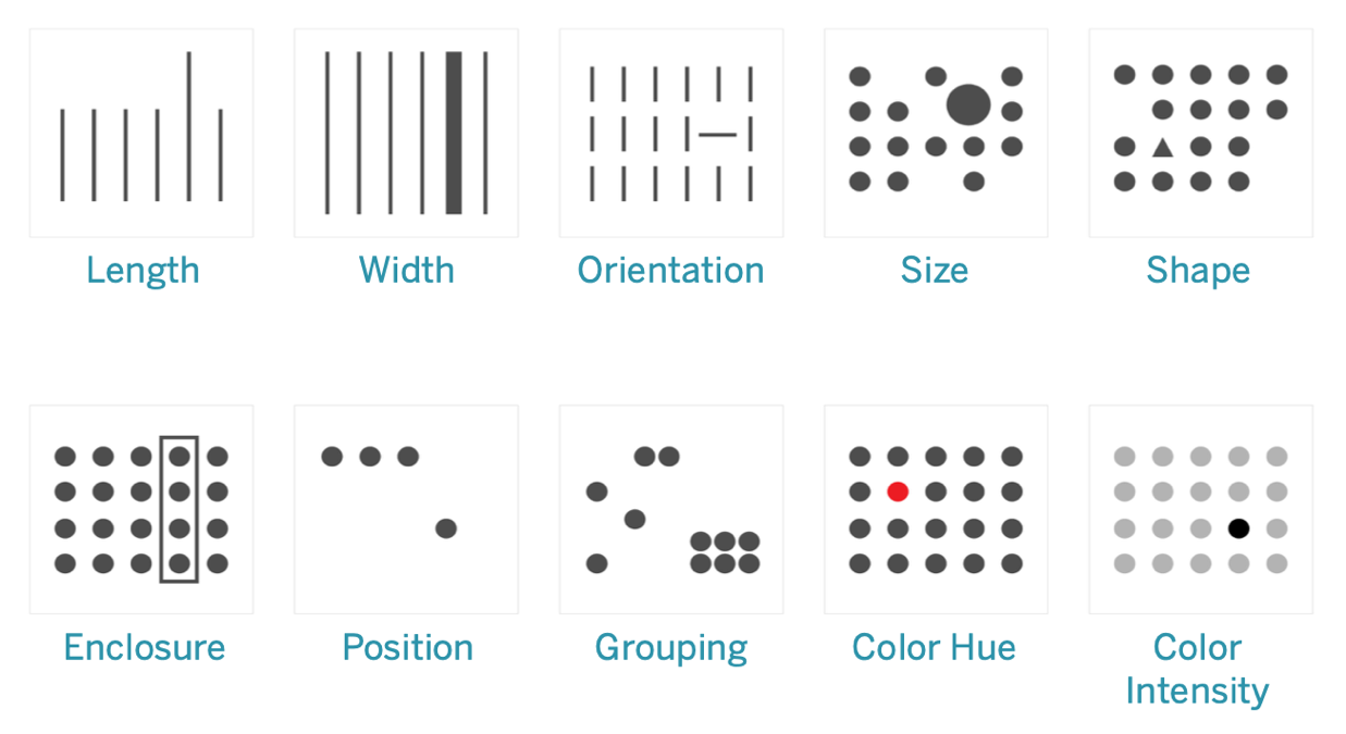
It is said that Tier 2 often contextualises the thinking of Tier 1 to inform a person’s decision-making. In visualisation, the pre-attentive attributes (below) are how we use vision to communicate between Tier 1 and Tier 2. So here Mushon asks ‘can we think of empathy as an additional pre-attentive attribute for visualisations?’ because we do not get to control or rationalise it, but it can inform our more deliberate decisions.
- How to scale compassion by appealing to both types of empathy
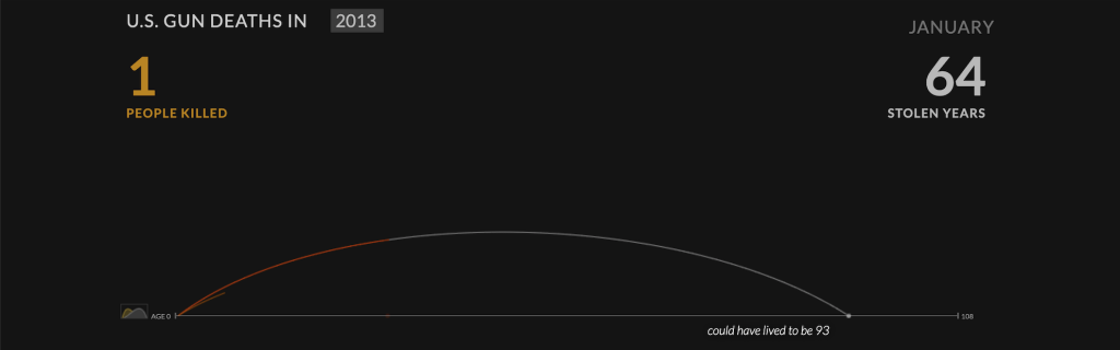
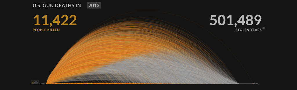
The above image is a powerful visualisation of gun deaths in America during a single year. It begins by illustrating the life arc of one person being cut in the middle vs how many more years they could have lived for.
Focussing on a single individual’s life being cut short appeals to the viewer’s affective empathy or tier 1 thinking, aka the more emotional response, before the impact of another 11,422 deaths are visualised in the same manner as below.
- Raising awareness is not enough
Data visualisations have the power to explore and explain important stories about the world.
However, it’s not enough to just say something is wrong with the world. If we have built that message well, then we should also direct that message towards the path of change and actionable insights.
4. Data points are people too
Hosted by Bronwen Robertson, Joachim Mangilima, Saja Othman, Zdeněk Hynek
Data4Change is a non-profit organisation based in London that connects social change organisations with designers, journalists, and technologists to collaboratively create data-driven solutions for some of the world’s most pressing problems. This talk focused on many of their projects which have helped to deliver change in countries around the world.
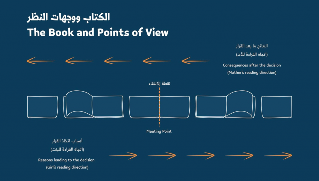
An example of this is ‘A Bride With A Doll‘, which focused on the issue of child marriage. The team designed a workshop kit and a storybook that could be read from both directions, reflecting emotional experiences, based on data insights from the community.

5. Mind Games: The psychology behind designing beautiful, effective, and impactful data viz
Hosted by Amy Alberts (Senior Director, User Research, Tableau)
This talk outlined practical guidelines which can help you predict where people look at certain parts of data viz – for example, jagged lines and bar graphs are effective at drawing the user’s attention.
Amy’s team at Tableau have previously employed eye-tracking software to discover where people were focusing, gaze plots to qualitatively and quantitatively show where the eye is fixated, heatmaps to show areas of high visual tension, and gaze opacity maps to highlight areas that people give less attention.
According to their findings, the biggest attention grabbers in data visualisation are:
- BANS (Big Ass Numbers) – Our eyes are drawn to large visual elements such as big text. Below is a gaze opacity map of a dashboard with big numbers.

- Colour – Visual contrast relative to other areas generates attention.
- Humans and maps – Our brains are hardwired to notice other humans, so when we see human-like figures in visualisations, we are automatically drawn to them. If maps and humans are relevant to your data, it is worth capitalising on this to draw attention.
Design with intent and be mindful of the context that you control. Use clear titles and high contrast elements, ethically making use of the psychological phenomenon known as the priming effect. This will help to ensure that your audience clearly understand the story that you are trying to tell with your data.
Final thoughts
The Outlier conference was incredibly informative and packed with so much knowledge about how to create culturally relevant, socially aware content that’s also visually impressive and effective in communicating concepts.
If you are interested in learning more, you can watch a playlist of video recordings with all of the talks from Outlier 2021.
Interested in our content marketing and digital PR services? Get in touch.