Data. The not-so-secret weapon of most businesses. It’s far more than just numbers in a spreadsheet – it has the power to reveal incredible stories and newsworthy content – but if you’re at the beginning of your data analysis journey, it can be daunting to know where to begin.
Fret not, though. Let us guide you through the best ways of unlocking the potential of your data.
There are so many ways to streamline and enhance your analysis to ensure your numbers are rock solid. With these processes, your PR campaigns can become storytelling masterpieces that journalists and readers can’t help but engage with.
From understanding what your campaign objectives are to having the best data tools for the job, it’s all about what you know and how you use it.
Here at Verve Search, data is the cornerstone of our digital PR work, creating original and exciting content that is bespoke to each brand we work with. Our award-winning campaigns are proof that good data and analysis are imperative if you want to make an impact.
Here’s exactly what we do collect, process, and analyse data for our digital PR campaigns.
Step 1: Campaign Objectives
Remember those objectives we just mentioned? They should be the first steps towards creating streamlined data campaigns.
But to achieve your campaign objectives you must first navigate what they are. Identifying clear and measurable goals can help focus and guide your analysis more effectively.
This involves asking questions like:
- What problems are you trying to solve? – This depends on the idea as well as client input.
- What metrics are best suited to the analysis? –This will depend on the angles you expect to pull out from the data and what you think will appeal to journalists the most.
- What is the time frame of the project? – This will impact the scope of your campaign.
Once you’ve answered these questions, you’ll be well on your way to understanding what you need to do to get there.
Step 2: Data Collection
Once you have laid out your campaign objectives, now is the time to make them come to life with data collection. In data-driven campaigns, there are countless data sources that can be used as the basis of the idea – and they often require different methods of collection.
Clients may offer up their internal data or you may have to go scraping the web to create your dataset. It’s useful to know what criteria make a good quality source while gauging whether they are suitable for your campaign, as well as how you can use them to your advantage and how long it will take to gather the data from them.
Looking for potential data sources that don’t require web scraping? Here are some examples:
Government Websites
Government websites like gov.uk or usa.gov hold extensive amounts of publicly available data across a broad range of topics and industries; all you need to do is hit download on whichever file you need.
For example, we leveraged government housing and land registry data to create Forever Homes and Priced Out Property campaigns. This created relevant, trustworthy, and newsworthy content that generated hundreds of links, whilst also keeping it super relevant for the brand.
APIs
Many websites offer an ‘API’ (Application Programming Interface) which gives access to their data in a clearly formatted and relatively accessible way.
For example, the Spotify API is free and all you need to do is sign up for a developer account to have access to the API keys that are required.
There are a few different ways to incorporate an API for data collection, but for one example, Python was our tool of choice. With it, we collected data for a music-focused campaign for a language tutoring client.
For them, we produced a lyric study which looked at the number of syllables in rappers’ songs. It relied heavily on Spotify’s API, as it allowed us to access a variety of metrics ranging from general song/artist information to scores of different elements of a song. In this case, “speechiness” was the most important metric to score how wordy each track was.
Freedom of Information Requests
Why not request information from a public authority? Freedom of Information (FOI) requests are a great way to gather credible data by leveraging your right to information. You have the right to ask for recorded information held by public authorities including government departments, the local council, and the police and fire services. All this information is free to access.
Keep in mind that if you’re contacting departments from all over the country, you will need to carefully craft your request so that the data you receive is in a consistent format. This makes it much easier when it comes to analysis.
Surveys
If you want truly original data, there is no better collection method than an organic survey. Carefully crafted questions will yield useful results and easily analysable data.
We leveraged first-hand survey data to create a campaign focused on female health for a fem-tech brand, analysing responses from around 10,000 users. The results yielded many headline-worthy statistics, and the real-life opinions and answers were fundamental to the campaign.
Just keep in mind that collecting first-hand data like this can often be expensive, so make sure to bake that cost into your campaign’s budget.
Step 3: Data Processing
Before you can start to analyse the heaps of data you’ve collected, it’s key to first process your data.
Processing is the most important step and often referred to as ‘cleaning your data’. It ensures your analysis will be smooth and produces accurate results by making everything you’ve collected consistent.
The two main tools that will be referenced – and that we use continuously – will be Excel and Pandas (a data analysis module of Python, particularly useful for larger datasets that may sometimes crash Excel).
Remove duplicates
Excel’s built-in ‘remove duplicate’ function can do this for you. Alternatively, the Python library, Pandas has a similar function (drop_duplicates). More on the best data tools later…

Checking for errors or missing values
Pivot tables, built into both Excel and Pandas, are your best friend for getting an overview of your data and easily checking issues before analysis.
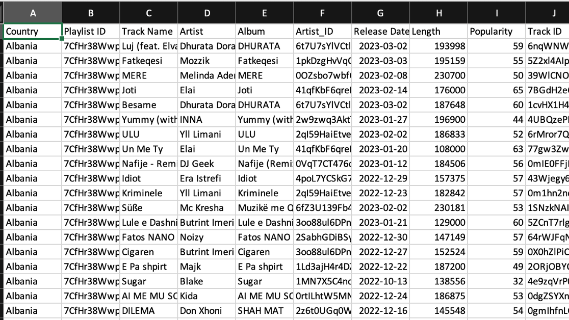
They allow you to check for anomalies and outliers within your dataset and summarise key metrics while also allowing you to filter and separate different columns for analysis. Below is an example of raw data for a potential campaign, which as you can see, would be difficult to analyse in its current form…
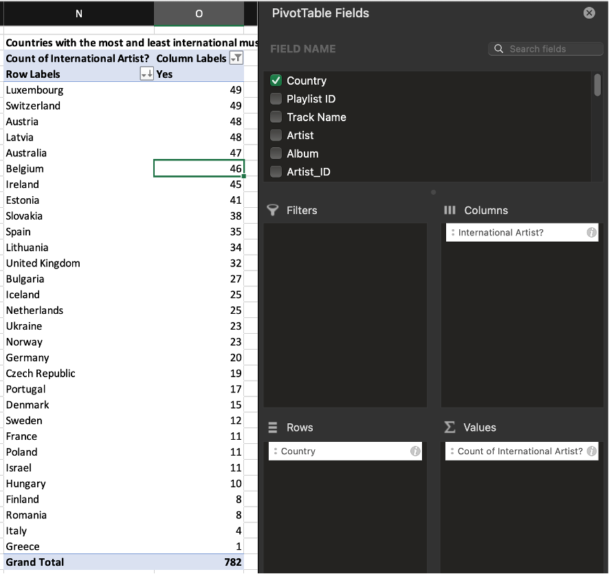
This is why we put it into a pivot table, as shown below. By selecting the individual columns to analyse, it is in a much more digestible format to pick out insights.
This specific table shows the number of international artists within the singles charts of each country and many more columns can be joined together with this, such as comparing Tempo scores by country to see which one has the most upbeat music.
Credit: Verve Search
Checking for and removing anomalies
Anomalies can disrupt analysis and interfere with useful results. They may occur for all kinds of reasons, but the most common is incorrect data collection. As mentioned above, pivot tables can help to identify anomalies, or even using Excel’s filter function: filter by ascending or descending order and you can see anomalous pieces of data, depending on your dataset.
Transforming
Any unchecked formatting may cause issues down the road, so check that your data is in the same format. Double-check that your columns are the data type you want them to be, including numbers, text and dates.
Sometimes numbers will be imported as text and need to be changed. If working with multiple data sources, they will need to be uniform across the board to prevent having to continuously refer to the original datasets to avoid confusion further along the analysis process.
Step 4: Data Analysis
With processing complete, you’re now ready to dive into data analysis.
Firstly, refer to your objectives. Check the initial goals to make sure your analysis still aligns with them and whether they’re still achievable with what you’ve got.
Make sure to explore your data. Most analysis can be done with pivot tables, either in Excel or Python.
Then visualise your data. Once you have dived into the data with pivot tables, you can use them to create charts and graphs that clearly represent the data. Your visualisations should make it obvious to anyone who takes a glance what the data is showing (refer to the data vis catalogue for inspiration).
Finally, it’s time to tell a story. Once trends have been identified and visualisations have been created, crafting a narrative around these findings will be what sets your campaign apart.
Pull out key statistics and create headline-worthy points from your analysis. Focus on making your points digestible for everyone, like opting for percentages rather than raw numbers as this will be clearer to both journalists and readers.
Data Analysis
Just like Batman, data analysts have a variety of tools in their utility belt. Below are the ones that we use the most day-to-day, to help us with steps in processes from planning to data analysis.
Excel
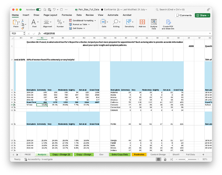
Hate it or love it, Excel is a necessary tool used for viewing, interpreting, and analysing data. Using pivot tables form a large part of the analysis process which is one of many useful functions that Excel contains.
Python Interpreter
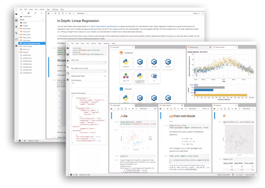
To write and run Python scripts, you need a Python interpreter. This is always down to personal preference, but we prefer using Jupyter Notebook/JupyterLab to run code in a more modular fashion as opposed to a whole script at once. Not your cup of tea? Look to alternatives including VS Code and Pycharm.
Python
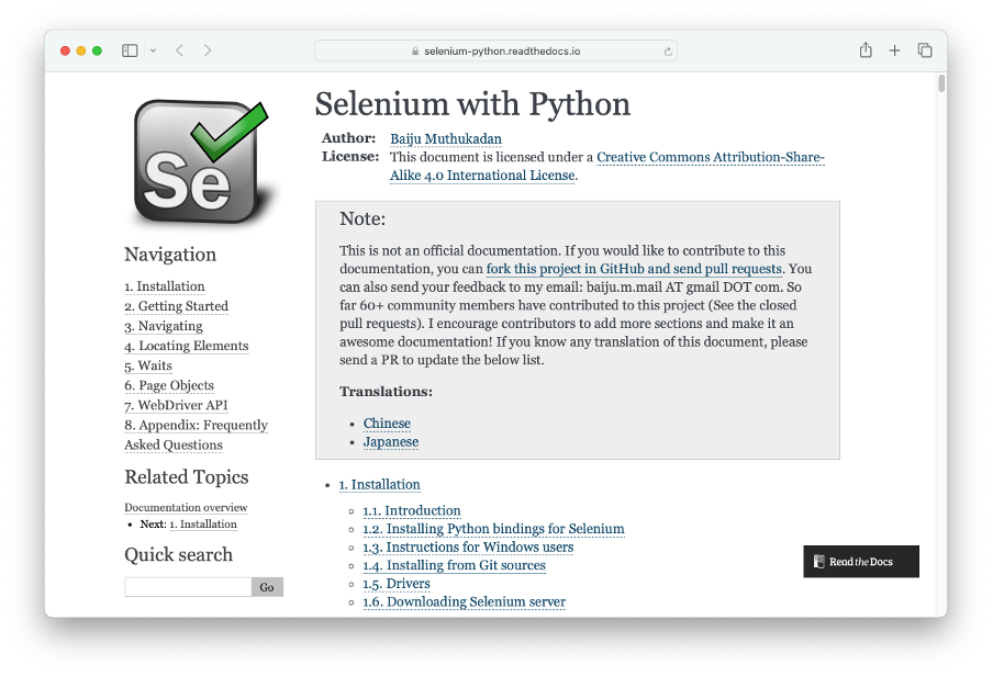
Python is a powerful programming language that can be used in various situations, specifically the scraping and analysis process for data analysts. By leveraging the power of the many libraries within Python, you can collect and manipulate large datasets easily to create visualisations.
The most-used libraries for data collection are BeautifulSoup, Requests and Selenium – and a combination of these can be used to access and scrape websites.
In the same vein, the most common library for analysis is Pandas, in which you can create data frames to contain and manipulate your data before exporting the results to Excel.
You can create visualisations using the libraries Matplotlib, Seaborn or Plotly, check out the documentation for more detailed information.
SQL
When working with large datasets, an SQL database can be useful in storing and accessing data. You can connect to a database through Python and store any scraped data directly. MySQL or SQLite are good starting points.
Data Visualisation Tool
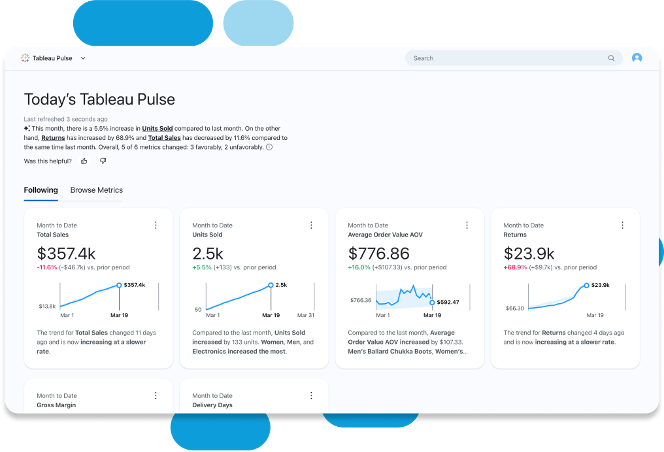
Looking for more a powerful method for creating visualisations? Platforms such as Tableau or PowerBI can be useful to create more interactive charts, which can allow for a different type of storytelling.
AI
Whether you’re ready to accept it or not, AI and Large Language Models such as ChatGPT are here to stay. They’re useful when used correctly, and especially when assisting with code or even its built-in analysis capabilities.
However, be careful: it’s not recommended to directly input your data into these tools as they may contain sensitive information. Instead, use it to create Python code, or give you a more general guide towards the best methods for analysis.
Interested in our content marketing and digital PR services, including data processing and analysis? Get in touch.


