Producing content built with AI shows that the help of artificial intelligence can open up plenty of new avenues for newsworthy storytelling.
As we’ve seen over the last few years, AI can assist content creators with a number of methodologies, including facial recognition, image generation, voice recordings and even sarcastic chatbots.
With the rise of ChatGPT (if you haven’t used it yet, what have you been doing?), we could even go as far as to say that AI has scared some of us content creators into feeling like jobs are at risk.
Luckily for now, AI hasn’t completely taken over – just yet.
With a report stating that 3 in 4 marketers are using AI for content creation, AI content is certainly on the rise with blogs, publishers and brands seeking out these tools to boost their efficiency and output. Whilst the tools are handy, it can be difficult for consumers to sift out the AI from the authentic. This, however, isn’t necessarily a bad thing.
Looking at examples of content built with AI, there are a mass of marketing campaigns that have gone on to earn linked coverage from news publishers in various sectors.
This project is more about posing as artificial intelligence to roast a topic that many people care enough about to share: personal music taste.
Spotify’s marketing success from their ‘Wrapped’ feature has become an annual event on social media — earning over 1.2 million tweets in a single month, and leading to huge increases in downloads of the app (plus many many more brands trying to replicate it).
The Pudding’s subversion of what makes Spotify Wrapped so popular was a genius way to appeal to the cynical side of music fandom.
Their “faux AI” tool gives the impression that a sophisticated AI bot is judging your prized personal music taste in real time, before returning sharable results that are partially tailored to the user.
Since launching in late 2020, it has been picked up by more than 1,300 linking root domains.
More than 1 in 5 of the headlines mention AI or artificial intelligence, suggesting that the AI’s participation in the experience is a key selling point in the story, as well as helping to make the project possible in the first place.
AI image recognition technology has the potential to reveal insights on a scale that the human eye wouldn’t be able to achieve. Truth is, content built with AI doesn’t always have to be copy-based.
Using Microsoft Azure in a case study, we wanted to see whether the many selfies that exist of pet owners and their pets show a happier image than a standard image of someone without a pet.
By comparing an anonymous sample of tens of thousands of pet owner selfies to standard selfies of people, we could compare the average level of emotions displayed in either category of picture.
Combining this AI tool with geotagged image data allowed us to reveal insights related to pet owners on a more international scale.
In other cases, we were also able to use this same process to measure the happiness of the average Instagram #selfie taker and the average #newhomeowner stood outside their front door and flashing their keys.
This campaign by Neomam studios for HouseFresh also used the same tool to identify the presence and strength of smiles in order to rank the happiness of locations in the USA.
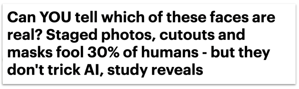
This research comes from a company that specialises in biometric authentication software with what is likely to be an attempt at downplaying some public fears over their technology.
While the statistics back up what they would hope to find — that AI isn’t fooled by spoof photos compared to the 30% of humans who do struggle to identify fakes — this story highlights an appetite that journalists have for exploring where humans and AI clash or collaborate in their capabilities around performing certain tasks.
Sentiment analysis tools can help us to draw insights around attitudes and emotions from large volumes of (usually) text-based data.
At Verve Search, one of our favourite use cases is to analyse the emotions behind different topics that are being talked about within various corners of social media.
In this example, we separated thousands of comments on US sports team’s official Facebook fan pages after wins and after losses to see which fan bases are more likely to remain supportive when the good times go bad and vice versa — also known as fair-weather fandom.
Initially, we would have loved to measure this on metrics such as fluctuating ticket sales or stadium attendances over a longer period of seasons.
But with that type of data mostly inaccessible and stadium attendance figures often debated for their accuracy, we found online fandom to be a good proxy with the help of SentiStrength, which could measure individual comments on a scale of positivity to negativity.
Other newsworthy examples of this type of analysis include when we found out which household chores cause the most stress or which elements of driving cause American motorists to complain the most.
This is a great example of content built with AI using machine learning to continue building on a subject of research from previous years.
An analysis of 3,000 English-language books by the USC Viterbi School of Engineering used NLP’s (Natural Language Processing) ability to detect the prevalence of pronouns, and thus how often men and women are represented in literature.
With this type of AI able to process vast quantities of text-based data and return such results, there is clear potential here for building on this method in other forms of media and entertainment where gender representation remains an issue.
Public speaking is usually a prerequisite of being one the most powerful people in business or politics.
So for this campaign we applied AI voice recognition software built on deep learning techniques to judge the emotional profile of famous leaders’ speaking styles.
Pulling together a large seed list of audio files from the public speeches of politicians and famous entrepreneurs, we could look at how certain emotions are more prevalent in certain individuals, political parties and genders of speaker.
Understanding what emotions are being portrayed within a person’s voice would normally have to be studied individually.
With AI-driven voice recognition, you can analyse large amounts of voiced audio files and retrieve results that are compared against the average emotional levels that the software is trained on. Or you can compare the relative emotional levels from your own dataset (in this case, the average leader) to see which voices rank highest and lowest vs those average scores.
As already noted, artificial intelligence is often talked about as something that clashes with humans — our judgement, our capabilities, or our jobs.
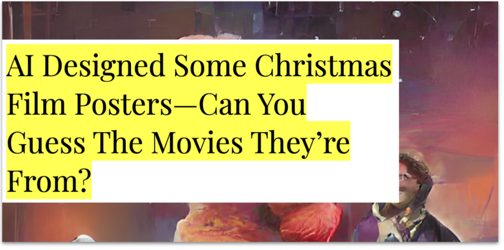
And although this content is built on AI-generated images, an essential aspect of its appeal requires the input of its audiences to guess what creation the AI tool has conjured up.
For this campaign that leant on a TikTok trend, each image is a famous scene from a Christmas movie that was mocked up in different styles by the app Wombo.
Thanks to this thread, where I found the campaign, you can also see content built with AI to help with other areas of the creative process:
Recently I've been playing around with AI image generation tools and I've realised there's SO many ways we can use them in digital PR
Below I've pulled together a list of 4 ways of how you can use AI image generation in your everyday 👇
There’s a Buzzfeed quiz for countless trends and topics. So, it’s not surprising to see that they also had a stab at the ‘audience vs AI guessing’ quiz format in July 2022, which you can try here.
AI image generation tools, such as DALL-E and Midjourney can capture our imagination in just a few words and visualise a detailed version of our thoughts much quicker than we would be capable of creating in the same format.
In this content example, the AI also had to capture the imagination of the journalist to whom the content was outreached to.
In our experience, motoring journalists who report on visual content are often an exception. They are used to dealing in data, reviews, previews, and shiny photography of even shinier vehicles.
Thanks to the creative angle used here by SEO Agency Screaming Frog, the supercars from a dystopian future is a fictional story that still managed to cut through to a sector that would normally be more concerned with stories related to cars that you can actually drive.
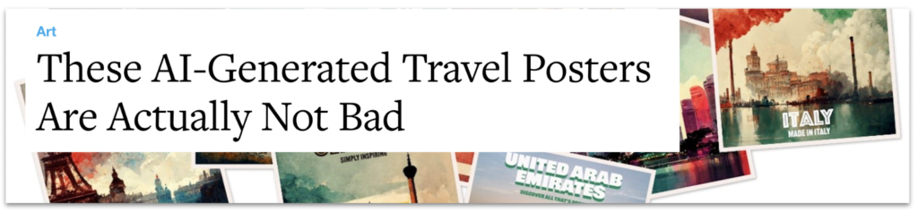
According to OpenAI, DALL-E is generating over 2 million images a day.
While the volume of AI-generated imagery already seems to be saturating the internet, the strategy of defining these image outputs to link them together under one newsworthy theme could still be in its infancy.
These examples of AI-generated imagery, also from the team at Screaming Frog, were fed by the names of countries and their travel slogans to see what Midjourney returned.
The posters are visually beautiful. However, when covering the story, the journalist seems particularly intrigued by what the AI — with no physical travel experience to rely on — chooses to prioritise in its interpretation of an entire country:
“Until you’ve seen a place for yourself, it’s a bit of an abstract idea, so why not ask Artificial Intelligence to generate your travel poster?… Like most travel posters, Midjourney has evoked a fairly sketchy sense of place, sometimes punctuated by notable landmarks or natural features.”
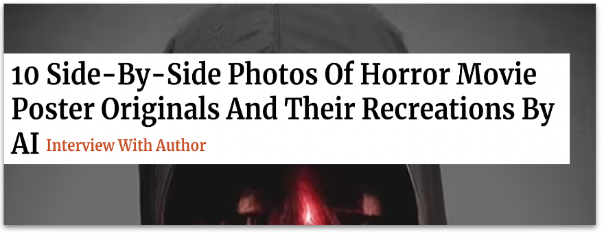
Many horror movies can be recognised by their iconic movie posters or from the faces of their terrifying villains.
The speed of AI image generation allows for trialling out different ideas for visual content. And any examples which appear to make the grade with some design touch-ups can also be targeted to a specific, short-term event in the calendar, such as Halloween.
This example by Digital PR Agency Evoluted took some of the most famous horror films of all time to see what even more terrifying versions of their posters could be reimagined by the AI app Wonder.
Check out this Twitter thread for a breakdown of the posters and more information on how they were created:
What if AI was behind our favourite Halloween classics? Using keywords from classic horror plots @vicki_collins and @laurarowleyx used AI to reimagine horror posters partnering with our design guru @willbarron to bring these to life in the style of the original posters 🧵
For more AI-generated movie poster goodness (and weirdness), take a look at this series of posters created by artist Vincenzi in his project ROBOMOJI.
Using a similar method as the Evoluted example, Apartment Therapy tells us that the artist inputted “a series of prompts and descriptions about a film’s visuals, titles, and premise into the AI software.”
As noted, the artist didn’t set out to earn linked coverage with his project. They are using it to ask important questions around what role AI will play in the art world going forward.
So, should we be creating content built with AI?
While artists and industries are rightly questioning what the adoption of these new technologies means for the future of creatives, some, like Manas Bhatia, are already acknowledging the part AI can play in quickly helping to visualise early concepts before an artist refines them with their expertise.
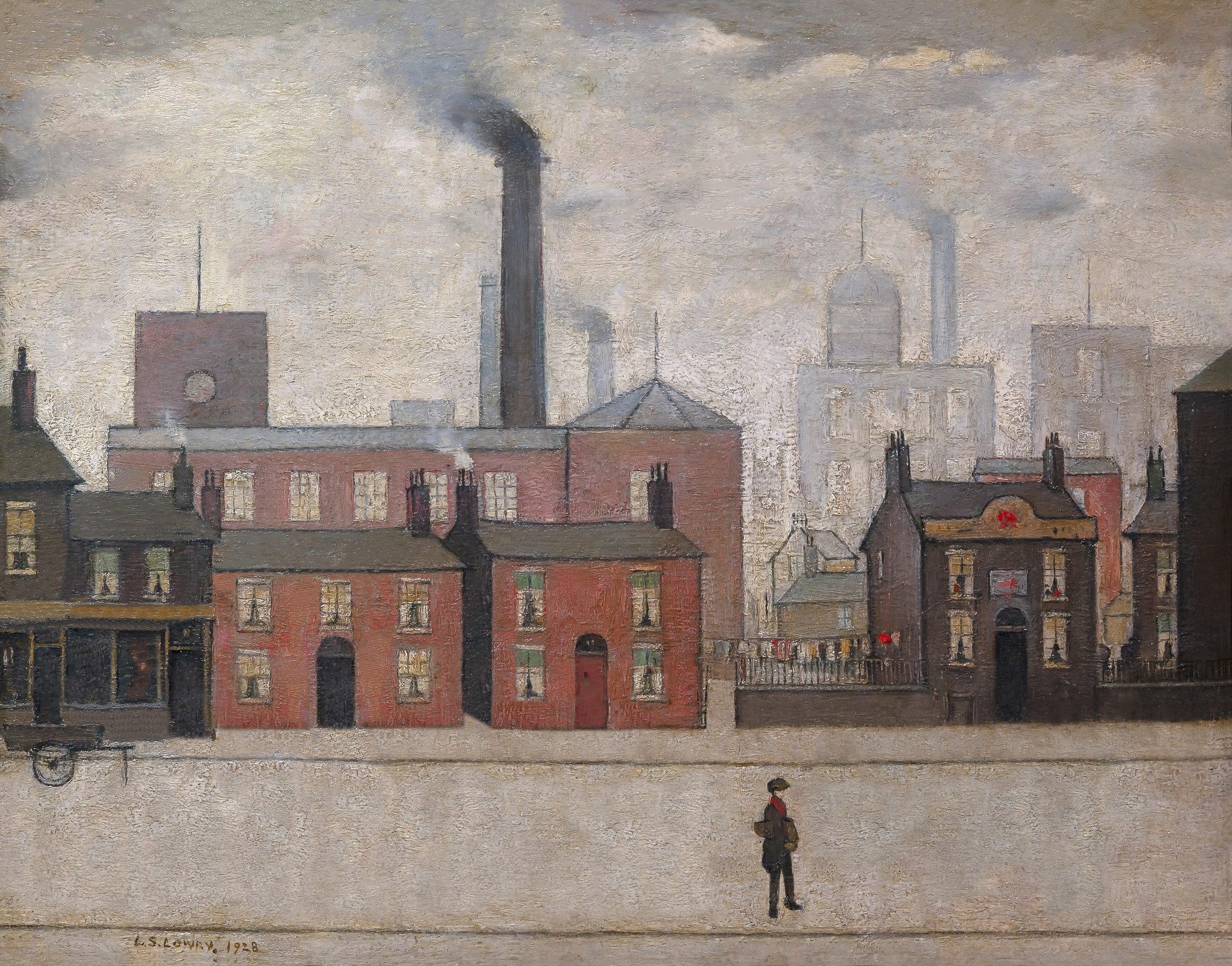
Back in 2022, we saw a campaign from Samsung earn widespread coverage after they enlisted the help of a digital designer to reinterpret famous artworks, according to the issues Gen-Z are most concerned about in 2022.
Relying on insights from a survey to inform the creative direction that an artist took provided a much more human and, therefore, newsworthy angle to this ‘reimagined’ content than what the artificial mind of a tool such as DALL-E would provide.
L.S. Lowry’s ‘Coming Home from the Mill’ (1928) reinterpreted by artist Quentin Devine (2022). Source: samsung.com/ The Art of the Problem (2022)
The extent to which you use AI and its different domains as part of your creative process will vary from one campaign to another. Some ideas will see content built with AI take the role of prototype designer, others will do much of the data processing to then allow your team to find the stories that matter within the data.
On the whole, it would be a mistake to think that the inclusion of AI alone will sell in a story to the press as newsworthy.
Without a defined creative concept to work with, these examples of AI are tools waiting to process whatever we feed them. As part of our role in creating newsworthy content out of AI, we should at the very least be setting the AI’s constraints, ensuring the inputs and outputs make sense, and closely monitoring what the overall direction is of the story that we’re trying to tell.
Further reading:
Deep Dive: AI Image Generator DALL-E Is Now Open To All — Why Should PRs and Marketers Care? by Rich Leigh [1]
The future of content creation with AI is closer than you might think by David Cohn [2]
The lawsuit that could rewrite the rules of AI copyright by James Vincent [3]
Messing around with AI and content concepts by Alex Cassidy [4]
Social analysis: the most stressful places for Christmas shopping
We analysed more than 500,000 tweets to reveal where Christmas shoppers are having the most stressful experiences.
As the 25th December draws closer, a trip to the high street is likely to become busier and more stressful with each passing day.
Even during the pandemic, a survey by Klarna from December 2020 revealed that 79 percent of Brits left their gift shopping until the last minute and 64 percent said they were still doing their shopping in-store rather than online. These conditions can easily make for a stressful experience when buying gifts for our friends, family and colleagues.
Can Twitter tell us whether some places are more stressful than others for Christmas shopping?
At Verve Search, we often analyse live tweets and historical Twitter activity to gain insights on certain topics from around the world.
For this article we have poured through more than 500,000 tweets to find those that mention ‘Christmas shopping’ and analysed the content of those tweets through a sentiment analysis tool called TensiStength.
This academic tool, developed by Mike Thelwall at the University of Wolverhampton, measures the stress levels of tweets on a scale of -5 (very highly stressed) to 0 (neutral).
We have used this method here to indicate which major cities in the United Kingdom and United States are seeing the most stressful tweets from Christmas shoppers and which activities and keywords within tweets about Christmas shopping are most likely to occur in a stressful tweet.
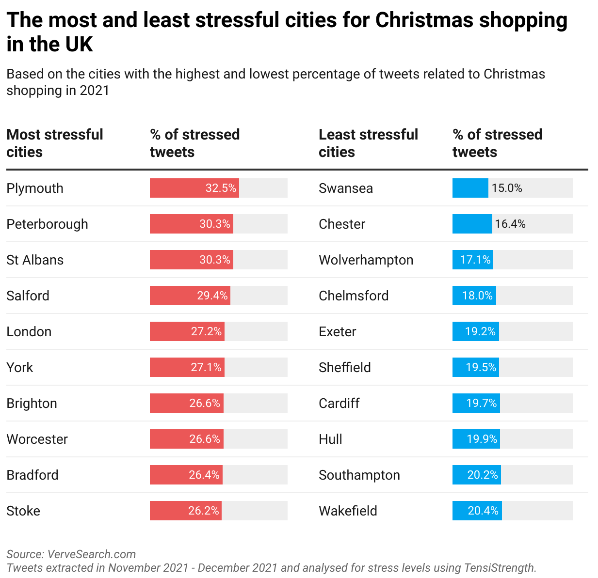
The most and least stressful cities for Christmas shopping in the UK
Although the port city of Plymouth has plenty of well-known shopping options to choose from, including Drake Circus, Royal William Yard, and Plymouth Market & West End, it is here where shoppers are most likely to encounter a stressful time while buying gifts at Christmas. Nearly one third of tweets (32.5%) related to Christmas shopping from people in the city measured as stressed in our analysis.
At the opposite end of the stress scale, shoppers in the Welsh city of Swansea have the least stressful experiences while xmas gift buying, with just 15% of tweets measuring as stressed in that location.
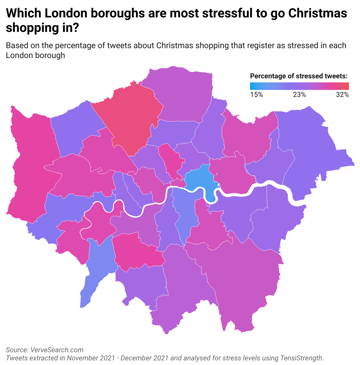
Which London Borough is the most stressful for Christmas shopping?
The London Assembly estimates more than 500,000 people walk through Oxford Street every day. And that’s just one of the UK capital’s outlets for shoppers among the many high streets, markets and shopping centres that exist there. With so many people concentrated in popular shopping areas, increased queuing times, higher competition for coveted items and busier transport links are all likely to occur, and be potential factors in raising a shopper’s stress levels.
According to our analysis of local London tweets, the boroughs of Barnet (30.3%), Hillingdon (28.5%), and Merton (28.4%) see shoppers most likely to be stressed out according to the percentage of stressed tweets in those locations.
While being the highest ranked boroughs in London, this still represents a minority of shoppers, and could be for a number of reasons. We have highlighted some of the UK and US’s most common reasons to be stressed out about Christmas shopping further down this article.
Tower Hamlets shoppers are the least stressed at Christmas time, with just 16.7% of shoppers tweeting with stressed language about their experience. Shoppers in Kingston-upon-Thames (19.7%) and Hounslow (21%) also had some of the least stressful gift-buying experiences at the festive time of year.
If you’d like to pay a visit to any of boroughs listed here and support their many excellent local businesses at Christmas, you can usually visit the local borough’s website for a breakdown of what their local shops have to offer during the festive period and beyond.
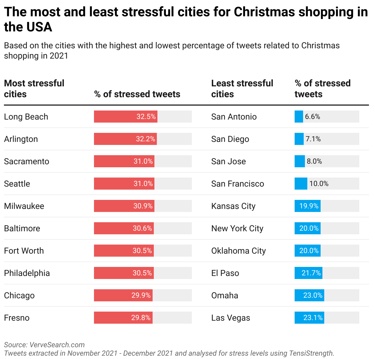
The most and least stressful cities for Christmas shopping in the USA
In America, a trip to the shopping centres of Long Beach, California are most likely to wind up as a stressful experience for people. This is based on 32.5% of shoppers tweeting about their Christmas gift buying with levels of moderate to very high stress detected in their choices of language.
However, if you are a Long Beach local or visitor, and want to support the local stores, reviewers on Yelp rate the Long Beach Exchange, Shoreline Village, and the LBX Exchange as some of the best shopping centres.
The least stressful cities to shop in are San Antonio, Texas with 6.6% of tweeters have a stressful Christmas shopping experience, followed by San Diego (7.1%) and San Jose (8%), both situated in the state of California.
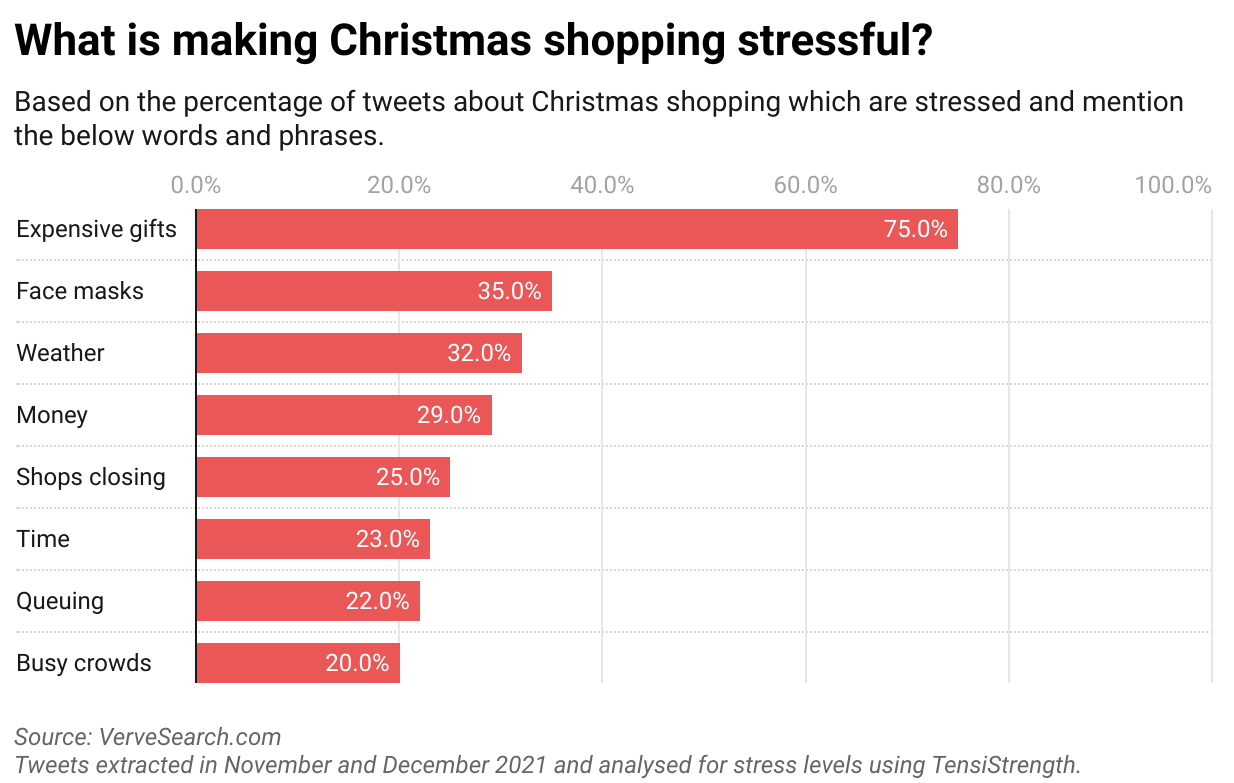
Which topics and activities are most associated with a stressful tweet by Christmas shoppers?
Some of the Christmas shopping-related tweets in our analysis mentioned specific phrases and key words related to their experience. From our analysis, we found that tweets that talked about ‘expensive gifts’ and ‘Christmas shopping’ were most likely to be stressed — equivalent to 75% of tweets — compared to other potential indicators of shopping stress, such as face masks, the weather, and money problems.
Methodology
We scraped more than 500,000 tweets in the 40 most populated cities in the UK and 50 most populated cities in the USA, and every London borough over two weeks between late November and early December.
With these tweets we analysed those which mentioned ‘Christmas shopping’ (equivalent to more than 62,000 tweets) with a tool called TensiStrength. This gave us a score for each tweet on a scale of 5 (very highly stressed) to 0 (neutral). Stress levels are detected according to the type of words, phrases and punctuation used.
A stressed tweet was categorised as any tweet with a score of 2, 3, 4, or 5.
To calculate what makes Christmas shopping stressful, we analysed the final sample of Christmas shopping tweets for mentions of each key word or phrase. Each tweet that contained target key words and phrases was measured according to what percentage of them measure as stressed.
Disclaimer:
Opinions on Twitter don’t tell the full story about visiting a place in real life. While some of the locations mentioned here may coincide with a ‘stressful’ experience from Twitter users, that shouldn’t put people off shopping there (in-store or online).
You can find out more information about where to shop with local businesses on local council websites, via: Local.gov.uk
You can shop independent and local at: locallyuk.com
How to support small and local businesses in your community [1]
Interested in our content marketing and digital PR services? Get in touch.
7 helpful Figma plugins for designers
Figma is evolving at an incredible rate. With a recent edition of FigJam and updates such as Cursor Chat and Audio, editors and viewers can collaborate even more effectively, saving time and resources.
One of the best things about Figma is the ease with which you can install all sorts of incredibly helpful plugins. If you’re new to Figma, it can be hard to know where to start – so here’s my guide to the best Figma plugins of 2021.
Master
Are you wanting to attach objects to an existing component or merge two main components? No problem. This plugin can help create, clone, and move components without losing overrides. While it might take some time to master this plugin, it’s absolutely worth it. Find out more about Master here.
Convertify Figma to Sketch/XD
In a previous blog, I touched on the differences between Figma and Adobe XD. For those designers that still have to toggle their design work between the two platforms, you might find the Convertify Figma to Sketch/XDplugin very useful. It easily converts and exports your design files from Figma to Sketch, Adobe XD, or After Effects with one click.
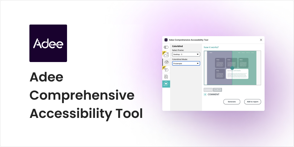
Adee Comprehensive Accessibility Tool
Adee is the plugin for you if you need to test your design out for accessibility. Adee is a powerful tool that offers a wide range of functionalities, including the game-changing colour-blind simulator. This feature lets designers select their design frames and preview them in eight colour blind modes within the Figma app.
Find / Focus
Alright, we’ve all been there – the larger the project, the harder it is to find that one layer. The Find / Focus plugin solves the difficulty of manually searching through endless layers in your document with its find, select, and zoom feature. Just type the layer name into the search window and refine your search with additional regex or case sensitive options.
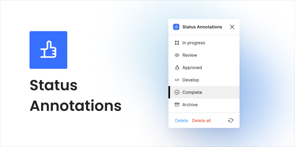
Status Annotations
For those who use Figma’sfree Starter Plan or like to keep all their design versions on one page, Status Annotationscould be a helpful plugin addition. Although the status labels are quite small, this plugin does the job. It indicates the status of the design process for any selected element – a collaboration feature we needed!
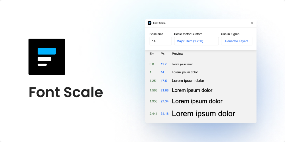
Font Scale
Fonts can be difficult at the best of times, especially for those who are just starting out in design. Font Scale helps designers achieve harmony and consistency in a typographical hierarchy. With several scale factor options to choose from, Font Scale generates font size previews.
Figma Chat
As previously mentioned, Cursor Chat does a great job as an instant messenger within Figma; it’s innovative and super helpful for collaboration work. However, if you are looking for something a bit more old school, theFigma Chatplugin is a great option.
This plugin lets you communicate with other people inside the Figma file. You can also select a frame or an element and attach it to your message so that the recipient can find that element quickly.
Final thoughts
As we’ve discussed in a previous blog post, the design team at Verve Search uses Figma because of the sense of community that the platform encourages with features that allow for enhanced collaboration between creatives. If you’re new to UX and UI design, check out our selected plugins to see how they can work for your workflow and improve the collaboration on your team.
Interested in our content marketing and digital PR services? Get in touch.
5 of my favourite data viz talks from Outlier 2021
I was given the opportunity to attend the inaugural Outlier 2021 conference hosted by the Data Visualization Society. It featured 41 inspirational talks given by people who work across different industries, each with unique and varying levels of experience in their data visualisation specialisms.
There were so many talks to choose from, but I’ve narrowed down five that will help to reframe how you think about the process of creating impactful data visuals.
1. How do we translate cultural experiences into data stories?
The talented team at Kontinentalist create engaging data stories that unpack cultural experiences to gain a better understanding of cultural trends.
In their talk, I learnt the following tips to create a compelling data story that translates other cultures:
Find an angle that is proudly niche
If you are translating your own cultural experience, do it with pride and communicate it with an urgency that suggests if you don’t tell your story about your experiences then other people won’t be able to either.
Explore a particular angle of interest in-depth, rather than being too wide-ranging in exploring a number of angles at surface level.
This can be something as simple as introducing one lesser-known artefact or phenomenon from your culture and communicating it in a way that educates and informs a wider audience from outside of your culture.
Unpack diversity within your angles to explain how certain phenomena are experienced within that culture.
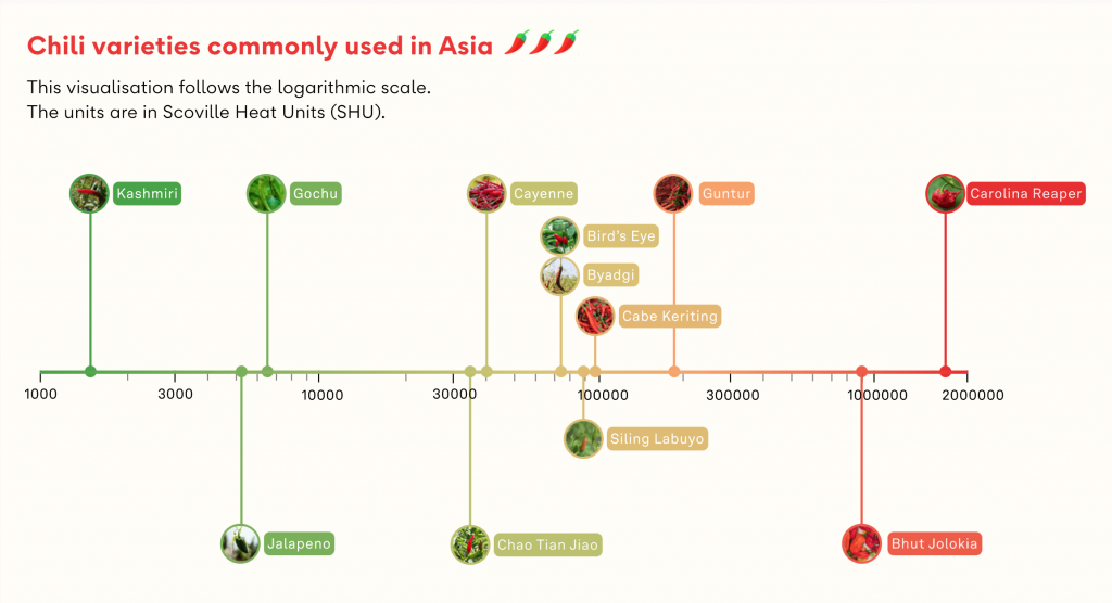
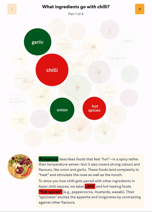
This can mean helping your audience to understand the ways in which cultural phenomena interact with the lives of different groups in that culture (e.g. What’s the big deal about chilli in Asia?).
In this example, chillis provided an excellent window for exploring Asian cuisines and the influence that chillis have upon many dishes.
The author began his analysis by asking ‘was spicy food popular in Asia?’. But the yes-no nature of the question provided added complications to finding a definitive answer to something not comprehensively documented, so he refined his analysis to explore ‘what ways spiciness – in particular, chillis – were experienced in Asia’, which was more open-ended and allowed for unpacking the answers in a less binary fashion.
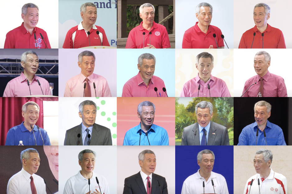
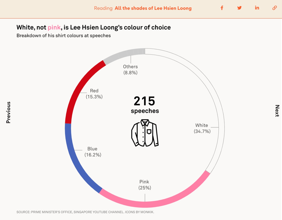
It’s a common myth that the Singaporean prime minister Lee Hsien Loong mostly wears pink shirts. After collecting data on all the shirt colours he’d worn during PM speeches it was revealed that his most commonly worn colour was actually white.
Some cultural phenomena might have a concept that is quantifiable (e.g. the popularity of different noodle brands).
But even if there isn’t an obvious quantifiable metric, you can translate the qualitative stuff by providing a rich visual experience via maps, audio or illustrations to convey the theme, atmosphere and cultural significance of your story’s topic.
In the below example, colours were used to convey the different dimensions of flavour used in Asian cuisine. Additionally a packed circle chart was used to visualise common ingredients in chilli dishes with chords connecting circled ingredients that go well together.
Balance accuracy and understanding to ensure that the data is well presented and easy to understand.
The above visualisation of ‘ingredients that go with chilli’ is actually a condensed version of more than 100 different bubbles that had to be indexed on a scale of between 1 to 9 flavours (such as ‘sweet and sour’).
While this is a less accurate representation of the very distinct flavours that exist within these many ingredient combinations, the authors felt this struck the right balance between beauty and simplicity. They were able to provide more detail through the illustrations and text boxes that more curious readers could explore.
Tip
Providing a clear and transparent methodology and documenting every step of the process behind how you arrived at your visualisations will help balance accuracy with understanding for your audience even more.
Find a common ground
It can be easy to over-explain when trying to tell a story about one culture to an audience outside of that culture.
Here, they recommend anchoring the angle of the cultural experience that you’re trying to analyse to a more universal sentiment.
In the talk, they used an example of relating the cultural tradition of new year fortune telling to people’s universal anxiety about the future and our well wishes for loved ones, or of the popularity of instant noodles in Asia to every culture’s respective love for certain comfort foods.
2. 3D Geo DataViz: From Insight to Data-Art
Hosted by Craig Taylor (Senior Data Visualisation Design Manager, Ito World)
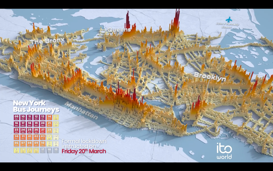
Craig and his team at Ito World create narrative-driven and cinematic-looking 3D visualisations.
Craig’s talk focused on how he and his team create insight-driven visualisations that reveal how the systems we interact with impact our lives. In his talk, he explained that producing this type of visualisation requires that you:
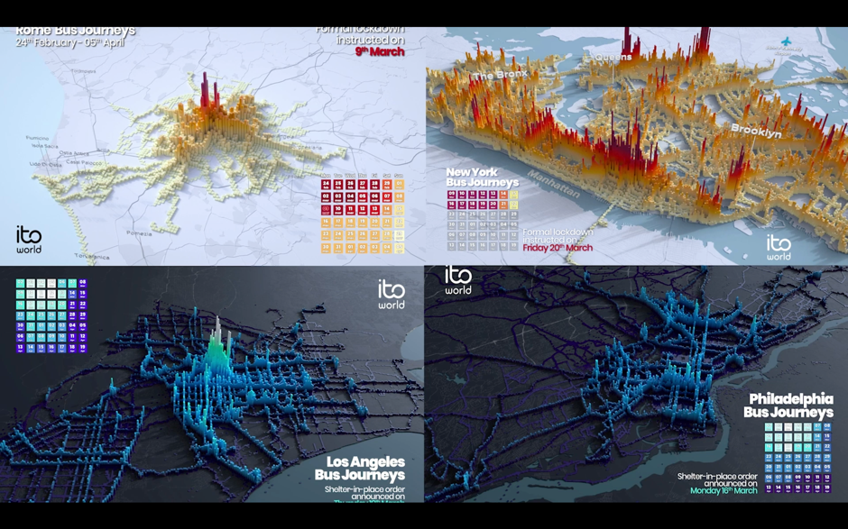
Include granular data, since it yields more interesting results. For example, for Ito World’s project Transit In Motion, the dataset for New York City included 14.8 million locations recorded per day, 4,488 unique bus trips, and 2GB of CSV files.
Focus on the patterns that your data is creating over time. For Transit in Emotion, this involved analysing the volume of transit usage over the period of one month.
Make your visualisation’s designabstract to highlight the rhythm of your data over time. In the past, Craig has used a variety of spheres, cuboids, and meshes to portray what city-wide transit in motion looks like.
If you’re interested in making 3D data art, Houdini and Blender (which is free) are recommended.
3. DataViz, the Unempathetic Art
Hosted by Mushon Zer Aviv
Mushon is a Tel Aviv based designer, researcher, educator, and media activist. His talk highlighted how data viz can lack empathy, and takes inspiration from the following quote:
“If I look at the mass I will never act. If I look at the one, I will.”
— Mother Teresa
To ensure that your work is empathetic, Mushin says you must be aware of:
Dark data viz, which risks tone-deafness and minimising important topics.
In 2015, Mathew Lucas produced a series of infographics showing the impact of the atomic bombing in Hiroshima. Although the graphics were visually pleasing, this data viz also sparked debate, with some questioning how design should be used to aestheticise a horrific event.
Mushon cites Professor of Psychology Paul Bloom who says empathy often shines a spotlight on the individual and can be biased towards those who look like us. We find it easier to empathise with individuals, not with the masses.
He also references a study from Paul Slovic in the talk, which further illustrates this idea with what he calls ‘statistical numbing’ whereby audiences seem to empathise more with individuals than with larger groups.
In Slovic’s research he found that charity donations in response to descriptions about identifiable individuals earned more than double the donation value in response to descriptions about statistical lives (i.e. groups of individuals that weren’t personally identifiable). Sadly, the value of donations even decreased when statistics were presented alongside individual descriptions in the story.
Affectiveempathy vs cognitive empathy
According to Simon Baron-Cohen, affective empathy, which is rooted in emotion, means that you’re able to feel the same emotion or feel your own distress in response to another’s pain.
Cognitive empathy, which is more rational, means that you’re able to understand someone’s perspective or imagine what it’s like in another person’s shoes.
Muson relates these two types of empathy to Daniel Kahneman’s distinction between two ways of thinking:
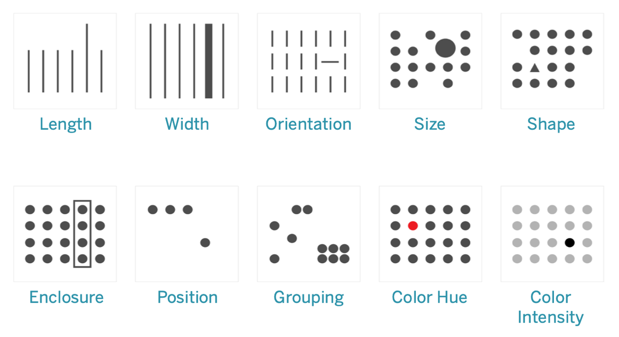
Tier 1thinking: thinking automatically, quickly, with little or no effort and sense of voluntary control. Tier 2thinking: allocates attention to the effortful mental activities that demand it. These type of operations are often associated with the subjective experience of agency, choice and concentration.
It is said that Tier 2 often contextualises the thinking of Tier 1 to inform a person’s decision-making. In visualisation, the pre-attentive attributes (below) are how we use vision to communicate between Tier 1 and Tier 2. So here Mushon asks ‘can we think of empathy as an additional pre-attentive attribute for visualisations?’ because we do not get to control or rationalise it, but it can inform our more deliberate decisions.
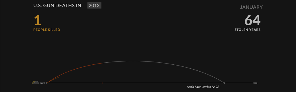
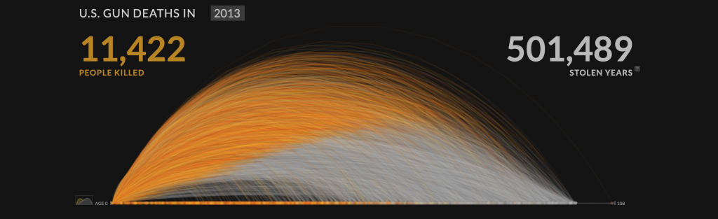
The above image is a powerful visualisation of gun deaths in America during a single year. It begins by illustrating the life arc of one person being cut in the middle vs how many more years they could have lived for.
Focussing on a single individual’s life being cut short appeals to the viewer’s affective empathy or tier 1 thinking, aka the more emotional response, before the impact of another 11,422 deaths are visualised in the same manner as below.
Data visualisations have the power to explore and explain important stories about the world.
However, it’s not enough to just say something is wrong with the world. If we have built that message well, then we should also direct that message towards the path of change and actionable insights.
4. Data points are people too
Hosted by Bronwen Robertson, Joachim Mangilima, Saja Othman, Zdeněk Hynek
Data4Change is a non-profit organisation based in London that connects social change organisations with designers, journalists, and technologists to collaboratively create data-driven solutions for some of the world’s most pressing problems. This talk focused on many of their projects which have helped to deliver change in countries around the world.
An example of this is ‘A Bride With A Doll‘, which focused on the issue of child marriage. The team designed a workshop kit and a storybook that could be read from both directions, reflecting emotional experiences, based on data insights from the community.
5. Mind Games: The psychology behind designing beautiful, effective, and impactful data viz
Hosted by Amy Alberts (Senior Director, User Research, Tableau)
This talk outlined practical guidelines which can help you predict where people look at certain parts of data viz – for example, jagged lines and bar graphs are effective at drawing the user’s attention.
Amy’s team at Tableau have previously employed eye-trackingsoftware to discover where people were focusing, gaze plots to qualitatively and quantitatively show where the eye is fixated, heatmaps to show areas of high visual tension, and gaze opacity maps to highlight areas that people give less attention.
According to their findings, the biggest attention grabbers in data visualisation are:
BANS (Big Ass Numbers) – Our eyes are drawn to large visual elements such as big text. Below is a gaze opacity map of a dashboard with big numbers.
Colour – Visual contrast relative to other areas generates attention.
Humans and maps – Our brains are hardwired to notice other humans, so when we see human-like figures in visualisations, we are automatically drawn to them. If maps and humans are relevant to your data, it is worth capitalising on this to draw attention.
Design with intent and be mindful of the context that you control. Use clear titles and high contrast elements, ethically making use of the psychological phenomenon known as the priming effect. This will help to ensure that your audience clearly understand the story that you are trying to tell with your data.
Final thoughts
The Outlier conference was incredibly informative and packed with so much knowledge about how to create culturally relevant, socially aware content that’s also visually impressive and effective in communicating concepts.
Interested in our content marketing and digital PR services? Get in touch.
The benefits of mood boarding for your clients
For this post, you’ll learn about the benefits of using mood boards to communicate ideas to clients with different types of requirements. I’ll be using real examples created by Verve Search’s designers.
But firstly…
What is a mood board?
A mood board is a type of visual presentation that consists of several design elements in one composition. It’s a way to visually communicate your imagination with the world, as well as convey a general idea or a feeling about a particular topic.
Mood boards can be physical or digital. For example, a UI designer might find a digital version a better option for organising inspiration for a new mobile application.
A digital mood board presented to Paxful for the Video Game Investments campaign
Conversely, someone like a perfumer may want to use a physical mood board to include textures and objects to convey the emotion and mood of a unique perfume scent.
The benefits of using a mood board for client work
Mood boards are a valuable step in the design process as they help establish a strong foundation to the look and feel of a project and can be used to creatively align with project stakeholders early on.
They are a fundamental transition between an initial thought and a first draft, and help save on resources and energy when maturing ideas.
Mood boards should be a jumping-off point for discussing, refining, and trying out ideas without commitment, while also making sure that the team and the client are on the same page as the designer.
At Verve Search, we use digital mood boards in the production process to communicate the mental model of a designer who is working on a campaign. Mood boards help transform ideas into a collage of useful visual references, and there are lots of options you can explore on what to include in your own digital mood board.
What to include in a digital mood board for a client
A mood board is a collection of elements, such as colour, typeface, UI framework, or theme, that visually unifies a set of images. You might also want to include customised design elements that will be used in the final design.
That being said, content visualised on a mood board doesn’t necessarily have to appear in the outcome of the project; the visuals could just serve as a way to describe a feeling or aesthetic.
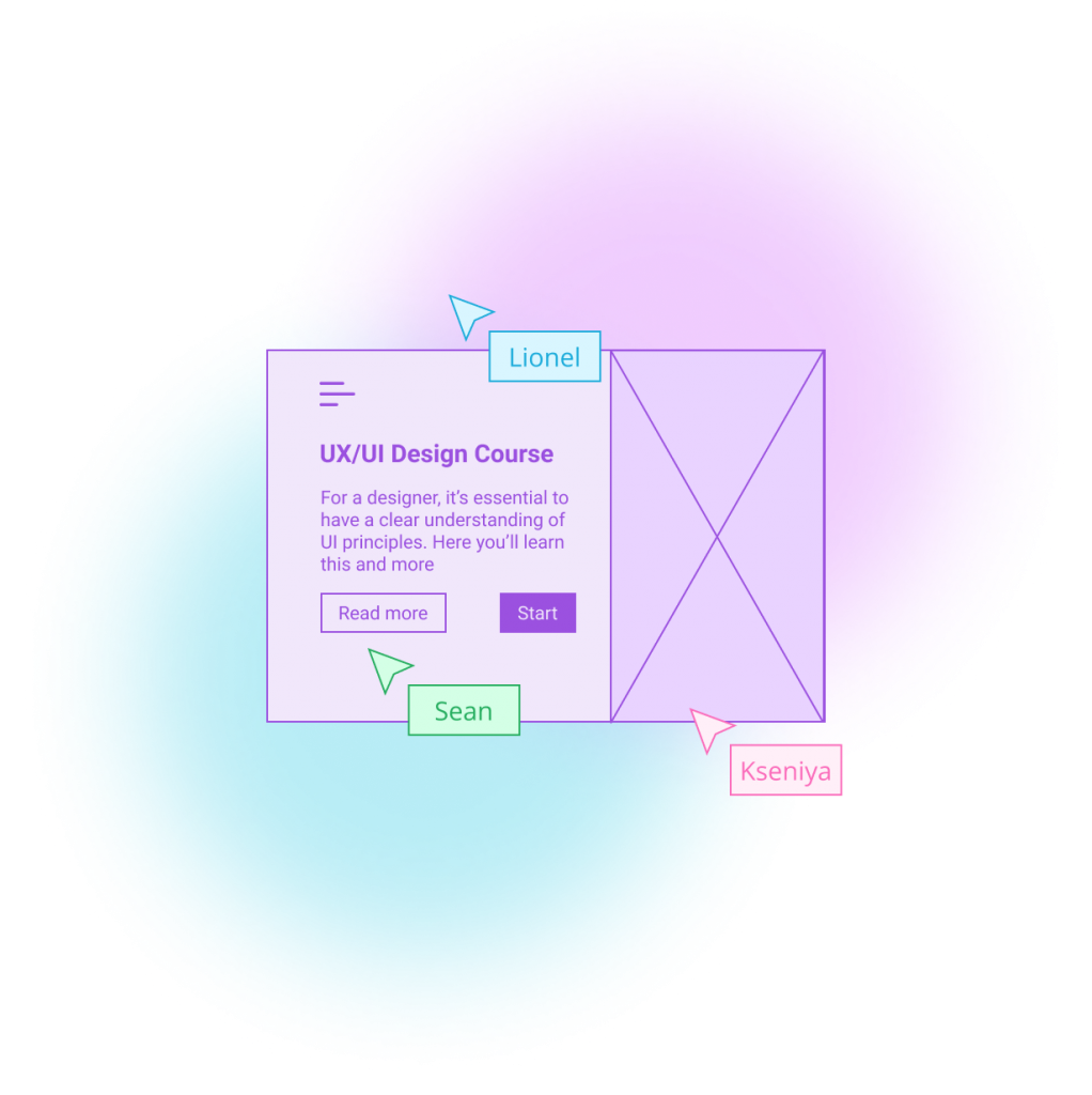
Below is an example of a mood board I presented to our client Paxful for the Video Game Investments campaign. As you can see, I’ve included different icon ideas, a colour palette, an example of typography, UI inspiration, imagery, and a logo.
On your mood board, you might also want to include different textures, shapes, and interactions between elements to give the client an idea of how you visualise your project’s look and feel.
Mood board presented to Paxful for the Video Game Investments campaign
Tip
Mood boards don’t need to appear too polished. They are not intended to show a final deliverable, but to give those involved with the project an idea of the visual direction.
Mood boarding approach
The way you should approach mood boarding at the beginning of a project depends on the type of project it is; is it a personal project or work for a client?
Working on a client project often means there is less freedom to experiment with design concepts, as there might be some existing client requirements or style guides in place. This is true especially for clients that already have an established design vision.
In this case, the mood boards should give a sense of the client’s taste and requirements while also exploring some potential design directions.
Below, I’ve detailed the ways the design team at Verve Search has approached three different client requirements and included some examples of our resulting mood boards and final designs…
1: Clients with a style guide and extensive requirements
In the first example, I will talk about clients that provide a style guide and have strict requirements when it comes to the look and feel of the final product.
Below is an example of a mood board that was put together for Lookfantastic’s Instagram Emotions campaign. The mood board includes some imagery from existing assets belonging to the client that serve as design reference, and some elements from their style guide, such as colour and typography. The mood board also includes some inspiration for the way our findings could be visualised in a map and pie chart.
Mood board presented to Lookfantastic for the Instagram Emotions campaign
Looking at the final design below, you can see how I maintained a similar layout and colour scheme to the ones showcased in the mood board.
The final designs used for assets in the live campaign
Working with clients that have strict design requirements and style guides in place might seem like a bit of a creative challenge, but having access to a client’s style guide is a helpful way of understanding the client themselves – especially if you are new to working with them. Overall, their style guides will contribute to better communication and a mutual understanding of what will be expected from the designs.
2. Clients with a style guide and minor requirements
For The Jargon of Jobs, our client Canva provided us with both a style guide and some minor design requirements to keep in mind. We were tasked with creating a playful feel, using Open Sans as our font choice, and selecting an accent colour from the two they had provided us.
The resulting mood board for this campaign included some style guide references, inspiration for data visualisation in the form of a map, and some examples of trending design choices that we believed would work well as a design direction for this project.
The initial mood board we created for The Jargon of Jobs campaign for Canva
The final design included all client requirements in terms of font, colour, and mood. On our side, we added a custom-made illustration depicting confusion (which worked well with the campaign’s theme) and a trendy radiant gradient to complement the logo.
The final splash page present in the live campaign
For this type of client, I’d recommend not getting too attached to a particular style or a design vision. It’s a good idea to have a few options in mind, for example a more experimental design and also a safer design option. In the case of the first design option being rejected, you can always fall back on another design option that you have at hand.
3. Clients with no style guide or specific requirements
For our client Admiral’s campaign Home Alone 2021, the client gave us complete freedom in terms of design choices. We did however have to create a layout similar to the previous Home Alone campaign, for which this campaign served as a 2021 update.
Since the topic for this campaign was vacant homes, we thought it would be great to reflect this with visuals like architectural blueprints. Therefore, a clean feel and accents of blue can be recognised in this project’s mood board. Other mood board elements included inspiration for the navigation aspects and snippets of the previous campaign.
The mood board for Home Alone 2021
Home Alone 2021’s final design featured a clean layout and an aesthetically pleasing colour scheme, with a large illustration of a lonely, isolated house on the splash page that made the interface more engaging.
The final splash page of the live campaign
From personal experience, I have worked on various campaigns and they all differed in their look and feel. Each project had its own concept that needed to be projected through design.
There have been campaigns that required more effort regardless of it having or not having a client’s style guide in place. No project is the same, but this is why mood boards exist – to help creatives in starting a project in the right direction.
How do the designers at Verve Search approach the mood boarding process?
The steps outlined below refer to the design stage of the campaign creation process. This is the standard mood boarding process as followed by the design team at Verve Search and may be a helpful guide if you’re starting out on a design project.
Step 1: Campaign kick-off
Campaign kick-off is the first meeting we have as a team when starting a new campaign. During this meeting we get briefed on the campaign’s concept and have the opportunity to ask campaign-related questions. For designers, this would usually be the time to ask about the client’s requirements and the creative team’s expectations.
Spending some time researching will help you visualise the ideas better during campaign-related meetings. This could apply to prior campaign kick-off or data handover.
Tips at this stage:
Understand the concept of the campaign
Understand the client and what they want to achieve
Note down relevant keywords
Step 2: Brainstorming
At this stage, the key is to write down as much relevant information as possible. Try to combine all the knowledge you’ve gathered on the project so far and start to think about what could inspire you, products to be inspired by, colours, and anything that could impact the design.
One way to do this is to take a piece of paper and start writing down keywords. You can then categorise them into groups like style, font, or colour. This process will help to organise your thoughts and transform mere imagination into a workable concept.
Brainstorming for Admiral Home Alone 2021 campaign
Tips at this stage:
Create a word cloud using relevant keywords and associations
Note initial thoughts on the look and feel of the campaign
Research possible ways to visualise the data
Step 3: Initial mood boarding
The initial mood boarding process should set the mood of the campaign and define a desired emotional response. These are the emotions a viewer should feel when looking at the mood board.
Try jotting down adjectives that define the style that needs to be achieved and organising all the images you’ve collected according to their common visual theme. It’s important to eliminate any images that look alike or unnecessary – less is more.
Tips at this stage:
Analyse the client’s style guide
Analyse the client’s website or similar platforms
Search for visual references and concepts on Dribbble or sources alike
Explore fonts (if not provided by the client)
Step 4: Data hand-over and mood board refinement
Once the data has been handed over to the designers and the content of the campaign is clear, it’s time to make final refinements to the mood boards by adding and removing visuals where appropriate.
Tips at this stage:
Refine the mood board according to the campaign’s content
Refine the mood board according to the campaign’s data
The takeaway from all of these steps is to organise your work, even if you are just brainstorming. Doing prior research and making a note of initial ideas could really help you later in the project. You will be able to go back to the initial ideation process and understand why you made a certain design decision. This is also helpful when presenting your work to clients or your team.
Final thoughts
Mood boards are an uncomplicated way of communicating a design concept that minimises any misunderstandings that might arise from trying to describe a concept verbally.
A good starting point for any designer is research, including reading through the client’s style guide, looking for the market’s standard in colour psychology, typography, and overall design.
Since mood boards are usually shared with non-designers, it’s important to arrange them in a way that will make sense to viewers who are new to design as well.
Further reading
Take a look at the below resources for further mood boarding inspiration:
Interested in our content marketing and digital PR services? Get in touch.
Figma vs Adobe XD: which tool should you design with?
With remote working presenting new challenges to our creative process and our production team wanting to experiment with new design features, we’ve recently switched to a new design tool. But which option would work best for you?
In 2016, Figma introduced an innovative browser-based interface design tool. The same year, Adobe Inc. released its own version of a UX design tool: Adobe XD.
Alongside other popular editing software options such as Sketch, both Adobe XD and Figma have evolved into competitive design platforms, and our production team decided to investigate the pros and cons of each. Here’s what we found:
Platform and performance
The most obvious difference between the two platforms is that Figma is browser-based, whereas Adobe XD is a downloadable desktop application.
Adobe XD allows users to work with local files offline. It also allows users to share and get feedback on their design, thanks to its cloud capabilities. In its recent update, Adobe took a step further and XD now integrates with apps and services across the Creative Cloud suite. This means that sharing assets between apps and users with Creative Cloud Libraries is now easier.
Some might assume that Figma’s browser-based approach to designing is limited to internet connectivity. However, Figma allows its users to work offline on a pre-opened file via a desktop app (available for both Mac and Windows).
When comparing the two, it all comes down to individual preference and work style. However, working on a browser-based platform like Figma definitely has some advantages when it comes to collaborative work and live updates.
Pricing
Both Figma and Adobe XD offer free and subscription-based pricing options. XD’s single-app plan for professionals and small teams costs £9.98 per month (without a trial) and is free for personal use. Figma’s pricing options break down as follows: free for personal use; $12 per editor/month on the Professional Plan; and $45 per editor/month on the Organization Plan (annual billing only).
It’s worth mentioning that Figma’s free version allows unlimited editors on 1 project and 3 team files, as well as a 30-day version history, unlimited cloud storage, and unlimited viewers. Adobe’s free starter plan only allows for collaboration on one shared document and one additional editor, limited cloud storage (2GB), and a 10-day version history.
Here a more detailed view on the price differences between the two:
Click to expand table
Features and functionality
Figma and Adobe XD are becoming more similar in terms of features and functionality. Each platform seems to adopt something new with every update. For example, Adobe XD has been working hard to achieve something similar to Figma’s game-changing collaboration features. On the other hand, Figma only recently introduced its Smart Animate feature, which is very similar to the Auto Animate feature that Adobe XD introduced some time ago and changed the prototyping experience completely. However, there are still some visible differences in workflow. Let’s discover them below:
Click to expand table
What are we using at Verve Search?
At Verve Search, we’ve chosen Figma over other prototyping design options.
Here are the five reasons we decided to go with Figma:
1. Figma is free
Team accounts are paid but individual accounts are free and include all the same key features as the paid version.
2. Simpler developer handoff
Our developers can get dimensions, styles, and download icons and images from the project URL. Resources such as images and SVGs can be exported globally and locally.
3. Easy collaboration
Co-designing alongside your co-workers is no longer a fantasy. Our team can now edit files together in real-time, leave comments with mentions, and follow along via Observation Mode. This has been particularly useful for remote working.
4. All-in-one platform
It’s an all-in-one platform that does not require switching from one system to another in order to complete or share the design process. Designing, prototyping, reviewing work, and sharing feedback are all in one place.
5. Design features
Tools like ‘deep selection’ provide more control over design elements and save time during editing. Other features that our team enjoy working with are instant arcs, overlays, gradient borders, smart animate gradient transitions, and much more. Figma helps our designers to expand their creative ideas and showcase their visions throughout the design process.
Final thoughts
Figma made the right choice to focus on collaborative work and the ability to access files from the browser without installation, while I find that XD’s strength is in finding new design processes, such as Scroll Groups, 3D Transform, and Repeat-Grid features.
Only time will tell which platform will gain more recognition among designers. So far, Figma and Adobe are doing well at listening to user feedback and transforming it into real features, bringing visual design onto another level.
Features and images presented in this article are extracted from the official websites of Figma and Adobe. Figures for both are correct as of May 2021.
Interested in our content marketing and digital PR services? Get in touch.
6 questions that turn numbers into newsworthy stories
Digital PR campaigns regularly build stories out of statistics, and the questions that we ask of numbers to arrive at those stories are quite consistent.
For this post, I will explore examples of news headlines, coverage for our campaigns and content from elsewhere that can be constructed from asking the following types of questions:
1. What are the highest and lowest values? 2. What’s the grand total? 3. How much or how little has something changed? 4. What’s the proportion? 5. What are the averages? 6. How many are there?
Data is as good as the questions you ask of it
Ideas for data-driven stories often start with asking: ‘what data can I find to answer my question or to create my intended headline?’.
But even once you or your team have sourced and cleaned the data you think you’ll need, you’re unlikely to find a dataset that is ready to outreach to a journalist without also examining all of the potential stories that lurk within it.
In a similar way to how a journalist asks different questions of their sources to gain different sides to a story, why wouldn’t you ‘interview’ the data that you’re working with to consider all of the ways in which you can tell your story?
Whatever your job title (asking questions of data isn’t reserved for data analysts), remembering to explore one dataset from different dimensions can be incredibly useful throughout the process of producing content and earning linked coverage — here are some of the ways in which it applies:
Ideation: the difference between producing a new idea for a campaign from one that already exists can sometimes involve calculating a similar dataset in a different way. The idea that you already have in mind may become even stronger by considering what further steps you need to take to apply a calculation that hasn’t been applied to it before.
Production: before committing to kicking off a campaign’s production, you should have some idea of the type of story that your research is going to produce. However, properly interrogating the data that you work with ensures that no important contextual layers of a story are being missed, and it may even reveal a stronger angle than what you originally set out to find.
Execution: uncovering new trends worth visualising helps to tell a more comprehensive data-driven story. Even if certain trends don’t go on to be your headline statistic, they can supplement your narrative for users of your content and for journalists who are going to write about your findings.
Outreach: applying different calculations to a dataset can diversify the number of angles you have to outreach — more angles generally means more potential for linking opportunities. At the very least, it will provide a journalist with more context around the story that you are telling them.
Not every team follows the exact same creative and outreach process, but the following examples will provide a useful framework for anyone stuck on what to do next in their quest to find stories within numbers.
1. What are the highest and lowest values?
It’s no secret that superlatives make great news stories. The maximum and minimum values in a dataset often translate as being the outliers, or the unusual, or the best and worst of something.
In 2020, two in every five headlines that had been published about Verve Search client campaigns contained one of the words: ‘most’, ‘best, ‘top’, or ‘highest’ — the majority of them referring to the highest rankings in one of our data-driven campaigns.
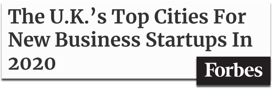
For example, when we analysed the details behind more than 6 million new business creations on Companies House, we were able to rank and reveal which UK cities and towns were enjoying the biggest boom in new start-ups in 2020.
Source: forbes.com (2020)
Ranking the highest and lowest values may often be the final step in a method of producing a story after asking other important questions of data. In the above case, we created a ranking-driven headline after our analysis also counted the number of new businesses registered on Companies House, and measured the year-on-year change in those figures.
These calculations also produced another headline figure by revealing the grand total of how many new businesses were created across every town and city in what was estimated to be a record-breaking year for UK startups forming. Summing together the key sections of data in your sample is another way to make a great headline…
Tip
Follow the links for how to find the highest and lowest values in a spreadsheet with Google Sheets, Excel or from sorting tables.
2. What’s the grand total?
How many times does a headline catch your eye with the size of the number it uses? One reason that the below headline from The Financial Times works is that behind the figure of 4,000 is a story about 4,000 humans who have lost their jobs from a single company during the COVID-19 pandemic.
Source: ft.com (2020)
The human element behind a totalvalue can help to sell it in as a headline figure, but an important consideration is whether its scale can be understood as a standalone number by the average person without needing further context. Although, sometimes, a large, eye-catching figure does do the job of providing a shocking headline before anymore context is given.
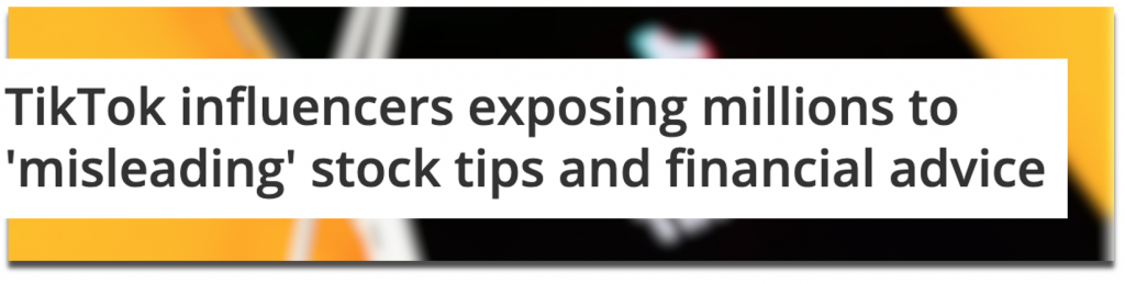
A campaign we produced called Influencer Investors analysed the scale of finance misinformation that was circulating among TikTok’s #stocktips from influencers with massive followings.
After mining through videos to calculate how frequently misleading content was appearing on the profiles of popular finance influencers, we also revealed the scale of the issue by summing together the total number of followers (28.4 million) and likes (3.6 million) that the misleading influencers and content had received.
Source: techradar.com (2021)
If you can uncover grandtotals to answer questions such as ‘how much something costs’ or ‘how many people were affected’, then you could be revealing a dataset’s most newsworthy statistic.
Even if this kind of figure doesn’t become your headline, it’s important to cite overall sample sizes as part of a transparent methodology. Add up all of the values and show off the scale of your analysis for whichever parts of your data make sense to. Journalists will usually mention this in their story along the lines of:
[Client name] analysed [sample size + metric] to discover [statistic]
Total values can become even more newsworthy when they represent a significant change…
Tip
Follow the links for how to calculate sums in spreadsheets through Google Sheets or Excel.
3. How much or how little has something changed?
Change is an essential part of storytelling. When important things change dramatically, or don’t change as expected, they often make the news. In the below investigation by the BBC, revealing howmany students sought mental health support was essential to the overall story, however, the headline focuses on that fact that more students were using mental health services than in previous years.
Source: bbc.co.uk (2019)
A campaign we produced called Priced-out Property revealed which locations in the UK and around the world have seen the greatest change in property affordability, based on the growing gap between earnings and property prices over recent years. Using change as our key measure meant we could consider every location with comparable historic data to produce a ranking of both positive and negative changes in affordability.
Source: hertfordshiremercury.co.uk (2021)
Another common way of converting change into a story is when a decreasing number is highlighted to indicate a ‘risk of extinction’ headline. This type of story often emerges from the Office For National Statistics’ Most Popular Baby Names dataset.
Source: flowercard.co.uk via mirror.co.uk (2020)
You may be working with data that isn’t longitudinal (i.e. doesn’t consider different time periods), such as cross-sectional survey results. That doesn’t necessarily mean you can’t suggest a change is taking place in the broader state of things.
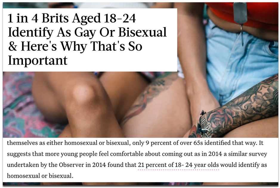
A survey-led campaign we produced called Between The Sheets asked Brits numerous questions related to their sexual activity, including what sexuality they identify as. Our insight revealed 24% of 18-24 year olds identified as either homosexual or bisexual.
Source: bustle.com (2018)
Although our data only accounted for one point in time, coverage by publications such as Bustle and The Mirror reported on this as an increase in young people identifying as gay or bisexual. They referenced a similar survey that was included in our outreach email from four years prior, which showed the figure was lower at 21%.
As well as calculating change, those headlines also incorporated proportion into their story…
Alongside other calculations, almost every campaign that I have referenced so far has included a proportional angle. Proportions tell you how large or small a number is in its relationship to a whole.
As neatly explained in an excerpt from Content hubble’s Ebook (2020), proportions provided a different perspective to the data in our Movie Mortalitycampaign, which revealed the actors who had been killed the most in their film roles:
“Without considering things proportionally, to some degree, the actor who dies the most will be a factor of who’s been in the most films. In another context, cities like London or New York will always over index for everything due to their financial power and population numbers.”
James Barnes, ‘Content hubble: 31 content campaigns that earned 11,882 links’
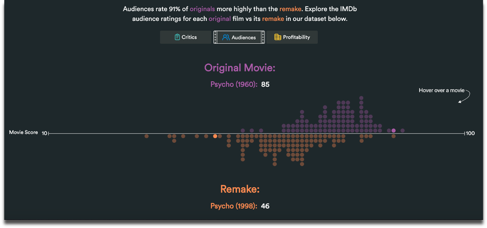
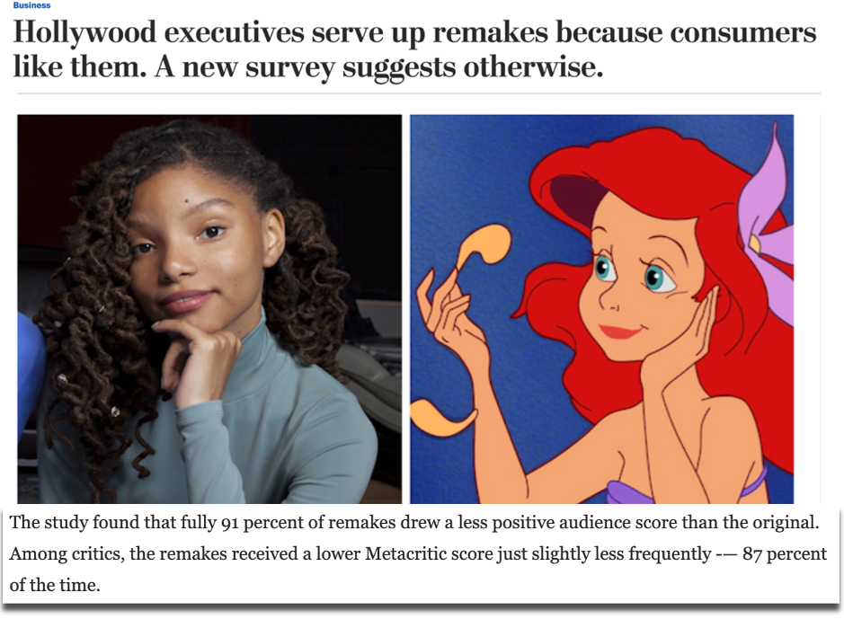
A campaign we created called Remake My Day analysed what the best and worst movie remakes were in history. This ranking of remakes according to critic and audience scores revealed little change in appetite for movie reboots, because they were consistently reviewed as worse than their original versions.
Source: Remake My Day (2019)
Based on the consistently negative reviews of remakes, we asked a broader question: what proportion of all remakes do audiences and critics actually prefer? Just 13% among critics and 9% among audiences was the answer. This angle – also indicated by the cluster of purple dots in our graph above – became the leading statistic that was covered in top tier publications, such as VICE and The Washington Post.
Source: washingtonpost.com (2019)
Our methodology for Remake My Day also relied on the movies in our dataset being pre-measured on a weighted average score, according to critic and audience reviews….
Tip
Follow the links for how to calculate percentages in spreadsheets through Google Sheets or Excel.
5. What are the averages?
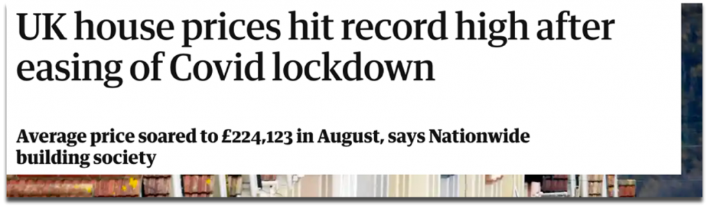
Average occurrences don’t always stop the press, but the average can be used as a benchmark to calculate who or what performs above or below it, or whether the average itself is wayward of what you would expect over a certain period of time. For example, when the average house price in the UK changes significantly, it hits the headlines.
Source: guardian.co.uk (2020)
Averages can also be useful for ranking large samples of different data points. A campaign of ours called Pioneering Women considered a sample of more than 6,900 female founders to rank universities on metrics such as how many female start-up founders had attended them and the average amount of funding raised by founders for the companies that they went on to launch.
Source: wustl.edu (2019)
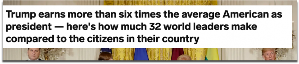
Average earnings are a particularly useful benchmark for comparing to society’s richest and (often) most talked about people. One of our most successful angles for a campaign called Pay Checkrevealed how much more world leaders earned compared to the citizens who paid their wages.
Source: businessinsider.com (2018)
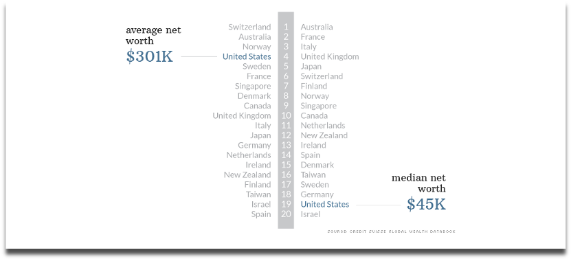
Remember to also read between averages, especially by looking at the mean and median values.
This analysis by CNN picked apart the assumption that the average American is one of the world’s wealthiest. In terms of mean net worth, which can be heavily skewed by a country’s super wealthy citizens, Americans were the fourth richest in the OECD (2014), but when you line up every individual’s net worth, the US median was actually one of the lowest.
Source: cnn.com (2014)
And such a vast gap between the mean and median values of a dataset may lead you to ask howmany super-wealthy people in the US there actually are.
Tip
Follow the links for how to calculate averages in spreadsheets through Google Sheets or Excel.
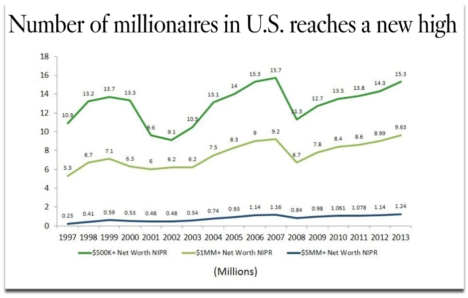
6. How many are there?
The same year that CNN published their analysis of the net worth of Americans, the LA Times took a different angle by counting how many households with a net worth of $1 million or more existed in the US, which turned out to be 9.6 million – a record number at the time. This is also a headline that highlights a significant change for the most recent time period.
Source: latimes.com (2014)
Counting how often a text or numerical value appears in a spreadsheet is often used to deliver a ‘best seller’, or, in the case of our campaign below, a ‘most borrowed’ type of angle. For a campaign called Well Read, we analysed three decades of lending data from UK libraries and counted which authors, novels and genres were borrowed the most.
Source: inews.co.uk (2018)
Unlike the data source we used above, you may be collecting information from multiple organisations, with the aim of comparing their data against each other. This means there could be missing data or inconsistent collection methods that can have implications, either as part of the story you’re trying to tell or in terms of whether the different datasets can be fairly compared at all.
By counting the data that was missing rather than what was present, VICE’s Broadly channel analysed and reported on 86 percent of universities failing to make any mention of stalking or abuse in their policy documents (2019).
One example of overcoming the nonuniform data collection methods that are typical of UK universities when responding to freedom of information requests came from an FOI-led survey by Uswitch. They counted UK University responses to uniform ‘yes’ or ‘no’ questions about their commitments to renewable energy to score them on a straightforward index.
Coming full-circle to the highest and lowest values again, many data-driven stories can be constructed by an index that considers multiple indicators to rank a group of data points.
Ranking locations within indexes is a common method for outreach campaigns, as it provides local journalists with stories that are targeted to their area, and because comparable towns, cities and countries tend to record all sorts of interesting data that can be spun into a story.
This is a creative approach to creating a headline out of many statistics where one statistic in isolation wouldn’t do the same. For example, there is no single metric that can determine what it means to be a hipster, but thisindex created by MoveHub compiled metrics such as the number of record shops, vintage boutiques, and vegan restaurants proportionally to the size of the local population to determine it was Brighton, UK.
Source: independent.co.uk (2018)
Indexes may be considered more comprehensive than trying to make the jump from one individual statistic to a headline, and indexes can sound impressive when a brand produces one about a topic within which they are considered an authority to name ‘the best’ or ‘worst’ or ‘capital’ of something.
However, indexes can also mask certain stories that exist behind individual metrics, which could have quite easily produced a headline on their own. We have previously analysed a similar metric to the one used in the above ‘Hipster Index’ to name the world’s most vegan-friendly capitals, based purely on the percentage of restaurants in a location that serve vegan food options. With a surprising result revealing Dublin, this is another example of the strength of one statistic built out of one question creating a strong headline.
Source: joe.ie (2019)
So be sure to consider how each data point or statistic that you’ve worked hard sourcing and analysing can produce its own outreach angle, even if it was originally intended to support an index’s methodology.
Recap
Keep an eye out for how often news stories are constructed by:
As part of your creative process, consider whether each of these methods can reveal more interesting angles about the next dataset you work with, or whether they can even form the crux of your next idea’s methodology.
There’s no guarantee that a dataset will contain a headline-worthy angle, and you may find that there is more data to source before you can build a story.
But when you do find yourself interrogating a particularly fruitful set of numbers from all of the dimensions we’ve discussed, then you could uncover numerous stories to tell as part of your content and outreach strategy, or at least be confident that you’ve found the most newsworthy statistic.
Further reading
A broader look at the process of turning data into a content marketing campaign: [1]
As well as your calculations, there are other ways to diversify your angles and ideas during the production and outreach stages of a campaign. This post discusses that process through considerations about topics and journalist sectors: [2]
3 useful resources for finding data and hunting for stories: [3] [4] [5]
Interested in our content marketing and digital PR services? Get in touch.